blog
- Quirks & Quarks is the one I’ve been subscribed to the longest and is a reliable overview of interesting science stories. I’ve been listening to this one for so long that I used to rely on an AppleScript to get episodes into my original scroll wheel iPod, well before podcasts were embraced by Apple.
- In Our Time is another veteran on my list. I really like the three-academics format and Melvyn Bragg is a great moderator. This show has a fascinating diversity of topics in science, history, and literature.
- All Songs Considered has helped me keep up with the latest music and Bob Boilen is a very good interviewer.
- The Talk Show has kept me up to date on the latest in Apple and related news since at least 2007.
- Exponent has really helped me think more clearly about strategy with discussions of tech and society.
- Focused has been a very helpful biweekly reminder to think more carefully about what I’m working on and how to optimize my systems.
- Making Sense has had reliably interesting discussions from Sam Harris. It just recently went behind a paywall. But I’m happy to pay for it, which comes with access to the Waking Up app.
- I admire what Jesse Brown has built with CANADALAND and happily support it.
- Reconcilable Differences is a bit niche, though I enjoy the dynamics between the hosts.
- Mindscape has had some of the most interesting episodes of any of my subscriptions in the last several months. There’s definitely a bias towards quantum mechanics and physics, but there’s nothing wrong with that.
- Liftoff keeps me up to date on space news.
- The Incomparable is great for geek culture.
- If Drafts isn’t the right place to start, I just pull down from the home screen to activate search and find the right app. I’ve found that the Siri Suggestions are often what I’m looking for (based on time of day and other context).
- Some apps are more important for their output than input. These include calendar, weather, and notes. I’ve set these up as widgets in the Today View. A quick slide to the right reveals these.
- I interact with several other apps through notifications, particularly for communication with Messages and Mail. But, I’ve set up VIPs in Mail to reduce these notifications to just the really important people.
- Charlotte got me started and there’s a clear trend of increasing power as I figure out the bikes and gain fitness
- George’s class is always fun, but my progress isn’t as high as I’d like (indicated by the shallower slope). This is likely my fault though: George’s rides are almost always Friday morning and I’m often tired by then and don’t push myself as hard as I could
- Justine hasn’t led many of my classes, but my two best results are with her. That said, my last two rides with her haven’t been great
- Marawan’s classes always feel really tough. He’s great at motivation and I always feel like I’ve pushed really hard in his classes. You can sort of see this with the relatively higher position of the best fit line for his classes. But, I also had one really poor class with him. This seems to coincide with some poor classes with both Tanis and George though. So, I was likely a bit sick then. Also, for Marawan, I’m certain I’ve had more classes with him (each one is memorably challenging), as he’s substituted for other instructors several times. Looks like Torq’s tracker doesn’t adjust the name of the instructor to match this substitution though
- Tanis’ classes are usually tough too. She’s relentless about increasing resistance and looks like I was improving well with her
- Other isn’t really worth describing in any detail, as it is a mix of 5 other instructors each with different styles.
- The data is scattered across a hundred different Excel files
- Candidates are in columns with their last name as the header
- Last names are not unique across all Electoral Districts, so can’t be used as a unique identifier
- Electoral District names are in a row, followed by a separate row for each poll within the district
- The party affiliation for each candidate isn’t included in the data
Download EmacsW32 patched and install in my user directory under Apps
Available from http://ourcomments.org/Emacs/EmacsW32.html
Set the environment variable for HOME to my user directory
Right click on My Computer, select the Advanced tab, and then Environment Variables.
Add a new variable and set Variable name to HOME and Variable value to C:\Documents and Settings\my_user_directory
Download technomancy’s Emacs Starter Kit
Available from http://github.com/technomancy/emacs-starter-kit
Extract archive into .emacs_d in %HOME%
Copy my specific emacs settings into .emacs_d\my_user_name.el
Declaring podcasts bankruptcy
Podcasts are great. I really enjoy being able to pick and choose interesting conversations from such a broad swath of topics. Somewhere along the way though, I managed to subscribe to way more than I could ever listen to and the unlistened count was inducing anxiety (I know, a real first world problem).
So, time to start all over again and only subscribe to a chosen few:
When all together on a list like this, it looks like a lot. Many are biweekly though, so they don’t accumulate.
I use Overcast for listening to these. I’ve tried many other apps and this one has the right mix of features and simplicity for me. I also appreciate the freedom of the Apple Watch integration which allows me to leave my phone at home and still have podcasts to listen to.
Task management with MindNode and Agenda
For several years now, I’ve been a very happy Things user for all of my task management. However, recent reflections on the nature of my work have led to some changes. My role now mostly entails tracking a portfolio of projects and making sure that my team has the right resources and clarity of purpose required to deliver them. This means that I’m much less involved in daily project management and have a much shorter task list than in the past. Plus, the vast majority of my time in the office is spent in meetings to coordinate with other teams and identify new projects.
As a result, in order to optimize my systems, I’ve switched to using a combination of MindNode and Agenda for my task managment.
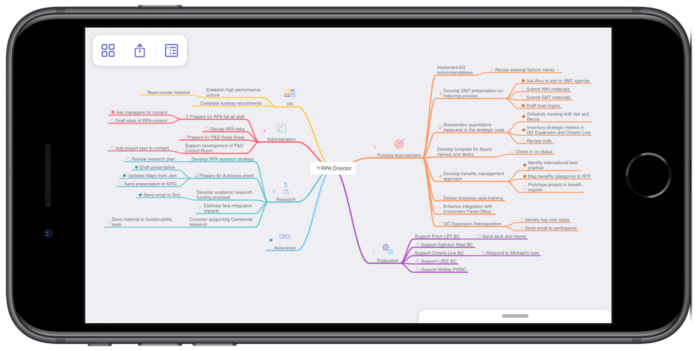
MindNode is an excellent app for mind mapping. I’ve created a mind map that contains all of my work-related projects across my areas of focus. I find this perspective on my projects really helpful when conducting a weekly review, especially since it gives me a quick sense of how well my projects are balanced across areas. As an example, the screenshot below of my mind map makes it very clear that I’m currently very active with Process Improvement, while not at all engaged in Assurance. I know that this is okay for now, but certainly want to keep an eye on this imbalance over time. I also find the visual presentation really helpful for seeing connections across projects.
MindNode has many great features that make creating and maintaining mind maps really easy. They look good too, which helps when you spend lots of time looking at them.
Agenda is a time-based note taking app. MacStories has done a thorough series of reviews, so I won’t describe the app in any detail here. There is a bit of a learning curve to get used to the idea of a time-based note, though it fits in really well to my meeting-dominated days and I’ve really enjoyed using it.
One point to make about both apps is that they are integrated with the new iOS Reminders system. The new Reminders is dramatically better than the old one and I’ve found it really powerful to have other apps leverage Reminders as a shared task database. I’ve also found it to be more than sufficient for the residual tasks that I need to track that aren’t in MindNode or Agenda.
I implemented this new approach a month ago and have stuck with it. This is at least three weeks longer than any previous attempt to move away from Things. So, the experiment has been a success. If my circumstances change, I’ll happily return to Things. For now, this new approach has worked out very well.
RStats on iPad
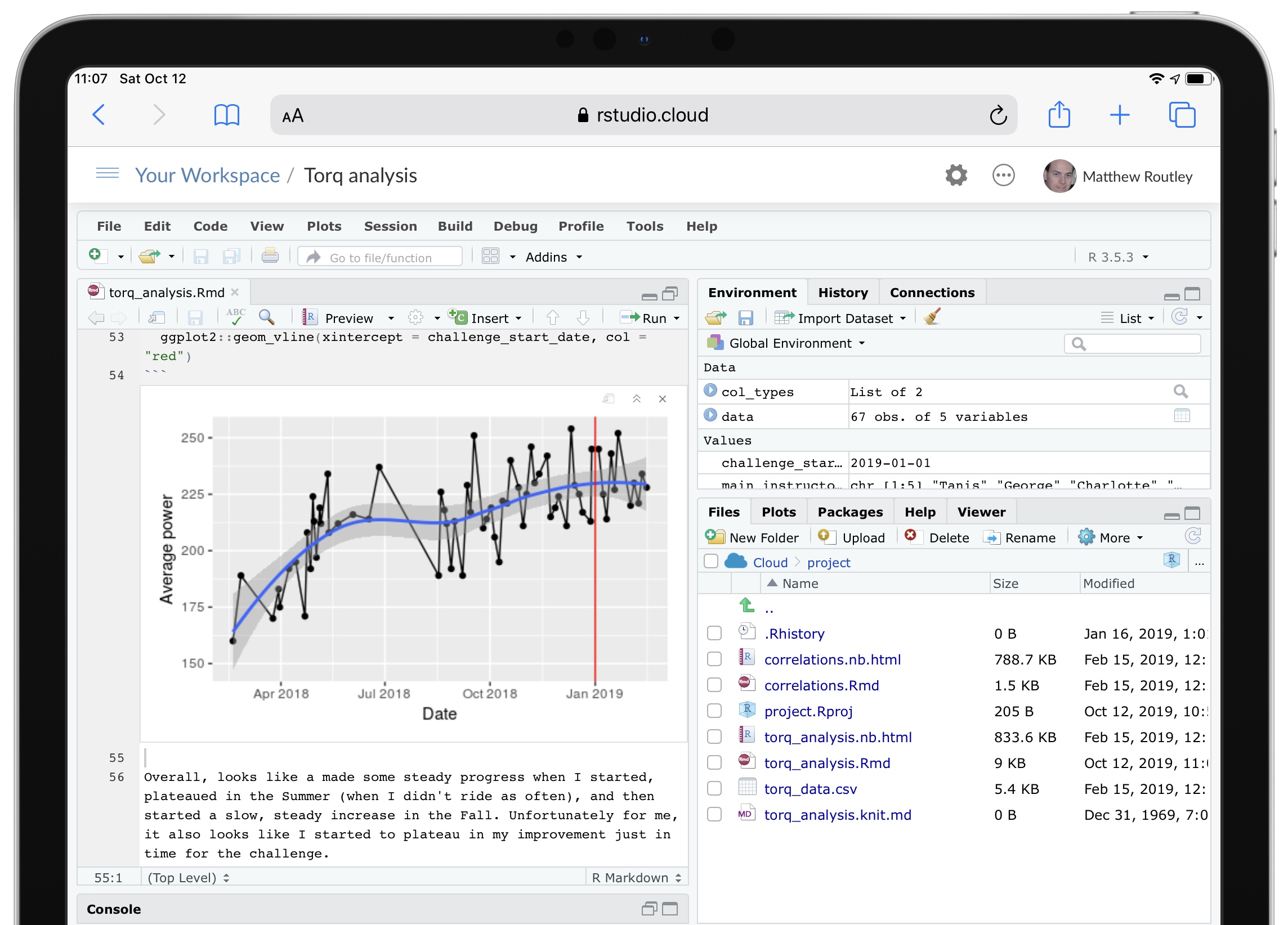
Among the many good new features in iPadOS, “Desktop Safari” has proven to be surprisingly helpful for my analytical workflows.
RStudio Cloud is a great service that provides a feature-complete version of RStudio in a web browser. In previous versions of Safari on iPad, RStudio Cloud was close to unusable, since the keyboard shortcuts didn’t work and they’re essential for using RStudio. In iPadOS, all of the shortcuts work as expected and RStudio Cloud is completely functional.
Although most of my analytical work will still be on my desktop, having RStudio on my iPad adds a very convenient option. RStudio Cloud also allows you to setup a project with an environment that persists across any device. So, now I can do most of my work at home, then fix a few issues at work, and refine at a coffee shop. Three different devices all using the exact same RStudio project.
One complexity with an RStudio Cloud setup is GitHub access. The usual approach of putting your git credentials in an .REnviron file (or equivalent) is a bad idea on a web service like RStudio Cloud. So, you need to type your git credentials into the console. To avoid having to do this very frequently, follow this advice and type this into the console:
git config --global credential.helper 'cache --timeout 3600'
My iPhone Home Screen
My goal for the home screen is to stay focused on action by making it easy to quickly capture my intentions and to minimize distractions. With previous setups I often found that I’d unlock the phone, be confronted by a screen full of apps with notification badges, and promptly forget what I had intended to do. So, I’ve reduced my home screen to just two apps.

Drafts is on the right and is likely my most frequently used app. As the tag line for the app says, this is where text starts. Rather than searching for a specific app, launching it, and then typing, Drafts always opens up to a blank text field. Then I type whatever is on my mind and send it from Drafts to the appropriate app. So, text messages, emails, todos, meeting notes, and random ideas all start in Drafts. Unfortunately my corporate iPhone blocks iCloud Drive, so I can’t use Drafts to share notes across my devices. Anything that I want to keep gets moved into Apple Notes.
Things is on the left and is currently my favoured todo app. All of my tasks, projects, and areas of focus are in there, tagged by context, and given due dates, if appropriate. If the Things app has a notification badge, then I’ve got work to do today. If you’re keen, The Sweet Setup has a great course on Things.
A few more notes on my setup:
I’ve been using this setup for a few months now and it certainly works for me. Even if this isn’t quite right for you, I’d encourage you to take a few minutes to really think through how you interact with your phone. I see far too many people with the default settings spending too much time scrolling around on their phones looking for the right app.
Consolidating my internet content
Like many of us, my online presence had become scattered across many sites: Twitter, Instagram, LinkedIn, Tumblr, and a close-to-defunct personal blog. So much of my content has been locked into proprietary services, each of which seemed like a good idea to start with.
Looking back at it now, I’m not happy with this and wanted to gather everything back into something that I could control. Micro.blog seems like a great home for this, as well described in this post from Manton Reece (micro.blog’s creator). So, I’ve consolidated almost everything here. All that’s left out is Facebook, which I may just leave alone.
By starting with micro.blog, I can selectively send content to other sites, while everything is still available from one source. I think this is a much better approach and I’m happy to be part of the open indie web again.
Backups
I’m very keen on backups. So many important things are digital now and, as a result, ephemeral. Fortunately you can duplicate digital assets, which makes backups helpful for preservation.
I have Backblaze, iCloud Drive, and Time Machine backups. I should be safe. But, I wasn’t.
Most of my backup strategy was aimed at recovering from catastrophic loss, like a broken hard drive or stolen computer. I wasn’t sufficiently prepared for more subtle, corrosive loss of files. As a result, many videos of my kids' early years were lost. This was really hard to take, especially given that I thought I was so prepared with backups.
Fortunately, I found an old Mac Mini in a closet that had most of the missing files! This certainly wasn’t part of my backup strategy, but I’ll take it.
So, just a friendly reminder to make sure your backups are actually working as you expect. We all know this. But, please check.
Commiting to a Fitness Challenge and Then Figuring Out if it is Achievable
My favourite spin studio has put on a fitness challenge for 2019. It has many components, one of which is improving your performance by 3% over six weeks. I’ve taken on the challenge and am now worried that I don’t know how reasonable this increase actually is. So, a perfect excuse to extract my metrics and perform some excessive analysis.
We start by importing a CSV file of my stats, taken from Torq’s website. We use readr for this and set the col_types in advance to specify the type for each column, as well as skip some extra columns with col_skip. I find doing this at the same time as the import, rather than later in the process, more direct and efficient. I also like the flexibility of the col_date import, where I can convert the source data (e.g., “Mon 11/02/19 - 6:10 AM”) into a format more useful for analysis (e.g., “2019-02-11”).
One last bit of clean up is to specify the instructors that have led 5 or more sessions. Later, we’ll try to identify an instructor-effect on my performance and only 5 of the 10 instructors have sufficient data for such an analysis. The forcats::fct_other function is really handy for this: it collapses several factor levels together into one “Other” level.
Lastly, I set the challenge_start_date variable for use later on.
col_types = cols(
  Date = col_date(format = "%a %d/%m/%y - %H:%M %p"),
  Ride = col_skip(),
  Instructor = col_character(),
  Spot = col_skip(),
  `Avg RPM` = col_skip(),
  `Max RPM` = col_skip(),
  `Avg Power` = col_double(),
  `Max Power` = col_double(),
  `Total Energy` = col_double(),
  `Dist. (Miles)` = col_skip(),
  Cal. = col_skip(),
  `Class Rank` = col_skip()
)
main_instructors <- c("Tanis", "George", "Charlotte", "Justine", "Marawan") # 5 or more sessions
data <- readr::read_csv("torq_data.csv", col_types = col_types) %>%
  tibbletime::as_tbl_time(index = Date) %>%
  dplyr::rename(avg_power    = `Avg Power`,
                max_power    = `Max Power`,
                total_energy = `Total Energy`) %>%
  dplyr::mutate(Instructor =
                  forcats::fct_other(Instructor, keep = main_instructors))
challenge_start_date <- lubridate::as_date("2019-01-01")
head(data)
## # A time tibble: 6 x 5
## # Index: Date
## Date Instructor avg_power max_power total_energy
##
## 1 2019-02-11 Justine 234 449 616
## 2 2019-02-08 George 221 707 577
## 3 2019-02-04 Justine 230 720 613
## 4 2019-02-01 George 220 609 566
## 5 2019-01-21 Justine 252 494 623
## 6 2019-01-18 George 227 808 590 To start, we just plot the change in average power over time. Given relatively high variability from class to class, we add a smoothed line to show the overall trend. We also mark the point where the challenge starts with a red line.
ggplot2::ggplot(data, aes(x = Date, y = avg_power)) +
  ggplot2::geom_point() +
  ggplot2::geom_line() +
  geom_smooth(method = "loess") +
  ggplot2::ylab("Average power") +
  ggplot2::geom_vline(xintercept = challenge_start_date, col = "red")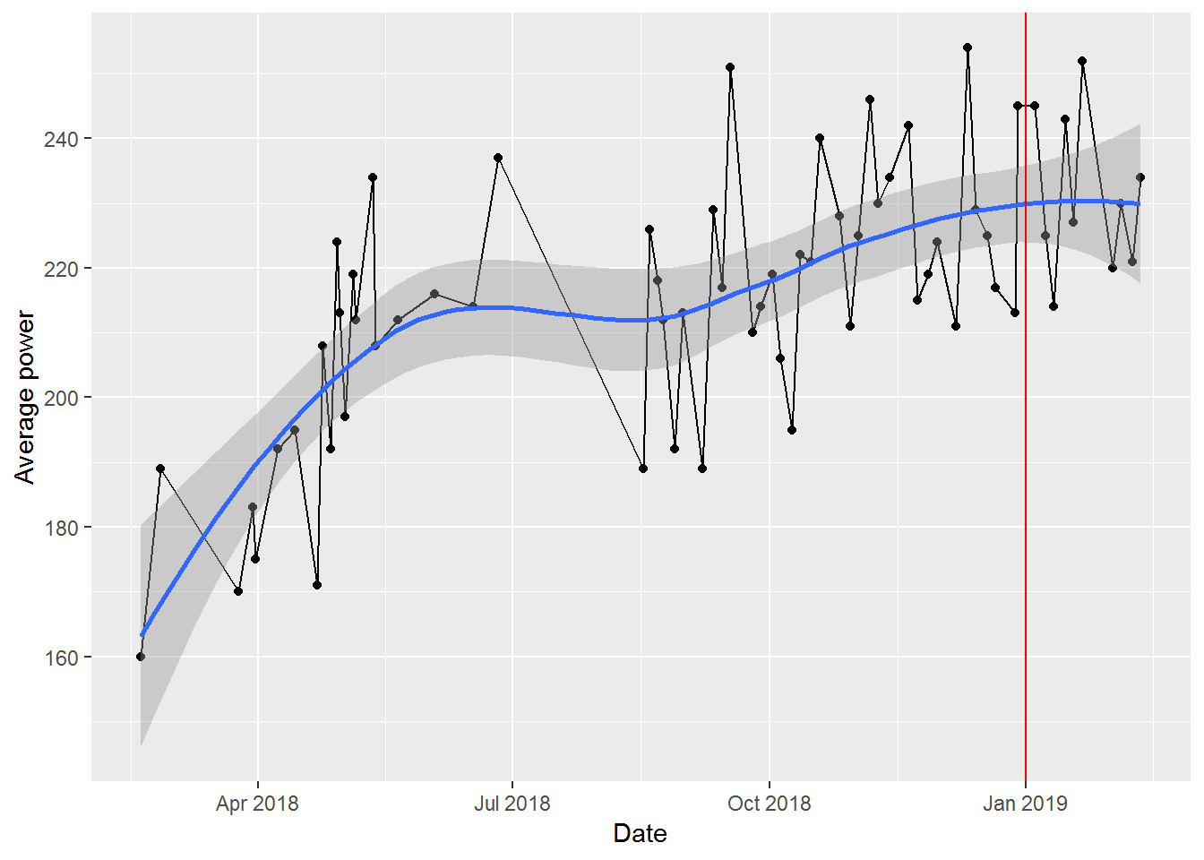
Overall, looks like I made some steady progress when I started, plateaued in the Summer (when I didn’t ride as often), and then started a slow, steady increase in the Fall. Unfortunately for me, it also looks like I started to plateau in my improvement just in time for the challenge.
We’ll start a more formal analysis by just testing to see what my average improvement is over time.
time_model <- lm(avg_power ~ Date, data = data)
summary(time_model)
##
## Call:
## lm(formula = avg_power ~ Date, data = data)
##
## Residuals:
## Min 1Q Median 3Q Max
## -30.486 -11.356 -1.879 11.501 33.838
##
## Coefficients:
## Estimate Std. Error t value Pr(>|t|)
## (Intercept) -2.032e+03 3.285e+02 -6.186 4.85e-08 ***
## Date 1.264e-01 1.847e-02 6.844 3.49e-09 ***
## ---
## Signif. codes: 0 '***' 0.001 '**' 0.01 '*' 0.05 '.' 0.1 ' ' 1
##
## Residual standard error: 15.65 on 64 degrees of freedom
## Multiple R-squared: 0.4226, Adjusted R-squared: 0.4136
## F-statistic: 46.85 on 1 and 64 DF, p-value: 3.485e-09Based on this, we can see that my performance is improving over time and the R2 is decent. But, interpreting the coefficient for time isn’t entirely intuitive and isn’t really the point of the challenge. The question is: how much higher is my average power during the challenge than before? For that, we’ll set up a “dummy variable” based on the date of the class. Then we use dplyr to group by this variable and estimate the mean of the average power in both time periods.
data %<>%
  dplyr::mutate(in_challenge = ifelse(Date > challenge_start_date, 1, 0))
(change_in_power <- data %>%
  dplyr::group_by(in_challenge) %>%
  dplyr::summarize(mean_avg_power = mean(avg_power)))
## # A tibble: 2 x 2
## in_challenge mean_avg_power
##
## 1 0 213.
## 2 1 231. So, I’ve improved from an average power of 213 to 231 for a improvement of 8%. A great relief: I’ve exceeded the target!
Of course, having gone to all of this (excessive?) trouble, now I’m interested in seeing if the instructor leading the class has a significant impact on my results. I certainly feel as if some instructors are harder than others. But, is this supported by my actual results? As always, we start with a plot to get a visual sense of the data.
ggplot2::ggplot(data, aes(x = Date, y = avg_power)) +
  ggplot2::geom_point() +
  ggplot2::geom_line() +
  ggplot2::geom_smooth(method = "lm", se = FALSE) +
  ggplot2::facet_wrap(~Instructor) +
  ggplot2::ylab("Average power")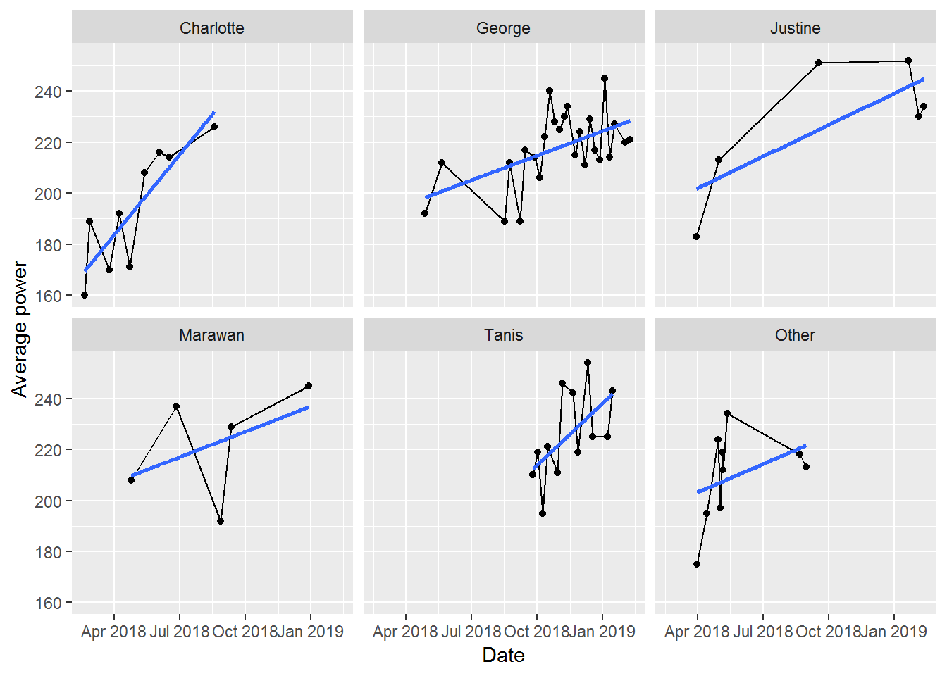
There’s a mix of confirmation and rejection of my expectations here:
Having eye-balled the charts. Let’s now look at a statistical model that considers just instructors.
instructor_model <- update(time_model, . ~ Instructor)
summary(instructor_model)
##
## Call:
## lm(formula = avg_power ~ Instructor, data = data)
##
## Residuals:
## Min 1Q Median 3Q Max
## -44.167 -10.590 0.663 13.540 32.000
##
## Coefficients:
## Estimate Std. Error t value Pr(>|t|)
## (Intercept) 194.000 6.123 31.683 < 2e-16 ***
## InstructorGeorge 23.840 7.141 3.339 0.001451 **
## InstructorJustine 33.167 9.682 3.426 0.001112 **
## InstructorMarawan 28.200 10.246 2.752 0.007817 **
## InstructorTanis 31.833 8.100 3.930 0.000222 ***
## InstructorOther 15.667 8.660 1.809 0.075433 .
## ---
## Signif. codes: 0 '***' 0.001 '**' 0.01 '*' 0.05 '.' 0.1 ' ' 1
##
## Residual standard error: 18.37 on 60 degrees of freedom
## Multiple R-squared: 0.2542, Adjusted R-squared: 0.1921
## F-statistic: 4.091 on 5 and 60 DF, p-value: 0.002916Each of the named instructors has a significant, positive effect on my average power. However, the overall R2 is much less than the model that considered just time. So, our next step is to consider both together.
time_instructor_model <- update(time_model, . ~ . + Instructor)
summary(time_instructor_model)
##
## Call:
## lm(formula = avg_power ~ Date + Instructor, data = data)
##
## Residuals:
## Min 1Q Median 3Q Max
## -31.689 -11.132 1.039 10.800 26.267
##
## Coefficients:
## Estimate Std. Error t value Pr(>|t|)
## (Intercept) -2332.4255 464.3103 -5.023 5.00e-06 ***
## Date 0.1431 0.0263 5.442 1.07e-06 ***
## InstructorGeorge -2.3415 7.5945 -0.308 0.759
## InstructorJustine 10.7751 8.9667 1.202 0.234
## InstructorMarawan 12.5927 8.9057 1.414 0.163
## InstructorTanis 3.3827 8.4714 0.399 0.691
## InstructorOther 12.3270 7.1521 1.724 0.090 .
## ---
## Signif. codes: 0 '***' 0.001 '**' 0.01 '*' 0.05 '.' 0.1 ' ' 1
##
## Residual standard error: 15.12 on 59 degrees of freedom
## Multiple R-squared: 0.5034, Adjusted R-squared: 0.4529
## F-statistic: 9.969 on 6 and 59 DF, p-value: 1.396e-07anova(time_instructor_model, time_model)## Analysis of Variance Table
##
## Model 1: avg_power ~ Date + Instructor
## Model 2: avg_power ~ Date
## Res.Df RSS Df Sum of Sq F Pr(>F)
## 1 59 13481
## 2 64 15675 -5 -2193.8 1.9202 0.1045This model has the best explanatory power so far and increases the coefficient for time slightly. This suggests that controlling for instructor improves the time signal. However, when we add in time, none of the individual instructors are significantly different from each other. My interpretation of this is that my overall improvement over time is much more important than which particular instructor is leading the class. Nonetheless, the earlier analysis of the instructors gave me some insights that I can use to maximize the contribution each of them makes to my overall progress. When comparing these models with an ANOVA though, we find that there isn’t a significant difference between them.
The last model to try is to look for a time by instructor interaction.
time_instructor_interaction_model <- update(time_model, . ~ . * Instructor)
summary(time_instructor_interaction_model)
##
## Call:
## lm(formula = avg_power ~ Date + Instructor + Date:Instructor,
## data = data)
##
## Residuals:
## Min 1Q Median 3Q Max
## -31.328 -9.899 0.963 10.018 26.128
##
## Coefficients:
## Estimate Std. Error t value Pr(>|t|)
## (Intercept) -5.881e+03 1.598e+03 -3.680 0.000540 ***
## Date 3.442e-01 9.054e-02 3.801 0.000368 ***
## InstructorGeorge 4.225e+03 1.766e+03 2.393 0.020239 *
## InstructorJustine 3.704e+03 1.796e+03 2.062 0.044000 *
## InstructorMarawan 4.177e+03 2.137e+03 1.955 0.055782 .
## InstructorTanis 1.386e+03 2.652e+03 0.523 0.603313
## InstructorOther 3.952e+03 2.321e+03 1.703 0.094362 .
## Date:InstructorGeorge -2.391e-01 9.986e-02 -2.394 0.020149 *
## Date:InstructorJustine -2.092e-01 1.016e-01 -2.059 0.044291 *
## Date:InstructorMarawan -2.357e-01 1.207e-01 -1.953 0.056070 .
## Date:InstructorTanis -7.970e-02 1.492e-01 -0.534 0.595316
## Date:InstructorOther -2.231e-01 1.314e-01 -1.698 0.095185 .
## ---
## Signif. codes: 0 '***' 0.001 '**' 0.01 '*' 0.05 '.' 0.1 ' ' 1
##
## Residual standard error: 14.86 on 54 degrees of freedom
## Multiple R-squared: 0.5609, Adjusted R-squared: 0.4715
## F-statistic: 6.271 on 11 and 54 DF, p-value: 1.532e-06anova(time_model, time_instructor_interaction_model)## Analysis of Variance Table
##
## Model 1: avg_power ~ Date
## Model 2: avg_power ~ Date + Instructor + Date:Instructor
## Res.Df RSS Df Sum of Sq F Pr(>F)
## 1 64 15675
## 2 54 11920 10 3754.1 1.7006 0.1044We can see that there are some significant interactions, meaning that the slope of improvement over time does differ by instructor. Before getting too excited though, an ANOVA shows that this model isn’t any better than the simple model of just time. There’s always a risk with trying to explain main effects (like time) with interactions. The story here is really that we need more data to tease out the impacts of the instructor by time effect.
The last point to make is that we’ve focused so far on the average power, since that’s the metric for this fitness challenge. There could be interesting interactions among average power, maximum power, RPMs, and total energy, each of which is available in these data. I’ll return to that analysis some other time.
In the interests of science, I’ll keep going to these classes, just so we can figure out what impact instructors have on performance. In the meantime, looks like I’ll succeed with at least this component of the fitness challenge and I have the stats to prove it.
Spatial analysis of votes in Toronto
This is a “behind the scenes” elaboration of the geospatial analysis in our recent post on evaluating our predictions for the 2018 mayoral election in Toronto. This was my first, serious use of the new sf package for geospatial analysis. I found the package much easier to use than some of my previous workflows for this sort of analysis, especially given its integration with the tidyverse.
We start by downloading the shapefile for voting locations from the City of Toronto’s Open Data portal and reading it with the read_sf function. Then, we pipe it to st_transform to set the appropriate projection for the data. In this case, this isn’t strictly necessary, since the shapefile is already in the right projection. But, I tend to do this for all shapefiles to avoid any oddities later.
download.file("http://opendata.toronto.ca/gcc/voting_location_2018_wgs84.zip",
                destfile = "data-raw/voting_location_2018_wgs84.zip", quiet = TRUE)
unzip("data-raw/voting_location_2018_wgs84.zip", exdir="data-raw/voting_location_2018_wgs84")
toronto_locations <- sf::read_sf("data-raw/voting_location_2018_wgs84",
                                 layer = "VOTING_LOCATION_2018_WGS84") %>%
  sf::st_transform(crs = "+init=epsg:4326")
toronto_locations
## Simple feature collection with 1700 features and 13 fields
## geometry type:  POINT
## dimension:      XY
## bbox:           xmin: -79.61937 ymin: 43.59062 xmax: -79.12531 ymax: 43.83052
## epsg (SRID):    4326
## proj4string:    +proj=longlat +datum=WGS84 +no_defs
## # A tibble: 1,700 x 14
##    POINT_ID FEAT_CD FEAT_C_DSC PT_SHRT_CD PT_LNG_CD POINT_NAME VOTER_CNT
##       <dbl> <chr>   <chr>      <chr>      <chr>     <chr>          <int>
##  1    10190 P       Primary    056        10056     <NA>              37
##  2    10064 P       Primary    060        10060     <NA>             532
##  3    10999 S       Secondary  058        10058     Malibu           661
##  4    11342 P       Primary    052        10052     <NA>            1914
##  5    10640 P       Primary    047        10047     The Summit       956
##  6    10487 S       Secondary  061        04061     White Eag…        51
##  7    11004 P       Primary    063        04063     Holy Fami…      1510
##  8    11357 P       Primary    024        11024     Rosedale …      1697
##  9    12044 P       Primary    018        05018     Weston Pu…      1695
## 10    11402 S       Secondary  066        04066     Elm Grove…        93
## # ... with 1,690 more rows, and 7 more variables: OBJECTID <dbl>,
## #   ADD_FULL <chr>, X <dbl>, Y <dbl>, LONGITUDE <dbl>, LATITUDE <dbl>,
## #   geometry <POINT [°]>
The file has 1700 rows of data across 14 columns. The first 13 columns are data within the original shapefile. The last column is a list column that is added by sf and contains the geometry of the location. This specific design feature is what makes an sf object work really well with the rest of the tidyverse: the geographical details are just a column in the data frame. This makes the data much easier to work with than in other approaches, where the data is contained within an [@data](https://micro.blog/data) slot of an object.
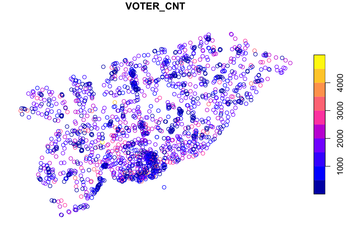
Plotting the data is straightforward, since sf objects have a plot function. Here’s an example where we plot the number of voters (VOTER_CNT) at each location. If you squint just right, you can see the general outline of Toronto in these points.
What we want to do next is use the voting location data to aggregate the votes cast at each location into census tracts. This then allows us to associate census characteristics (like age and income) with the pattern of votes and develop our statistical relationships for predicting voter behaviour.
We’ll split this into several steps. The first is downloading and reading the census tract shapefile.
download.file("http://www12.statcan.gc.ca/census-recensement/2011/geo/bound-limit/files-fichiers/gct_000b11a_e.zip",
                destfile = "data-raw/gct_000b11a_e.zip", quiet = TRUE)
unzip("data-raw/gct_000b11a_e.zip", exdir="data-raw/gct")
census_tracts <- sf::read_sf("data-raw/gct", layer = "gct_000b11a_e") %>%
  sf::st_transform(crs = "+init=epsg:4326")
Now that we have it, all we really want are the census tracts in Toronto (the shapefile includes census tracts across Canada). We achieve this by intersecting the Toronto voting locations with the census tracts using standard R subsetting notation.
to_census_tracts <- census_tracts[toronto_locations,]
And, we can plot it to see how well the intersection worked. This time we’ll plot the CTUID, which is the unique identifier for each census tract. This doesn’t mean anything in this context, but adds some nice colour to the plot.
plot(to_census_tracts["CTUID"])
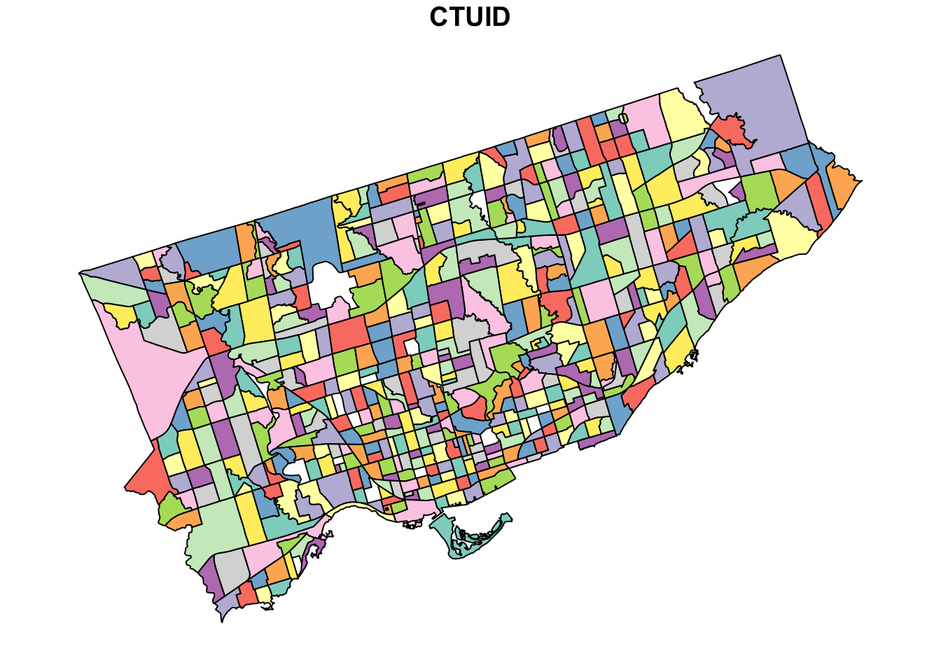
Now you can really see the shape of Toronto, as well as the size of each census tract.
Next we need to manipulate the voting data to get votes received by major candidates in the 2018 election. We take these data from the toVotes package and arbitrarily set the threshold for major candidates to receiving at least 100,000 votes. This yields our two main candidates: John Tory and Jennifer Keesmaat.
major_candidates <- toVotes %>%
  dplyr::filter(year == 2018) %>%
  dplyr::group_by(candidate) %>%
  dplyr::summarise(votes = sum(votes)) %>%
  dplyr::filter(votes > 100000) %>%
  dplyr::select(candidate)
major_candidates
## # A tibble: 2 x 1
##   candidate
##   <chr>
## 1 Keesmaat Jennifer
## 2 Tory John
Given our goal of aggregating the votes received by each candidate into census tracts, we need a data frame that has each candidate in a separate column. We start by joining the major candidates table to the votes table. In this case, we also filter the votes to 2018, since John Tory has been a candidate in more than one election. Then we use the tidyr package to convert the table from long (with one candidate column) to wide (with a column for each candidate).
spread_votes <- toVotes %>%
  tibble::as.tibble() %>%
  dplyr::filter(year == 2018) %>%
  dplyr::right_join(major_candidates) %>%
  dplyr::select(-type, -year) %>%
  tidyr::spread(candidate, votes)
spread_votes
## # A tibble: 1,800 x 4
##     ward  area `Keesmaat Jennifer` `Tory John`
##    <int> <int>               <dbl>       <dbl>
##  1     1     1                  66         301
##  2     1     2                  72         376
##  3     1     3                  40         255
##  4     1     4                  24         161
##  5     1     5                  51         211
##  6     1     6                  74         372
##  7     1     7                  70         378
##  8     1     8                  10          77
##  9     1     9                  11          82
## 10     1    10                  12          76
## # ... with 1,790 more rows
Our last step before finally aggregating to census tracts is to join the spread_votes table with the toronto_locations data. This requires pulling the ward and area identifiers from the PT_LNG_CD column of the toronto_locations data frame which we do with some stringr functions. While we’re at it, we also update the candidate names to just surnames.
to_geo_votes <- toronto_locations %>%
  dplyr::mutate(ward = as.integer(stringr::str_sub(PT_LNG_CD, 1, 2)),
                area = as.integer(stringr::str_sub(PT_LNG_CD, -3, -1))) %>%
  dplyr::left_join(spread_votes) %>%
  dplyr::select(`Keesmaat Jennifer`, `Tory John`) %>%
  dplyr::rename(Keesmaat = `Keesmaat Jennifer`, Tory = `Tory John`)
to_geo_votes
## Simple feature collection with 1700 features and 2 fields
## geometry type:  POINT
## dimension:      XY
## bbox:           xmin: -79.61937 ymin: 43.59062 xmax: -79.12531 ymax: 43.83052
## epsg (SRID):    4326
## proj4string:    +proj=longlat +datum=WGS84 +no_defs
## # A tibble: 1,700 x 3
##    Keesmaat  Tory             geometry
##       <dbl> <dbl>          <POINT [°]>
##  1       55   101 (-79.40225 43.63641)
##  2       43    53  (-79.3985 43.63736)
##  3       61    89 (-79.40028 43.63664)
##  4      296   348 (-79.39922 43.63928)
##  5      151   204 (-79.40401 43.64293)
##  6        2    11 (-79.43941 43.63712)
##  7      161   174 (-79.43511 43.63869)
##  8      221   605  (-79.38188 43.6776)
##  9       68   213 (-79.52078 43.70176)
## 10        4    14 (-79.43094 43.64027)
## # ... with 1,690 more rows
Okay, we’re finally there. We have our census tract data in to_census_tracts and our voting data in to_geo_votes. We want to aggregate the votes into each census tract by summing the votes at each voting location within each census tract. We use the aggregate function for this.
ct_votes_wide <- aggregate(x = to_geo_votes,
                           by = to_census_tracts,
                           FUN = sum)
ct_votes_wide
## Simple feature collection with 522 features and 2 fields
## geometry type:  MULTIPOLYGON
## dimension:      XY
## bbox:           xmin: -79.6393 ymin: 43.58107 xmax: -79.11547 ymax: 43.85539
## epsg (SRID):    4326
## proj4string:    +proj=longlat +datum=WGS84 +no_defs
## First 10 features:
##    Keesmaat Tory                       geometry
## 1       407  459 MULTIPOLYGON (((-79.39659 4...
## 2      1103 2400 MULTIPOLYGON (((-79.38782 4...
## 3       403 1117 MULTIPOLYGON (((-79.27941 4...
## 4        96  570 MULTIPOLYGON (((-79.28156 4...
## 5       169  682 MULTIPOLYGON (((-79.49104 4...
## 6       121  450 MULTIPOLYGON (((-79.54422 4...
## 7        42   95 MULTIPOLYGON (((-79.45379 4...
## 8       412  512 MULTIPOLYGON (((-79.33895 4...
## 9        83  132 MULTIPOLYGON (((-79.35427 4...
## 10       92  629 MULTIPOLYGON (((-79.44554 4...]
As a last step, to tidy up, we now convert the wide table with a column for each candidate into a long table that has just one candidate column containing the name of the candidate.
ct_votes <- tidyr::gather(ct_votes_wide, candidate, votes, -geometry)
ct_votes
## Simple feature collection with 1044 features and 2 fields
## geometry type:  MULTIPOLYGON
## dimension:      XY
## bbox:           xmin: -79.6393 ymin: 43.58107 xmax: -79.11547 ymax: 43.85539
## epsg (SRID):    4326
## proj4string:    +proj=longlat +datum=WGS84 +no_defs
## First 10 features:
##    candidate votes                       geometry
## 1   Keesmaat   407 MULTIPOLYGON (((-79.39659 4...
## 2   Keesmaat  1103 MULTIPOLYGON (((-79.38782 4...
## 3   Keesmaat   403 MULTIPOLYGON (((-79.27941 4...
## 4   Keesmaat    96 MULTIPOLYGON (((-79.28156 4...
## 5   Keesmaat   169 MULTIPOLYGON (((-79.49104 4...
## 6   Keesmaat   121 MULTIPOLYGON (((-79.54422 4...
## 7   Keesmaat    42 MULTIPOLYGON (((-79.45379 4...
## 8   Keesmaat   412 MULTIPOLYGON (((-79.33895 4...
## 9   Keesmaat    83 MULTIPOLYGON (((-79.35427 4...
## 10  Keesmaat    92 MULTIPOLYGON (((-79.44554 4...
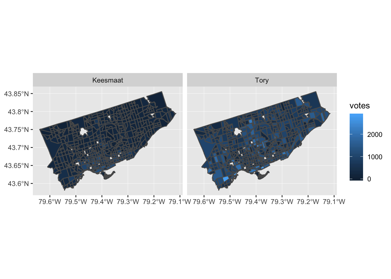
Now that we have votes aggregated by census tract, we can add in many other attributes from the census data. We won’t do that here, since this post is already pretty long. But, we’ll end with a plot to show how easily sf integrates with ggplot2. This is a nice improvement from past workflows, when several steps were required. In the actual code for the retrospective analysis, I added some other plotting techniques, like cutting the response variable (votes) into equally spaced pieces and adding some more refined labels. Here, we’ll just produce a simple plot.
ggplot2::ggplot(data = ct_votes) +
  ggplot2::geom_sf(ggplot2::aes(fill = votes)) +
  ggplot2::facet_wrap(~candidate)


Fixing a hack finds a better solution
In my Elections Ontario official results post, I had to use an ugly hack to match Electoral District names and numbers by extracting data from a drop down list on the Find My Electoral District website. Although it was mildly clever, like any hack, I shouldn’t have relied on this one for long, as proven by Elections Ontario shutting down the website.
So, a more robust solution was required, which led to using one of Election Ontario’s shapefiles. The shapefile contains the data we need, it’s just in a tricky format to deal with. But, the sf package makes this mostly straightforward.
We start by downloading and importing the Elections Ontario shape file. Then, since we’re only interested in the City of Toronto boundaries, we download the city’s shapefile too and intersect it with the provincial one to get a subset:
download.file("[www.elections.on.ca/content/d...](https://www.elections.on.ca/content/dam/NGW/sitecontent/2016/preo/shapefiles/Polling%20Division%20Shapefile%20-%202014%20General%20Election.zip)",
              destfile = "data-raw/Polling%20Division%20Shapefile%20-%202014%20General%20Election.zip")
unzip("data-raw/Polling%20Division%20Shapefile%20-%202014%20General%20Election.zip",
      exdir = "data-raw/Polling%20Division%20Shapefile%20-%202014%20General%20Election")
prov_geo <- sf::st_read(“data-raw/Polling%20Division%20Shapefile%20-%202014%20General%20Election”,
layer = “PDs_Ontario”) %>%
sf::st_transform(crs = “+init=epsg:4326”)
download.file("opendata.toronto.ca/gcc/votin…",
destfile = “data-raw/voting_location_2014_wgs84.zip”)
unzip(“data-raw/voting_location_2014_wgs84.zip”, exdir=“data-raw/voting_location_2014_wgs84”)
toronto_wards <- sf::st_read(“data-raw/voting_location_2014_wgs84”, layer = “VOTING_LOCATION_2014_WGS84”) %>%
sf::st_transform(crs = “+init=epsg:4326”)
to_prov_geo <- prov_geo %>%
sf::st_intersection(toronto_wards)
Now we just need to extract a couple of columns from the data frame associated with the shapefile. Then we process the values a bit so that they match the format of other data sets. This includes converting them to UTF-8, formatting as title case, and replacing dashes with spaces:
electoral_districts <- to_prov_geo %>%
  dplyr::transmute(electoral_district = as.character(DATA_COMPI),
                   electoral_district_name = stringr::str_to_title(KPI04)) %>%
  dplyr::group_by(electoral_district, electoral_district_name) %>%
  dplyr::count() %>%
  dplyr::ungroup() %>%
  dplyr::mutate(electoral_district_name = stringr::str_replace_all(utf8::as_utf8(electoral_district_name), "\u0097", " ")) %>%
  dplyr::select(electoral_district, electoral_district_name)
electoral_districts
## Simple feature collection with 23 features and 2 fields
## geometry type: MULTIPOINT
## dimension: XY
## bbox: xmin: -79.61919 ymin: 43.59068 xmax: -79.12511 ymax: 43.83057
## epsg (SRID): 4326
## proj4string: +proj=longlat +datum=WGS84 +no_defs
## # A tibble: 23 x 3
## electoral_distri… electoral_distric… geometry
##
## 1 005 Beaches East York (-79.32736 43.69452, -79.32495 43…
## 2 015 Davenport (-79.4605 43.68283, -79.46003 43.…
## 3 016 Don Valley East (-79.35985 43.78844, -79.3595 43.…
## 4 017 Don Valley West (-79.40592 43.75026, -79.40524 43…
## 5 020 Eglinton Lawrence (-79.46787 43.70595, -79.46376 43…
## 6 023 Etobicoke Centre (-79.58697 43.6442, -79.58561 43.…
## 7 024 Etobicoke Lakesho… (-79.56213 43.61001, -79.5594 43.…
## 8 025 Etobicoke North (-79.61919 43.72889, -79.61739 43…
## 9 068 Parkdale High Park (-79.49944 43.66285, -79.4988 43.…
## 10 072 Pickering Scarbor… (-79.18898 43.80374, -79.17927 43…
## # ... with 13 more rows In the end, this is a much more reliable solution, though it seems a bit extreme to use GIS techniques just to get a listing of Electoral District names and numbers.
Elections Ontario official results
In preparing for some PsephoAnalytics work on the upcoming provincial election, I’ve been wrangling the Elections Ontario data. As provided, the data is really difficult to work with and we’ll walk through some steps to tidy these data for later analysis.
Here’s what the source data looks like:
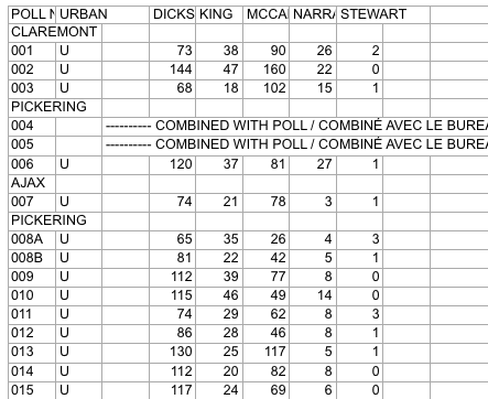
Screenshot of raw Elections Ontario data
A few problems with this:
So, we have a fair bit of work to do to get to something more useful. Ideally something like:
## # A tibble: 9 x 5
##   electoral_district  poll candidate   party votes
##                <chr> <chr>     <chr>   <chr> <int>
## 1                  X     1         A Liberal    37
## 2                  X     2         B     NDP    45
## 3                  X     3         C      PC    33
## 4                  Y     1         A Liberal    71
## 5                  Y     2         B     NDP    37
## 6                  Y     3         C      PC    69
## 7                  Z     1         A Liberal    28
## 8                  Z     2         B     NDP    15
## 9                  Z     3         C      PC    34
This is much easier to work with: we have one row for the votes received by each candidate at each poll, along with the Electoral District name and their party affiliation.
Candidate parties
As a first step, we need the party affiliation for each candidate. I didn’t see this information on the Elections Ontario site. So, we’ll pull the data from Wikipedia. The data on this webpage isn’t too bad. We can just use the table xpath selector to pull out the tables and then drop the ones we aren’t interested in.
``` candidate_webpage <- "https://en.wikipedia.org/wiki/Ontario_general_election,_2014#Candidates_by_region" candidate_tables <- "table" # Use an xpath selector to get the drop down list by IDcandidates <- xml2::read_html(candidate_webpage) %>% rvest::html_nodes(candidate_tables) %>% # Pull tables from the wikipedia entry .[13:25] %>% # Drop unecessary tables rvest::html_table(fill = TRUE)
</pre> <p>This gives us a list of 13 data frames, one for each table on the webpage. Now we cycle through each of these and stack them into one data frame. Unfortunately, the tables aren’t consistent in the number of columns. So, the approach is a bit messy and we process each one in a loop.</p> <pre class="r"><code># Setup empty dataframe to store results candidate_parties <- tibble::as_tibble( electoral_district_name = NULL, party = NULL, candidate = NULL ) for(i in seq_along(1:length(candidates))) { # Messy, but works this_table <- candidates[[i]] # The header spans mess up the header row, so renaming names(this_table) <- c(this_table[1,-c(3,4)], "NA", "Incumbent") # Get rid of the blank spacer columns this_table <- this_table[-1, ] # Drop the NA columns by keeping only odd columns this_table <- this_table[,seq(from = 1, to = dim(this_table)[2], by = 2)] this_table %<>% tidyr::gather(party, candidate, -`Electoral District`) %>% dplyr::rename(electoral_district_name = `Electoral District`) %>% dplyr::filter(party != "Incumbent") candidate_parties <- dplyr::bind_rows(candidate_parties, this_table) } candidate_parties</code></pre> <pre># A tibble: 649 x 3
electoral_district_name party candidate
1 Carleton—Mississippi Mills Liberal Rosalyn Stevens
2 Nepean—Carleton Liberal Jack Uppal
3 Ottawa Centre Liberal Yasir Naqvi
4 Ottawa—Orléans Liberal Marie-France Lalonde
5 Ottawa South Liberal John Fraser
6 Ottawa—Vanier Liberal Madeleine Meilleur
7 Ottawa West—Nepean Liberal Bob Chiarelli
8 Carleton—Mississippi Mills PC Jack MacLaren
9 Nepean—Carleton PC Lisa MacLeod
10 Ottawa Centre PC Rob Dekker
# … with 639 more rows
</pre> </div> <div id="electoral-district-names" class="section level2"> <h2>Electoral district names</h2> <p>One issue with pulling party affiliations from Wikipedia is that candidates are organized by Electoral District <em>names</em>. But the voting results are organized by Electoral District <em>number</em>. I couldn’t find an appropriate resource on the Elections Ontario site. Rather, here we pull the names and numbers of the Electoral Districts from the <a href="https://www3.elections.on.ca/internetapp/FYED_Error.aspx?lang=en-ca">Find My Electoral District</a> website. The xpath selector is a bit tricky for this one. The <code>ed_xpath</code> object below actually pulls content from the drop down list that appears when you choose an Electoral District. One nuisance with these data is that Elections Ontario uses <code>--</code> in the Electoral District names, instead of the — used on Wikipedia. We use <code>str_replace_all</code> to fix this below.</p> <pre class="r"><code>ed_webpage <- "https://www3.elections.on.ca/internetapp/FYED_Error.aspx?lang=en-ca" ed_xpath <- "//*[(@id = \"ddlElectoralDistricts\")]" # Use an xpath selector to get the drop down list by ID electoral_districts <- xml2::read_html(ed_webpage) %>% rvest::html_node(xpath = ed_xpath) %>% rvest::html_nodes("option") %>% rvest::html_text() %>% .[-1] %>% # Drop the first item on the list ("Select...") tibble::as.tibble() %>% # Convert to a data frame and split into ID number and name tidyr::separate(value, c("electoral_district", "electoral_district_name"), sep = " ", extra = "merge") %>% # Clean up district names for later matching and presentation dplyr::mutate(electoral_district_name = stringr::str_to_title( stringr::str_replace_all(electoral_district_name, "--", "—"))) electoral_districts</code></pre> <pre># A tibble: 107 x 2
electoral_district electoral_district_name
1 001 Ajax—Pickering
2 002 Algoma—Manitoulin
3 003 Ancaster—Dundas—Flamborough—Westdale
4 004 Barrie
5 005 Beaches—East York
6 006 Bramalea—Gore—Malton
7 007 Brampton—Springdale
8 008 Brampton West
9 009 Brant
10 010 Bruce—Grey—Owen Sound
# … with 97 more rows
</pre> <p>Next, we can join the party affiliations to the Electoral District names to join candidates to parties and district numbers.</p> <pre class="r"><code>candidate_parties %<>% # These three lines are cleaning up hyphens and dashes, seems overly complicated dplyr::mutate(electoral_district_name = stringr::str_replace_all(electoral_district_name, "—\n", "—")) %>% dplyr::mutate(electoral_district_name = stringr::str_replace_all(electoral_district_name, "Chatham-Kent—Essex", "Chatham—Kent—Essex")) %>% dplyr::mutate(electoral_district_name = stringr::str_to_title(electoral_district_name)) %>% dplyr::left_join(electoral_districts) %>% dplyr::filter(!candidate == "") %>% # Since the vote data are identified by last names, we split candidate's names into first and last tidyr::separate(candidate, into = c("first","candidate"), extra = "merge", remove = TRUE) %>% dplyr::select(-first)</code></pre> <pre><code>## Joining, by = "electoral_district_name"</code></pre> <pre class="r"><code>candidate_parties</code></pre> <pre># A tibble: 578 x 4
electoral_district_name party candidate electoral_district
*
1 Carleton—Mississippi Mills Liberal Stevens 013
2 Nepean—Carleton Liberal Uppal 052
3 Ottawa Centre Liberal Naqvi 062
4 Ottawa—Orléans Liberal France Lalonde 063
5 Ottawa South Liberal Fraser 064
6 Ottawa—Vanier Liberal Meilleur 065
7 Ottawa West—Nepean Liberal Chiarelli 066
8 Carleton—Mississippi Mills PC MacLaren 013
9 Nepean—Carleton PC MacLeod 052
10 Ottawa Centre PC Dekker 062
# … with 568 more rows
</pre> <p>All that work just to get the name of each candiate for each Electoral District name and number, plus their party affiliation.</p> </div> <div id="votes" class="section level2"> <h2>Votes</h2> <p>Now we can finally get to the actual voting data. These are made available as a collection of Excel files in a compressed folder. To avoid downloading it more than once, we wrap the call in an <code>if</code> statement that first checks to see if we already have the file. We also rename the file to something more manageable.</p> <pre class="r"><code>raw_results_file <- "[www.elections.on.ca/content/d...](http://www.elections.on.ca/content/dam/NGW/sitecontent/2017/results/Poll%20by%20Poll%20Results%20-%20Excel.zip)" zip_file <- "data-raw/Poll%20by%20Poll%20Results%20-%20Excel.zip" if(file.exists(zip_file)) { # Only download the data once # File exists, so nothing to do } else { download.file(raw_results_file, destfile = zip_file) unzip(zip_file, exdir="data-raw") # Extract the data into data-raw file.rename("data-raw/GE Results - 2014 (unconverted)", "data-raw/pollresults") }</code></pre> <pre><code>## NULL</code></pre> <p>Now we need to extract the votes out of 107 Excel files. The combination of <code>purrr</code> and <code>readxl</code> packages is great for this. In case we want to filter to just a few of the files (perhaps to target a range of Electoral Districts), we declare a <code>file_pattern</code>. For now, we just set it to any xls file that ends with three digits preceeded by a “_“.</p> <p>As we read in the Excel files, we clean up lots of blank columns and headers. Then we convert to a long table and drop total and blank rows. Also, rather than try to align the Electoral District name rows with their polls, we use the name of the Excel file to pull out the Electoral District number. Then we join with the <code>electoral_districts</code> table to pull in the Electoral District names.</p> <pre class="r">file_pattern <- “*_[[:digit:]]{3}.xls” # Can use this to filter down to specific files poll_data <- list.files(path = “data-raw/pollresults”, pattern = file_pattern, full.names = TRUE) %>% # Find all files that match the pattern purrr::set_names() %>% purrr::map_df(readxl::read_excel, sheet = 1, col_types = “text”, .id = “file”) %>% # Import each file and merge into a dataframe
Specifying sheet = 1 just to be clear we’re ignoring the rest of the sheets
Declare col_types since there are duplicate surnames and map_df can’t recast column types in the rbind
For example, Bell is in both district 014 and 063
dplyr::select(-starts_with(“X__")) %>% # Drop all of the blank columns dplyr::select(1:2,4:8,15:dim(.)[2]) %>% # Reorganize a bit and drop unneeded columns dplyr::rename(poll_number =
POLL NO.) %>% tidyr::gather(candidate, votes, -file, -poll_number) %>% # Convert to a long table dplyr::filter(!is.na(votes), poll_number != “Totals”) %>% dplyr::mutate(electoral_district = stringr::str_extract(file, “[[:digit:]]{3}"), votes = as.numeric(votes)) %>% dplyr::select(-file) %>% dplyr::left_join(electoral_districts) poll_data</pre> <pre># A tibble: 143,455 x 5
poll_number candidate votes electoral_district electoral_district_name
1 001 DICKSON 73 001 Ajax—Pickering
2 002 DICKSON 144 001 Ajax—Pickering
3 003 DICKSON 68 001 Ajax—Pickering
4 006 DICKSON 120 001 Ajax—Pickering
5 007 DICKSON 74 001 Ajax—Pickering
6 008A DICKSON 65 001 Ajax—Pickering
7 008B DICKSON 81 001 Ajax—Pickering
8 009 DICKSON 112 001 Ajax—Pickering
9 010 DICKSON 115 001 Ajax—Pickering
10 011 DICKSON 74 001 Ajax—Pickering
# … with 143,445 more rows
</pre> <p>The only thing left to do is to join <code>poll_data</code> with <code>candidate_parties</code> to add party affiliation to each candidate. Because the names don’t always exactly match between these two tables, we use the <code>fuzzyjoin</code> package to join by closest spelling.</p> <pre class="r"><code>poll_data_party_match_table <- poll_data %>% group_by(candidate, electoral_district_name) %>% summarise() %>% fuzzyjoin::stringdist_left_join(candidate_parties, ignore_case = TRUE) %>% dplyr::select(candidate = candidate.x, party = party, electoral_district = electoral_district) %>% dplyr::filter(!is.na(party)) poll_data %<>% dplyr::left_join(poll_data_party_match_table) %>% dplyr::group_by(electoral_district, party) tibble::glimpse(poll_data)</code></pre> <pre>Observations: 144,323
Variables: 6
$ poll_number
“001”, “002”, “003”, “006”, “007”, “00… $ candidate
“DICKSON”, “DICKSON”, “DICKSON”, “DICK… $ votes
73, 144, 68, 120, 74, 65, 81, 112, 115… $ electoral_district
“001”, “001”, “001”, “001”, “001”, “00… $ electoral_district_name
“Ajax—Pickering”, “Ajax—Pickering”, “A… $ party
“Liberal”, “Liberal”, “Liberal”, “Libe… </pre> <p>And, there we go. One table with a row for the votes received by each candidate at each poll. It would have been great if Elections Ontario released data in this format and we could have avoided all of this work.</p> </div>
Finance fixed their data and broke my case study
The past few years, I’ve delivered an introduction to using R workshop that relied on manipulating Ministry of Finance demographic projections.
Analyzing these data was a great case study for the typical data management process. The data was structured for presentation, rather than analysis. So, there were several header rows, notes at the base of the table, and the data was spread across many worksheets.
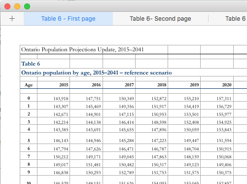
Sometime recently, the ministry released an update that provides the data in a much better format: one sheet with rows for age and columns for years. Although this is a great improvement, I’ve had to update my case study, which makes it actually less useful as a lesson in data manipulation.
Although I’ve updated the main branch of the github repository, I’ve also created a branch that sources the archive.org version of the page from October 2016. Now, depending on the audience, I can choose the case study that has the right level of complexity.
Despite briefly causing me some trouble, I think it is great that these data are closer to a good analytical format. Now, if only the ministry could go one more step towards tidy data and make my case study completely unecessary.
A workflow for leaving the office
Sometimes it’s the small things, accumulated over many days, that make a difference. As a simple example, every day when I leave the office, I message my family to let them know I’m leaving and how I’m travelling. Relatively easy: just open the Messages app, find the most recent conversation with them, and type in my message.
Using Workflow I can get this down to just a couple of taps on my watch. By choosing the “Leaving Work” workflow, I get a choice of travelling options:

Choosing one of them creates a text with the right emoticon that is pre-addressed to my family. I hit send and off goes the message.
The workflow itself is straightforward:

Like I said, pretty simple. But saves me close to a minute each and every day.
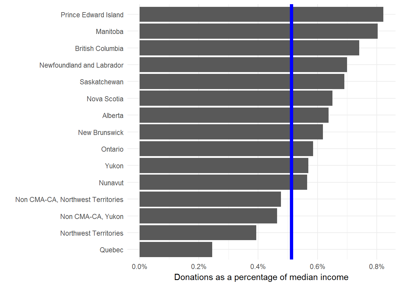
Charity donations by province
This tweet about the charitable donations by Albertans showed up in my timeline and caused a ruckus.
Albertans give the most to charity in Canada, 50% more than the national average, even in tough economic times. #CdnPoli pic.twitter.com/keKPzY8brO
— Oil Sands Action (@OilsandsAction) August 31, 2017
Many people took issue with the fact that these values weren’t adjusted for income. Seems to me that whether this is a good idea or not depends on what kind of question you’re trying to answer. Regardless, the CANSIM table includes this value. So, it is straightforward to calculate. Plus CANSIM tables have a pretty standard structure and showing how to manipulate this one serves as a good template for others.
library(tidyverse)
# Download and extract
url <- "[www20.statcan.gc.ca/tables-ta...](http://www20.statcan.gc.ca/tables-tableaux/cansim/csv/01110001-eng.zip)"
zip_file <- "01110001-eng.zip"
download.file(url,
              destfile = zip_file)
unzip(zip_file)
# We only want two of the columns. Specifying them here.
keep_data <- c("Median donations (dollars)",
               "Median total income of donors (dollars)")
cansim <- read_csv("01110001-eng.csv") %>%
  filter(DON %in% keep_data,
         is.na(`Geographical classification`)) %>% # This second filter removes anything that isn't a province or territory
  select(Ref_Date, DON, Value, GEO) %>%
  spread(DON, Value) %>%
  rename(year = Ref_Date,
         donation = `Median donations (dollars)`,
         income = `Median total income of donors (dollars)`) %>%
  mutate(donation_per_income = donation / income) %>%
  filter(year == 2015) %>%
  select(GEO, donation, donation_per_income)
cansim
## # A tibble: 16 x 3
## GEO donation donation_per_income
##
## 1 Alberta 450 0.006378455
## 2 British Columbia 430 0.007412515
## 3 Canada 300 0.005119454
## 4 Manitoba 420 0.008032129
## 5 New Brunswick 310 0.006187625
## 6 Newfoundland and Labrador 360 0.007001167
## 7 Non CMA-CA, Northwest Territories 480 0.004768528
## 8 Non CMA-CA, Yukon 310 0.004643499
## 9 Northwest Territories 400 0.003940887
## 10 Nova Scotia 340 0.006505932
## 11 Nunavut 570 0.005651398
## 12 Ontario 360 0.005856515
## 13 Prince Edward Island 400 0.008221994
## 14 Quebec 130 0.002452830
## 15 Saskatchewan 410 0.006910501
## 16 Yukon 420 0.005695688 Curious that they dropped the territories from their chart, given that Nunavut has such a high donation amount.
Now we can plot the normalized data to find how the rank order changes. We’ll add the Canadian average as a blue line for comparison.
I’m not comfortable with using median donations (adjusted for income or not) to say anything in particular about the residents of a province. But, I’m always happy to look more closely at data and provide some context for public debates.
One major gap with this type of analysis is that we’re only looking at the median donations of people that donated anything at all. In other words, we aren’t considering anyone who donates nothing. We should really compare these median donations to the total population or the size of the economy. This Stats Can study is a much more thorough look at the issue.
For me the interesting result here is the dramatic difference between Quebec and the rest of the provinces. But, I don’t interpret this to mean that Quebecers are less generous than the rest of Canada. Seems more likely that there are material differences in how the Quebec economy and social safety nets are structured.
TTC delay data and Friday the 13th
The TTC releasing their Subway Delay Data was great news. I’m always happy to see more data released to the public. In this case, it also helps us investigate one of the great, enduring mysteries: Is Friday the 13th actually an unlucky day?
As always, we start by downloading and manipulating the data. I’ve added in two steps that aren’t strictly necessary. One is converting the Date, Time, and Day columns into a single Date column. The other is to drop most of the other columns of data, since we aren’t interested in them here.
url <- "http://www1.toronto.ca/City%20Of%20Toronto/Information%20&%20Technology/Open%20Data/Data%20Sets/Assets/Files/Subway%20&%20SRT%20Logs%20(Jan01_14%20to%20April30_17).xlsx"
filename <- basename(url)
download.file(url, destfile = filename, mode = "wb")
delays <- readxl::read_excel(filename, sheet = 2) %>%
  dplyr::mutate(date = lubridate::ymd_hm(paste(`Date`,
                                               `Time`,
                                               sep = " ")),
                delay = `Min Delay`) %>%
  dplyr::select(date, delay)
delays
## # A tibble: 69,043 x 2
##                   date delay
##                 <dttm> <dbl>
##  1 2014-01-01 02:06:00     3
##  2 2014-01-01 02:40:00     0
##  3 2014-01-01 03:10:00     3
##  4 2014-01-01 03:20:00     5
##  5 2014-01-01 03:29:00     0
##  6 2014-01-01 07:31:00     0
##  7 2014-01-01 07:32:00     0
##  8 2014-01-01 07:34:00     0
##  9 2014-01-01 07:34:00     0
## 10 2014-01-01 07:53:00     0
## # ... with 69,033 more rows
Now we have a delays dataframe with 69043 incidents starting from 2014-01-01 00:21:00 and ending at 2017-04-30 22:13:00. Before we get too far, we’ll take a look at the data. A heatmap of delays by day and hour should give us some perspective.
delays %>%
  dplyr::mutate(day = lubridate::day(date),
         hour = lubridate::hour(date)) %>%
  dplyr::group_by(day, hour) %>%
  dplyr::summarise(sum_delay = sum(delay)) %>%
  ggplot2::ggplot(aes(x = hour, y = day, fill = sum_delay)) +
    ggplot2::geom_tile(alpha = 0.8, color = "white") +
    ggplot2::scale_fill_gradient2() +
    ggplot2::theme(legend.position = "right") +
    ggplot2::labs(x = "Hour", y = "Day of the month", fill = "Sum of delays")
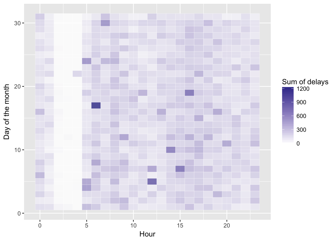
Other than a reliable band of calm very early in the morning, no obvious patterns here.
We need to identify any days that are a Friday the 13th. We also might want to compare weekends, regular Fridays, other weekdays, and Friday the 13ths, so we add a type column that provides these values. Here we use the case_when function:
delays <- delays %>%
    dplyr::mutate(type = case_when( # Partition into Friday the 13ths, Fridays, weekends, and weekdays
      lubridate::wday(.$date) %in% c(1, 7) ~ "weekend",
      lubridate::wday(.$date) %in% c(6) &
        lubridate::day(.$date) == 13 ~ "Friday 13th",
      lubridate::wday(.$date) %in% c(6) ~ "Friday",
      TRUE ~ "weekday" # Everything else is a weekday
  )) %>%
  dplyr::mutate(type = factor(type)) %>%
  dplyr::group_by(type)
delays
## # A tibble: 69,043 x 3
## # Groups:   type [4]
##                   date delay    type
##                 <dttm> <dbl>  <fctr>
##  1 2014-01-01 02:06:00     3 weekday
##  2 2014-01-01 02:40:00     0 weekday
##  3 2014-01-01 03:10:00     3 weekday
##  4 2014-01-01 03:20:00     5 weekday
##  5 2014-01-01 03:29:00     0 weekday
##  6 2014-01-01 07:31:00     0 weekday
##  7 2014-01-01 07:32:00     0 weekday
##  8 2014-01-01 07:34:00     0 weekday
##  9 2014-01-01 07:34:00     0 weekday
## 10 2014-01-01 07:53:00     0 weekday
## # ... with 69,033 more rows
With the data organized, we can start with just a simple box plot of the minutes of delay by type.
ggplot2::ggplot(delays, aes(type, delay)) +
  ggplot2::geom_boxplot() +
  ggplot2::labs(x = "Type", y = "Minutes of delay")
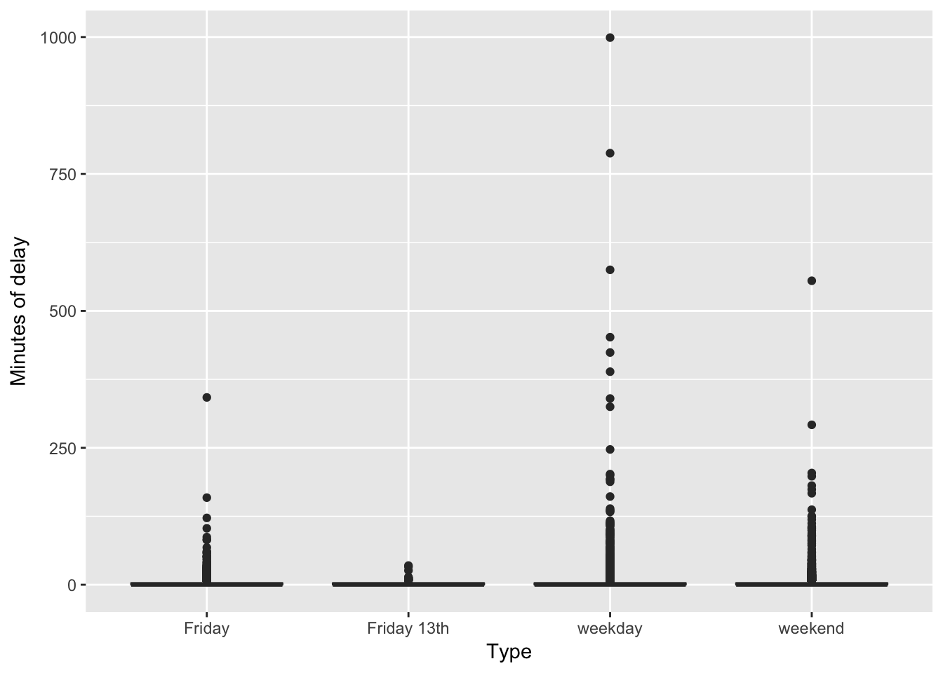
Not very compelling. Basically most delays are short (as in zero minutes long) with many outliers.
How about if we summed up the total minutes in delays for each of the types of days?
delays %>%
  dplyr::summarise(total_delay = sum(delay))
## # A tibble: 4 x 2
##          type total_delay
##        <fctr>       <dbl>
## 1      Friday       18036
## 2 Friday 13th         619
## 3     weekday       78865
## 4     weekend       28194
Clearly the total minutes of delays are much shorter for Friday the 13ths. But, there aren’t very many such days (only 6 in fact). So, this is a dubious analysis.
Let’s take a step back and calculate the average of the total delay across the entire day for each of the types of days. If Friday the 13ths really are unlucky, we would expect to see longer delays, at least relative to a regular Friday.
daily_delays <- delays %>% # Total delays in a day
  dplyr::mutate(year = lubridate::year(date),
                day = lubridate::yday(date)) %>%
  dplyr::group_by(year, day, type) %>%
  dplyr::summarise(total_delay = sum(delay))

mean_daily_delays <- daily_delays %>% # Average delays in each type of day
  dplyr::group_by(type) %>%
  dplyr::summarise(avg_delay = mean(total_delay))
mean_daily_delays
## # A tibble: 4 x 2
##          type avg_delay
##        <fctr>     <dbl>
## 1      Friday 107.35714
## 2 Friday 13th 103.16667
## 3     weekday 113.63833
## 4     weekend  81.01724
ggplot2::ggplot(daily_delays, aes(type, total_delay)) +
  ggplot2::geom_boxplot() +
  ggplot2::labs(x = "Type", y = "Total minutes of delay")
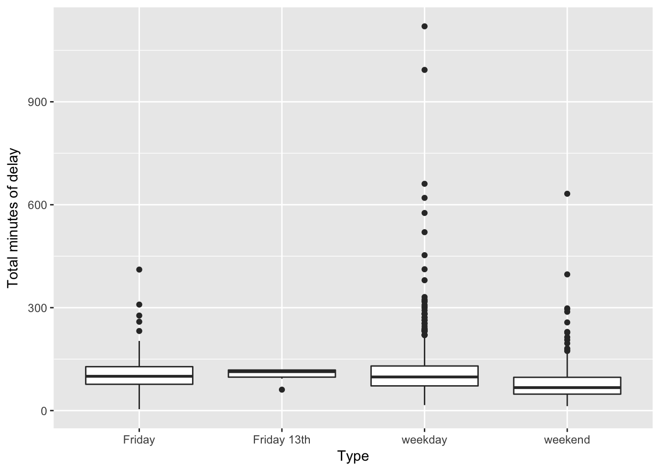
On average, Friday the 13ths have shorter total delays (103 minutes) than either regular Fridays (107 minutes) or other weekdays (114 minutes). Overall, weekend days have far shorter total delays (81 minutes).
If Friday the 13ths are unlucky, they certainly aren’t causing longer TTC delays.
For the statisticians among you that still aren’t convinced, we’ll run a basic linear model to compare Friday the 13ths with regular Fridays. This should control for many unmeasured variables.
model <- lm(total_delay ~ type, data = daily_delays,
            subset = type %in% c("Friday", "Friday 13th"))
summary(model)
##
## Call:
## lm(formula = total_delay ~ type, data = daily_delays, subset = type %in%
##     c("Friday", "Friday 13th"))
##
## Residuals:
##      Min       1Q   Median       3Q      Max
## -103.357  -30.357   -6.857   18.643  303.643
##
## Coefficients:
##                 Estimate Std. Error t value Pr(>|t|)
## (Intercept)      107.357      3.858  27.829   <2e-16 ***
## typeFriday 13th   -4.190     20.775  -0.202     0.84
## ---
## Signif. codes:  0 '***' 0.001 '**' 0.01 '*' 0.05 '.' 0.1 ' ' 1
##
## Residual standard error: 50 on 172 degrees of freedom
## Multiple R-squared:  0.0002365,  Adjusted R-squared:  -0.005576
## F-statistic: 0.04069 on 1 and 172 DF,  p-value: 0.8404
Definitely no statistical support for the idea that Friday the 13ths cause longer TTC delays.
How about time series tests, like anomaly detections? Seems like we’d just be getting carried away. Part of the art of statistics is knowing when to quit.
In conclusion, then, after likely far too much analysis, we find no evidence that Friday the 13ths cause an increase in the length of TTC delays. This certainly suggests that Friday the 13ths are not unlucky in any meaningful way, at least for TTC riders.
Glad we could put this superstition to rest!
Successful AxePC 2016 event
Thank you to all the participants, donors, and volunteers for making the third Axe Pancreatic Cancer event such a great success! Together we’re raising awareness and funding to support Pancreatic Cancer Canada.

Axe PC 2016
We’re hosting our third-annual Axe Pancreatic Cancer event. Help us kick off Pancreatic Cancer Awareness Month by drinking beer and throwing axes!

Public service vs. Academics
I recently participated in a panel discussion at the University of Toronto on the career transition from academic research to public service. I really enjoyed the discussion and there were many great questions from the audience. Here’s just a brief summary of some of the main points I tried to make about the differences between academics and public service.
The major difference I’ve experienced involves a trade-off between control and influence.
As a grad student and post-doctoral researcher I had almost complete control over my work. I could decide what was interesting, how to pursue questions, who to talk to, and when to work on specific components of my research. I believe that I made some important contributions to my field of study. But, to be honest, this work had very little influence beyond a small group of colleagues who are also interested in the evolution of floral form.
Now I want to be clear about this: in no way should this be interpreted to mean that scientific research is not important. This is how scientific progress is made – many scientists working on particular, specific questions that are aggregated into general knowledge. This work is important and deserves support. Plus, it was incredibly interesting and rewarding.
However, the comparison of the influence of my academic research with my work on infrastructure policy is revealing. Roads, bridges, transit, hospitals, schools, courthouses, and jails all have significant impacts on the day-to-day experience of millions of people. Every day I am involved in decisions that determine where, when, and how the government will invest scarce resources into these important services.
Of course, this is where the control-influence trade-off kicks in. As an individual public servant, I have very little control over these decisions or how my work will be used. Almost everything I do involves medium-sized teams with members from many departments and ministries. This requires extensive collaboration, often under very tight time constraints with high profile outcomes.
For example, in my first week as a public servant I started a year-long process to integrate and enhance decision-making processes across 20 ministries and 2 agencies. The project team included engineers, policy analysts, accountants, lawyers, economists, and external consultants from all of the major government sectors. The (rather long) document produced by this process is now used to inform every infrastructure decision made by the province.
Governments contend with really interesting and complicated problems that no one else can or will consider. Businesses generally take on the easy and profitable issues, while NGOs are able to focus on specific aspects of issues. Consequently, working on government policy provides a seemingly endless supply of challenges and puzzles to solve, or at least mitigate. I find this very rewarding.
None of this is to suggest that either option is better than the other. I’ve been lucky to have had two very interesting careers so far, which have been at the opposite ends of this control-influence trade-off. Nonetheless, my experience suggests that an actual academic career is incredibly challenging to obtain and may require significant compromises. Public service can offer many of the same intellectual challenges with better job prospects and work-life balance. But, you need to be comfortable with the diminished control.
Thanks to my colleague Andrew Miller for creating the panel and inviting me to participate. The experience led me to think more clearly about my career choices and I think the panel was helpful to some University of Toronto grad students.
From brutal brooding to retrofit-chic
Our offices will be moving to this new space. I’m looking forward to actually working in a green building, in addition to developing green building policies.
The Jarvis Street project will set the benchmark for how the province manages its own building retrofits. The eight-month-old Green Energy Act requires Ontario government and broader public-sector buildings to meet a minimum LEED Silver standard – Leadership in Energy and Environmental Design. Jarvis Street will also be used to promote an internal culture of conservation, and to demonstrate the province’s commitment to technologically advanced workspaces that are accessible, flexible and that foster staff collaboration and creativity, Ms. Robinson explains.
Emacs Installation on Windows XP
I spend a fair bit of time with a locked-down Windows XP machine. Fortunately, I’m able to install Emacs which provides capabilities that I find quite helpful. I’ve had to reinstall Emacs a few times now. So, for my own benefit (and perhaps your’s) here are the steps I follow: