Finance fixed their data and broke my case study
The past few years, I’ve delivered an introduction to using R workshop that relied on manipulating Ministry of Finance demographic projections.
Analyzing these data was a great case study for the typical data management process. The data was structured for presentation, rather than analysis. So, there were several header rows, notes at the base of the table, and the data was spread across many worksheets.
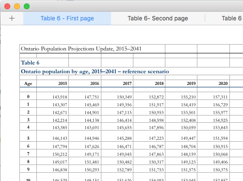
Sometime recently, the ministry released an update that provides the data in a much better format: one sheet with rows for age and columns for years. Although this is a great improvement, I’ve had to update my case study, which makes it actually less useful as a lesson in data manipulation.
Although I’ve updated the main branch of the github repository, I’ve also created a branch that sources the archive.org version of the page from October 2016. Now, depending on the audience, I can choose the case study that has the right level of complexity.
Despite briefly causing me some trouble, I think it is great that these data are closer to a good analytical format. Now, if only the ministry could go one more step towards tidy data and make my case study completely unecessary.