blog
- Document syncing is far more reliable. This isn’t entirely Agenda’s fault. I’m restricted by corporate policy from using iCloud Documents, so have been using Dropbox sync for Agenda. I often have to wait an indeterminate, though long, time before documents sync across my devices. Craft sync has been instantaneous and very reliable.
- Having access to my documents from a web browser is great. I’ll be back to working from the office on a Windows laptop soon and won’t have access to my iPad. So, web access will be important.
- Performance is much better on Craft. Agenda often freezes in the middle of typing and suffers from random crashes. This could very well be something about my particular setup, though it doesn’t happen in any other apps.
- Exercise via Zoom in the morning
- Meditate with Waking Up on the iPhone
- Read news on my iPad while having breakfast
- Back and forth between Teams (almost 3 hours a day!) and Outlook on the iPad throughout the work day
- Learning guitar on YouTube and reading books in the iPad in the evening
- Although I’ll continue reading ebooks, since the convenience is so great, I’ll be rotating paper books into the queue regularly.
- I’ve lost my running outdoor routine. Getting that back will be a nice addition to the Zoom classes and add in some very much needed fresh air.
- As a family, we’ve been enjoying playing board games on weekends, just not routinely. Making sure we play at least one game a week will be good for all of us.
- My son is keen on electronics. We’re going to try assembling a gaming PC for him from components, as well as learn some basic electronics with a breadboard and Arduino.
- Our dog will be excited to get out for more regular walks with especially long ones on the weekend.
- Integration of events and tasks into the calendar view
- Access to event attachments
- Automatic link detection for Teams and Zoom meetings
- 📚 for Apple Books
- 💵 for The Economist
- 📰 for NetNewsWire
- 👓 for Safari Reading List
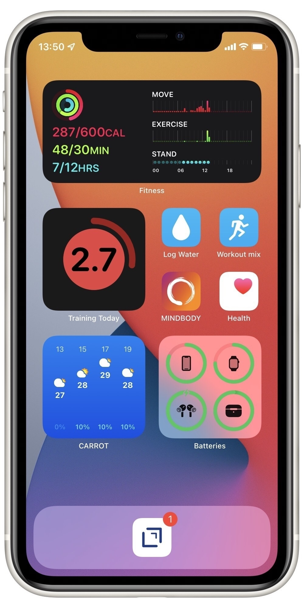
Readiness To Train with the Training Today app 🏃♂️
I’m trying to sequence my workouts in a more systematic way to avoid overtraining. I’ve found Training Today really helpful in determining this Readiness To Train (RTT). The app uses data collected by my Apple Watch to provide a straightforward indicator of how ambitious I should be on any particular day.
As an example, here’s today’s evaluation:
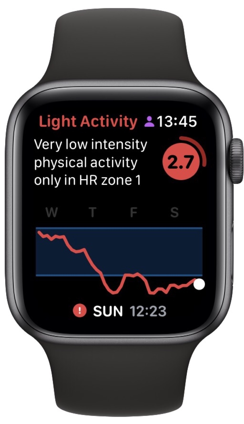
This matches how I feel 🥴. So, today was a good day for some recuperative yoga.
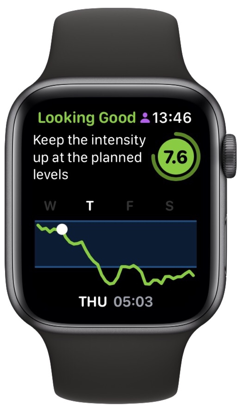
Scrolling back to Thursday, everything looked much better and I put in a good HIIT session:
Of course, the whole point of doing this is to adjust my training to match how my body is recovering. I clearly didn’t do this on Friday. Rather than catch up on some sleep, I choose to do a moderate workout and my RTT stayed on the floor. Not great, considering I’d signed up for an intense One Academy Endure Challenge on Saturday. I managed to finish, which is the main goal, but it didn’t feel good.
Comparing my RTT for this week’s Endure Challenge with the last one shows how this indicator can be informative:
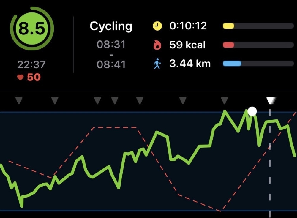
My RTT was much higher back then and I felt really good during the challenge. This gives me comfort that RTT is actually measuring something real and actionable.
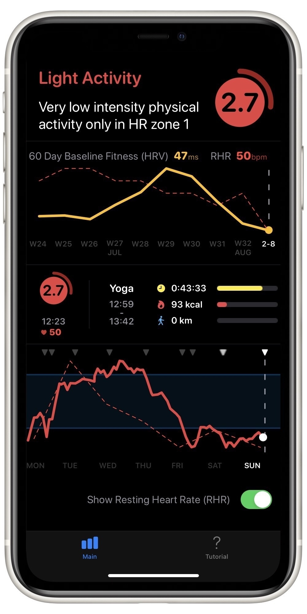
The Apple Watch screenshots shown above are part of the free version of the Training Today app. The more detailed chart above is included in a one-time in-app purchase. This gets you details like this:
And a simple widget, shown below on my fitness home screen:
I really like the focussed simplicity of Training Today, along with the straightforward one-time purchase. My Apple Watch is collecting lots of data about me and I’m glad I can use it to better manage my fitness.
Switching from Agenda to Craft, for now 📅🗒
In my corner of the internet, there’s a well trodden, twisted path of searching for the one true notes app. I’ve reached a fork in the path between Agenda and Craft. As I wrote earlier, I’ve been using Agenda for a while now and its date-based approach really suits my meeting-dominated work. Now, though, Craft has added calendar integration and I’m testing it out.
There are several things I really like about Craft, relative to Agenda:
On the downside, I do miss Agenda’s simplicity. Craft has lots of ways to organize notes (such as cards and subpages). Of course, you can mostly ignore this, but I like Agenda’s well-thought-through approach that didn’t require much deliberation about where to put things.
Of course, having just made this switch, Apple announced Quick Notes and I may well be back on Apple Notes in a few months.
Choosing a podcast player 🤔🎧
There’s been a fair bit of discussion over on Micro.blog about podcast players recently. I’ve switched among Overcast, Castro, and Apple Podcasts players over the years and, mostly to help myself think it through (again), here are my thoughts.
For me, there are three main criteria: audio quality, episode management, and OS integration. Though, I completely understand that others may have different criteria.
Like most podcast listeners, I listen at high speed, usually around 1.5x, which can distort the audio. Apple Podcasts player is definitely the worst for this criterion. For me, Overcast’s smart speed and voice boost features give it the edge over Castro, in terms of audio quality at increased speeds.
Castro is definitely the player of choice if you subscribe to more podcasts than you can listen to. The queue management features in Castro are very good. You can replicate some of this with Overcast, but that isn’t one of the app’s main features. Apple Podcasts player doesn’t offer much in this regard. Despite listing this as a criterion, I’ve actually elevated to subscription, rather than episode, triage. I carefully curate my list of podcasts and don’t add new ones very often. Given this, Overcast’s approach is more than sufficient for me.
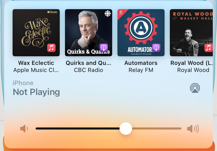
OS integration is a bit unfair, as Apple has given themselves some nice features that independent app developers aren’t able to use. Nonetheless, Apple does a good job of intermixing podcasts and music into their Siri-powered widgets in iOS and the HomePods. With my reinforced interest in less screen time and use of home screen widgets, Apple Podcasts wins out here. This may change once Overcast releases a widget.
As just one example of the integration, here’s what happens when I plug headphones into my iPhone: a selection of music playlists and podcasts appears. I use this feature a lot.
After all that, I’m using Apple Podcasts for now, mostly to take advantage of the OS integrations while I’m experimenting with a widget-based iPhone. I’m quite certain this is short term and that I’ll return to Overcast soon. In addition to the better audio quality, Overcast also has some nice refinements, like per subscription speed settings (I like to play music podcasts at 1x) and skip-forward amounts (Quirks and Quarks, for example, always has a two-minute preamble that I skip). These small refinements are typically what distinguishes the stock Apple apps from good indie apps.
I’m glad there are so many solid apps for podcast listening. Whatever your preferences, there’s sure to be one for you.
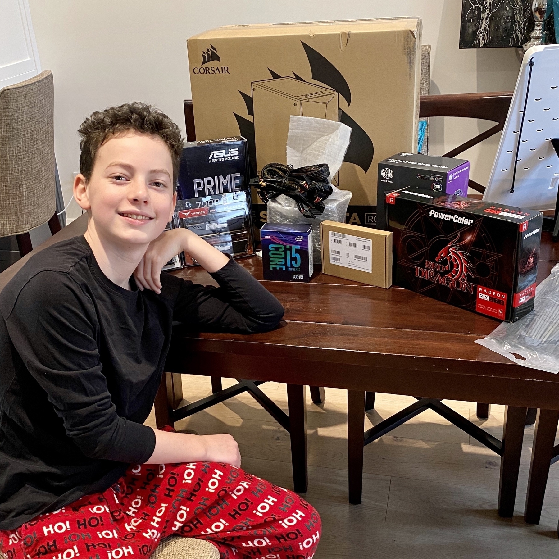
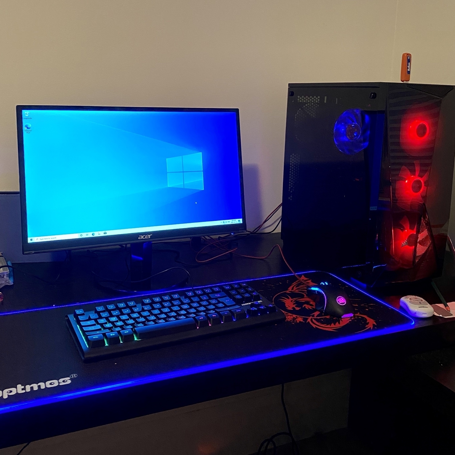
Transforming boxes of components into a gaming PC 📦🕹
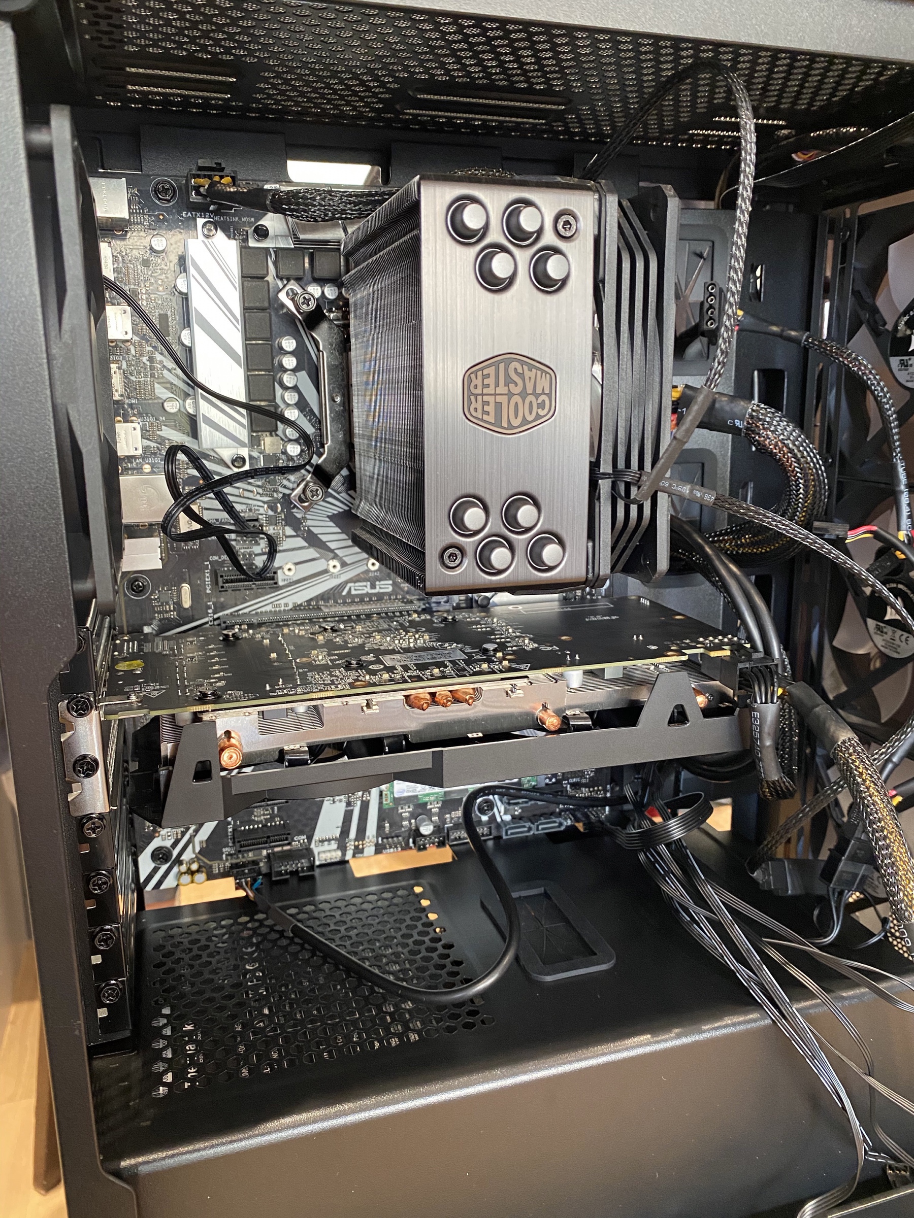
Like any 12-year old, my son is pretty keen on gaming. As an all Apple house, his options were a bit constrained. So, we decided to build a PC from components.
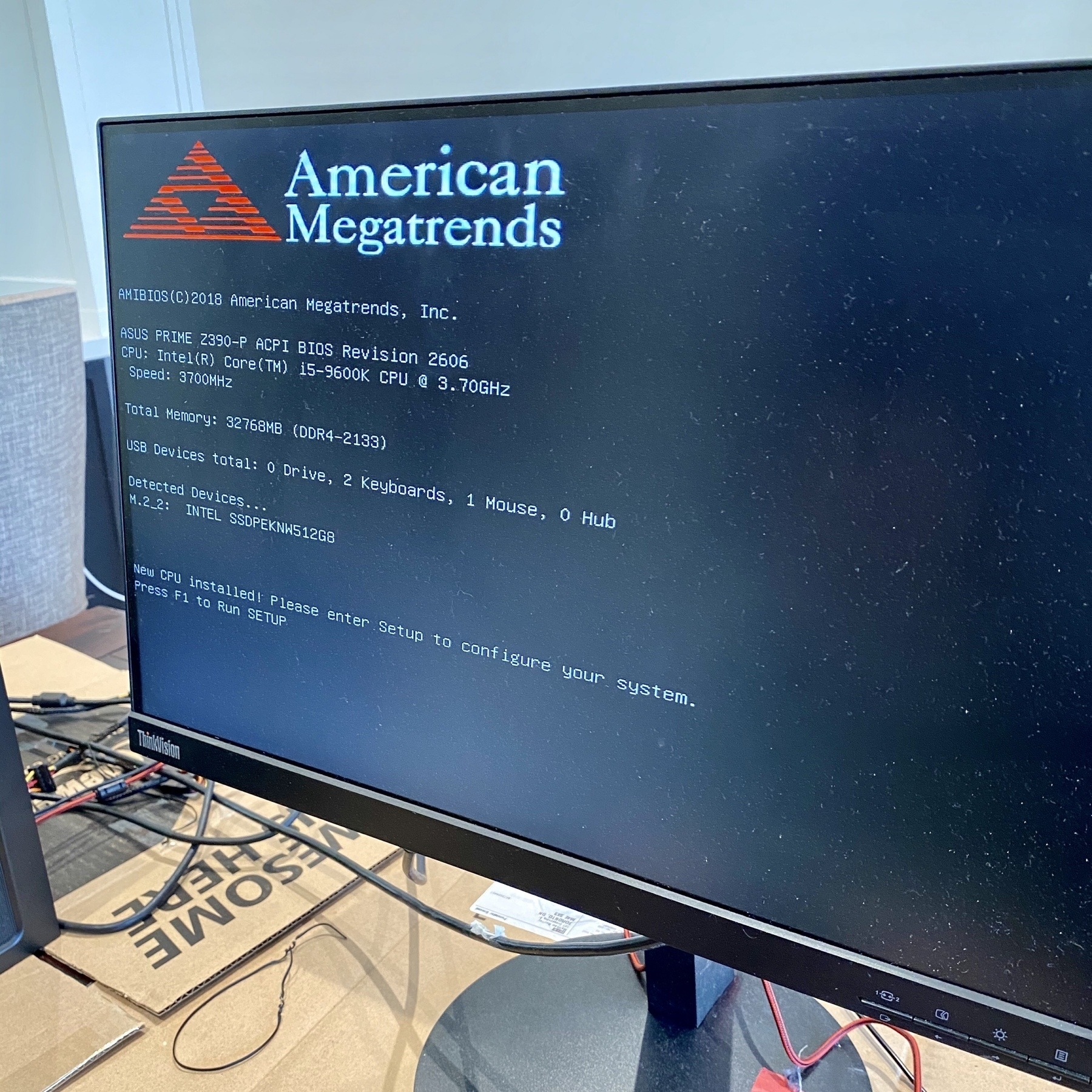
I’d last built a PC about 30 years ago, when I wasn’t much older than him. I remember thinking it was cool to be using a machine I’d built myself, plus as a parent it seemed like a good educational experience. I have to admit to being a bit nervous about the whole thing, as there was certainly a scenario in which we spent an entire weekend unsuccessfully trying to get a bunch of malfunctioning components to work.
After much deliberation and analysis, we ordered our parts from Newegg and everything arrived within a couple of weeks.
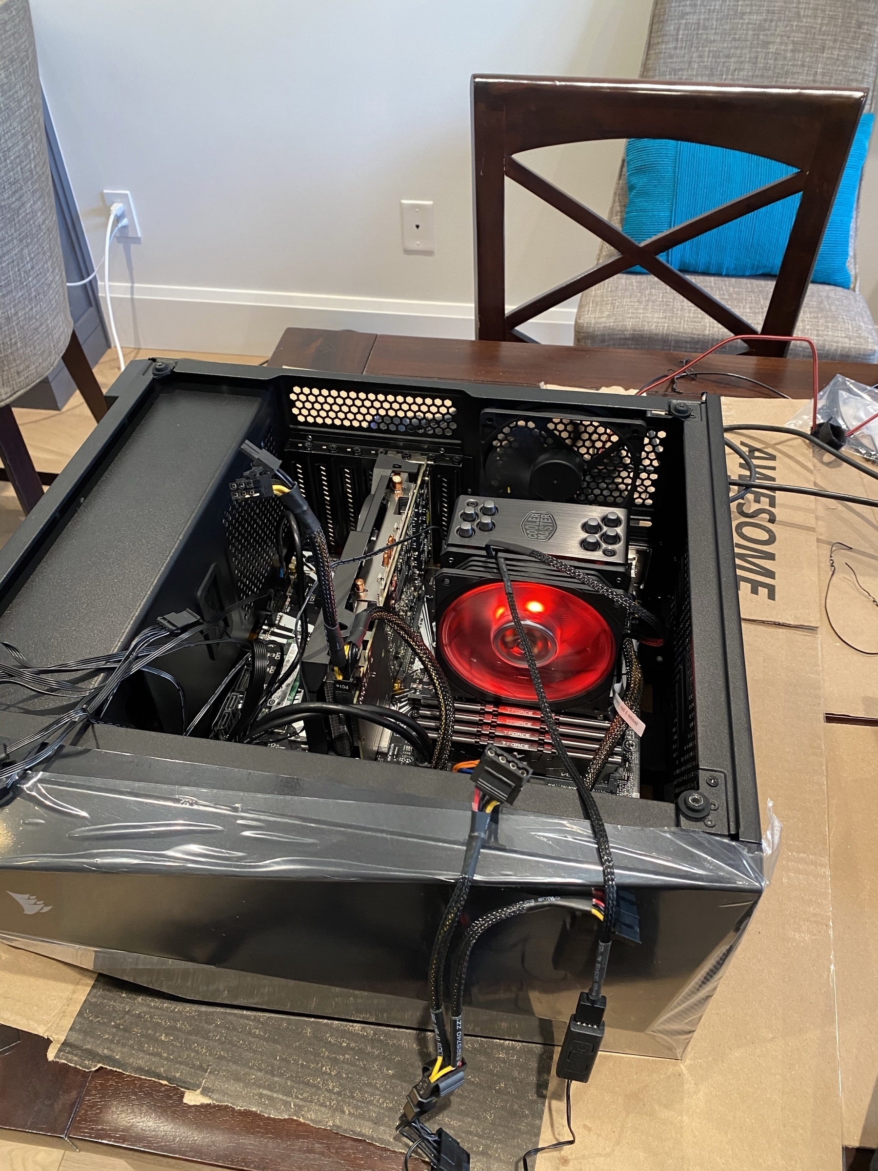
Following along with this great step-by-step video, we assembled the components.
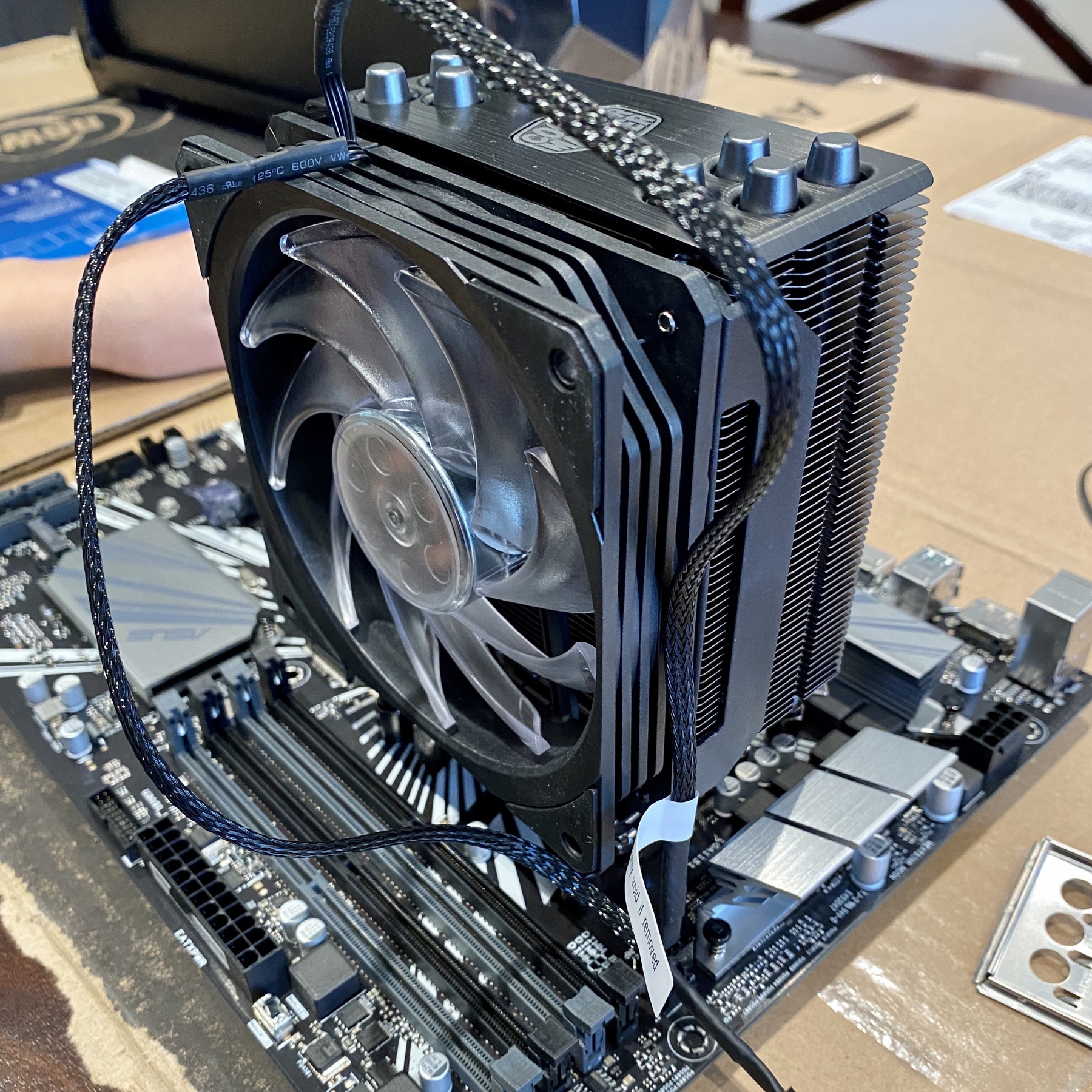
Given my initial anxiety, I was very relieved when we saw this screen. The BIOS booted up and showed that the RAM, SSD, and other components were all properly connected.
With that done, we then got to what ended up being the complicated part. Evidently part of the point of a gaming PC is to have lots of fans and lights. None of this was true when I was a kid and there were a daunting number of wires required to power the lights and fans. Sorting this out actually took a fair bit of time. But, eventually success!
Then our last challenge, which I likely should have anticipated much sooner. We didn’t bother ordering a DVD drive, since everything is online these days. But, our Windows installation showed up as a DVD and we couldn’t create any Windows install media on our Apple devices. Fortunately, we checked in with a slightly older kid down the street and he provided us with a USB drive with the right software. With that challenge solved, we finished the project!
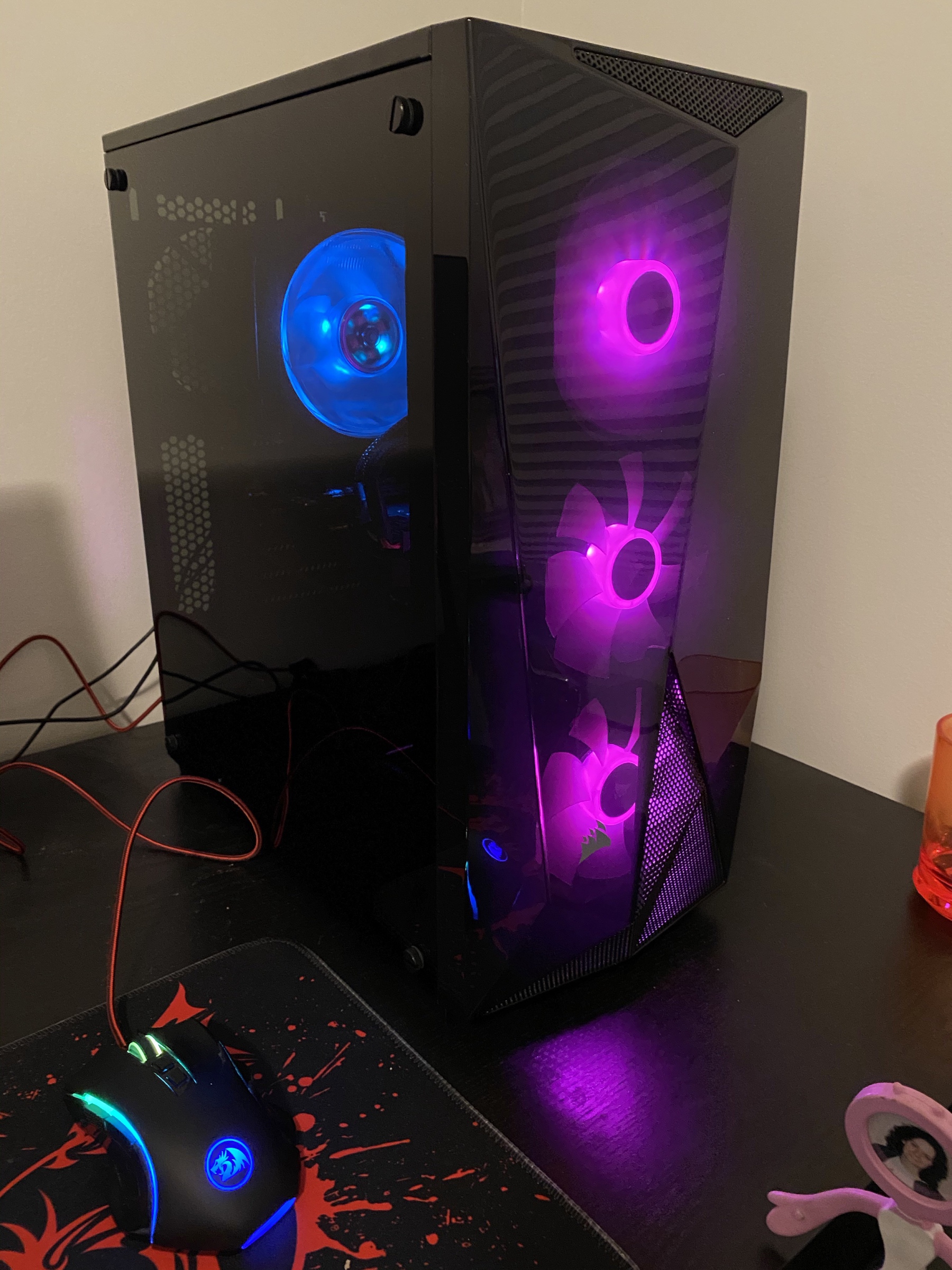
Not counting choosing the components online, the whole project took about 5 hours from opening the boxes to booting into Windows for the first time. I’d definitely recommend it to anyone that’s tempted and technically inclined. My son is quite excited to be using a computer that he built from parts.

Scheduling random meetings with a Shortcut ⚙️🗓
Staying in touch with my team is important. So, I schedule a skip-level meeting with someone on the team each week. These informal conversations are great for getting to know everyone, finding out about new ideas, and learning about recent achievements.
Getting these organized across a couple of dozen people is logistically challenging and I’ve developed a Shortcut to automate most of the process.
Borrowing from Scotty Jackson, I have a base in AirTable with a record for each team member. I use this to store all sorts of useful information about everyone, including when we last had a skip-level meeting. The Shortcut uses this field to pull out team members that I haven’t met with in the past four months and then randomizes the list of names. Then it passes each name over to Fantastical while also incrementing the date by a week. The end result is a recurring set of weekly meetings, randomized across team members.
The hardest part of the Shortcut development was figuring out how to get the names in a random order. A big thank you to sylumer in the Automators forum for pointing out that the Files action can randomly sort any list, not just lists of files.
I’m not sharing the Shortcut here, since the implementation is very specific to my needs. Rather, I’m sharing some of the thinking behind the code, since I think that it demonstrates the general utility of something like Shortcuts for managing routine tasks with just a small amount of upfront effort.
Year of the Tangible
Inspired by Coretex, I’m declaring Tangible as my theme for 2021.
I’ve chosen this theme because I want to spend less time looking at a screen and more time with “tangible stuff”. I’m sure that this is a common sentiment and declaring this theme will keep me focused on improvements.
Since working from home with an iPad, I’m averaging about 9 hours a day with an iOS device. This isn’t just a vague estimate; Screen Time gives me to-the-minute tracking of every app I’m actively using.
A generic day is something like:
Throw in some Netflix, journaling in DayOne, social networking, and random YouTube videos and I’m spending an incredible amount of time looking at a screen.
I’m certainly not a Luddite! The ability of these rectangles of glass to take on so many functions and provide so much meaningful content is astounding. There’s just something unsettling about the dominant role they play.
So, a few things I plan to try:
I’ll be adding much of this to Streaks, an app that I’ve found really helpful for building habits. I’ll also add a “tangible” tag to my time tracker to quantify the shift.
My hope is that I can find the right balance of screen time and tangible activities with intention.
MindNode is the best mind mapping app for iOS
Continuing my plan to update App Store reviews for my favourite apps, up next is MindNode.
MindNode is indispensable to my workflow. My main use for it is in tracking all of my projects and tasks, supported by MindNode’s Reminders integration. I can see all of my projects, grouped by areas of focus, simultaneously which is great for weekly reviews and for prioritizing my work.
I’ve also found it really helpful for sketching out project plans. I can get ideas out of my head easily with quick entry and then drag and drop nodes to explore connections. Seeing connections among items and rearranging them really brings out the critical elements.
MindNode’s design is fantastic and the app makes it really easy to apply styles across nodes. The relatively recent addition of tags has been great too. Overall, one of my most used apps.
Data Governance Sponsor recruitment
I’m very excited to be recruiting for a Data Governance Sponsor to join my team and help enhance the use of good data analytics in our decisions at Metrolinx.
I’m looking for someone that enjoys telling compelling stories with data and has a passion for collaborating to build clean and reliable analytical processes. If you know someone that could fit (maybe you!), please pass along the job ad
Supporting my favourite apps with App Store reviews 🎖
I’ve been negligent in supporting some of my favourite apps on the App Store. In many cases, I reviewed the app a few years ago and then never refreshed my ratings. So, I’m making a new commitment to updating my reviews for apps by picking at least one each month to refresh.
First up is Fantastical. This one took a real hit when they switched to a subscription pricing model. I get the controversy with subscriptions in general. For me, Fantastical has earned a spot on my short list of apps that I support with an ongoing subscription.
And here’s my App Store review:
Fantastical is a great app and is definitely one of my top three most-used apps. Well worth the subscription price.
A few favourite features:
Trying out a new iPhone Home Screen 📱
With the release of iOS 7, I’m reconsidering my earlier approach to the Home Screen. So far I’m trying out a fully automated first screen that uses the Smart Stack, Siri Suggestions, and Shortcut widgets. These are all automatically populated, based on anticipated use and have been quite prescient.
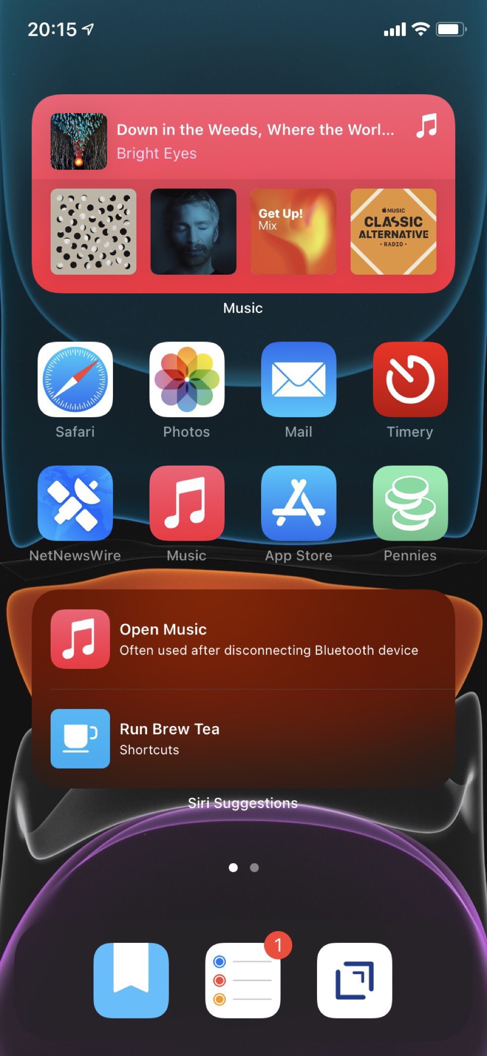
My second screen is all widgets with views from apps that I want to have always available. Although the dynamic content on the first screen has been really good, I do want some certainty about accessing specific content. This second screen replaces how I was using the Today View. I’m not really sure what to do with that feature anymore.
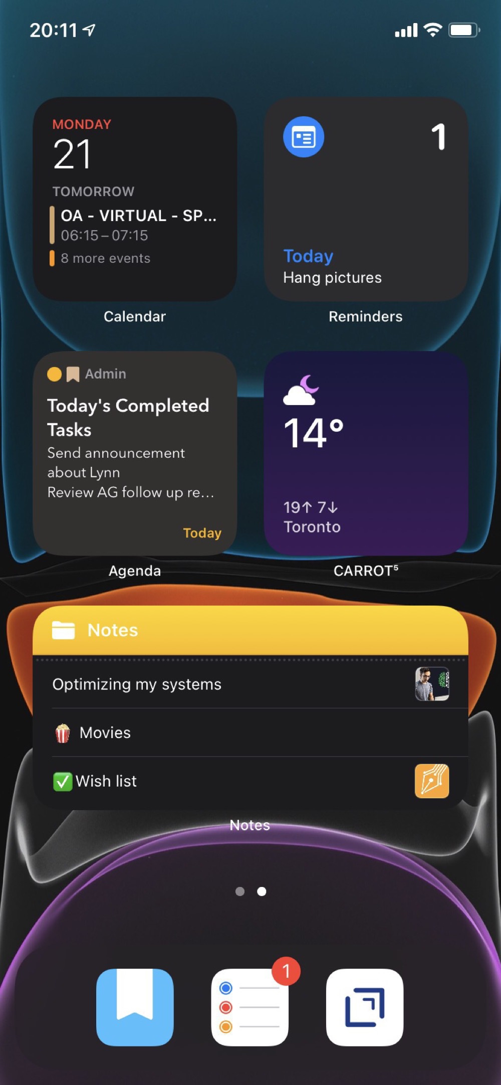
I’ve hidden all of the other screens and rely on the App Library and search to find anything else.
I still like the simplicity behind my earlier approach to the Home Screen. We’ll see if that is just what I’m used to. This new approach is worth testing out for at least a few weeks.
In defence of “poisonous" models ☠️🧮
Skipping past the unnecessarily dramatic title, The Broken Algorithm That Poisoned American Transportation does make some useful points. As seems typical though these days, the good points are likely not the ones a quick reader would take away. My guess is most people see the headline and think that transportation demand models (TDMs) are inherently broken. Despite my biases, I don’t think this is actually true.
For me, the most important point is about a third of the way through:
nearly everyone agreed the biggest question is not whether the models can yield better results, but why we rely on them so much in the first place. At the heart of the matter is not a debate about TDMs or modeling in general, but the process for how we decide what our cities should look like.
Models are just a tool for helping guide decisions. Ideally we would use them to compare alternatives and pick a favoured “vector” of change (rough direction and magnitude). Then with continuous monitoring and refinements throughout the project’s lifecycle, we can guide decisions towards favoured outcomes. This is why scenario planning, sensitivity tests, and clear presentation of uncertainty are so important. This point is emphasized later in the article:
civil engineers doing the modeling tend to downplay the relevance of the precise numbers and speak more broadly about trends over time. Ideally, they argue, policymakers would run the model with varying population forecasts, land use patterns, and employment scenarios to get a range of expectations. Then, they would consider what range of those expectations the project actually works for.
Although I’m not a civil engineer, this sounds right to me! I get that people want certainty and precise numbers, I just don’t think anyone can provide these things. Major infrastructure projects have inherent risks and uncertainty. We need to acknowledge this and use judgement, along with a willingness to adjust over time. There is no magical crystal ball that can substitute for deliberation. [Me working from home:🧙♂️🔮]
Fortunately for the modellers among us, the article does acknowledge that we’re getting better:
As problematic as they have been, the models have gotten smarter. Especially in the last decade or so, more states are working from dynamic travel models that more closely reflect how humans actually behave. They are better at taking into consideration alternate modes of transportation like biking, walking, and public transportation. And, unlike previous versions, they’re able to model how widening one section of road might create bottlenecks in a different section.
But, wait:
Still, experts warn that unless we change the entire decision-making process behind these projects, a better model won’t accomplish anything. The models are typically not even run—and the results presented to the public—until after a state department of transportation has all but settled on a preferred project.
😔 Maybe it wasn’t the model’s fault after all.
This brings as back to the earlier point: we should be favouring more sophisticated decision-making processes, not just more sophisticated models.
Reading Shortcut for the iPad 👓⚙️
I haven’t yet adopted the minimalist style of my iPhone for my iPad. Rather, I’ve found that setting up “task oriented” Shortcuts on my home screen is a good alternative to arranging lots of app icons.
The one I use the most is a “Reading” Shortcut, since this is my dominant use of the iPad. Nothing particularly fancy. Just a list of potential reading sources and each one starts up a Timery timer, since I like to track how much time I’m reading.
Here’s a screenshot of the first few actions:
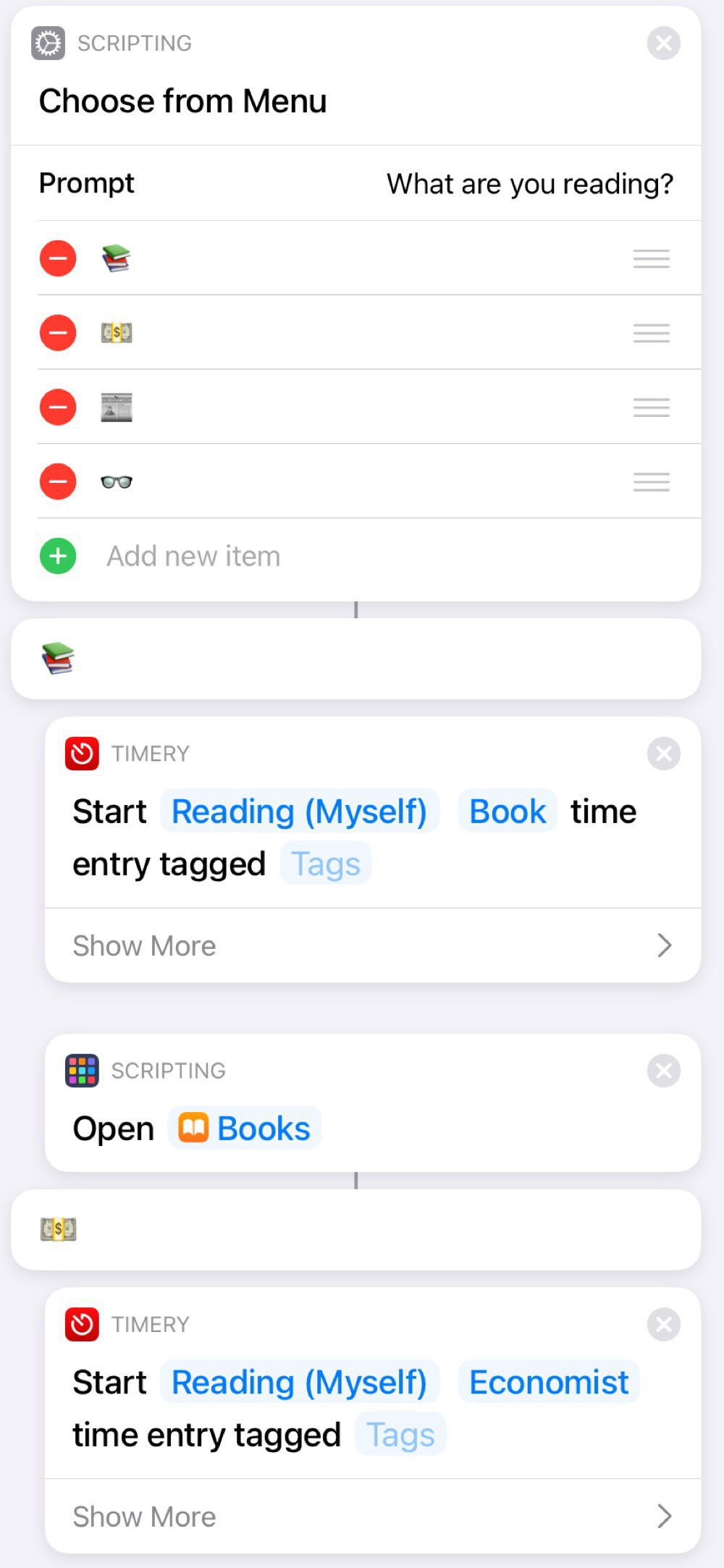
I like the bit of whimsy from using emoticons:
A nice feature of using a Shortcut for this is that I can add other actions, such as turning on Do Not Disturb or starting a specific playlist. I can also add and subtract reading sources over time, depending on my current habits. For example, the first one was Libby for a while, since I was reading lots of library books.
This is another example of how relatively simple Shortcuts can really help optimize how you use your iOS devices.
Reflection journal in Day One with an Agenda assist
I’ve been keeping a “director’s commentary” of my experiences in Day One since August 2, 2012 (5,882 entries and counting). I’ve found this incredibly helpful and really enjoy the “On This Day” feature that shows all of my past entries on a particular day.
For the past few months, I’ve added in a routine based on the “5 minute PM” template which prompts me to add three things that happened that day and one thing I could have done to make the day better. This is a great point of reflection and will build up a nice library of what I’ve been doing over time.
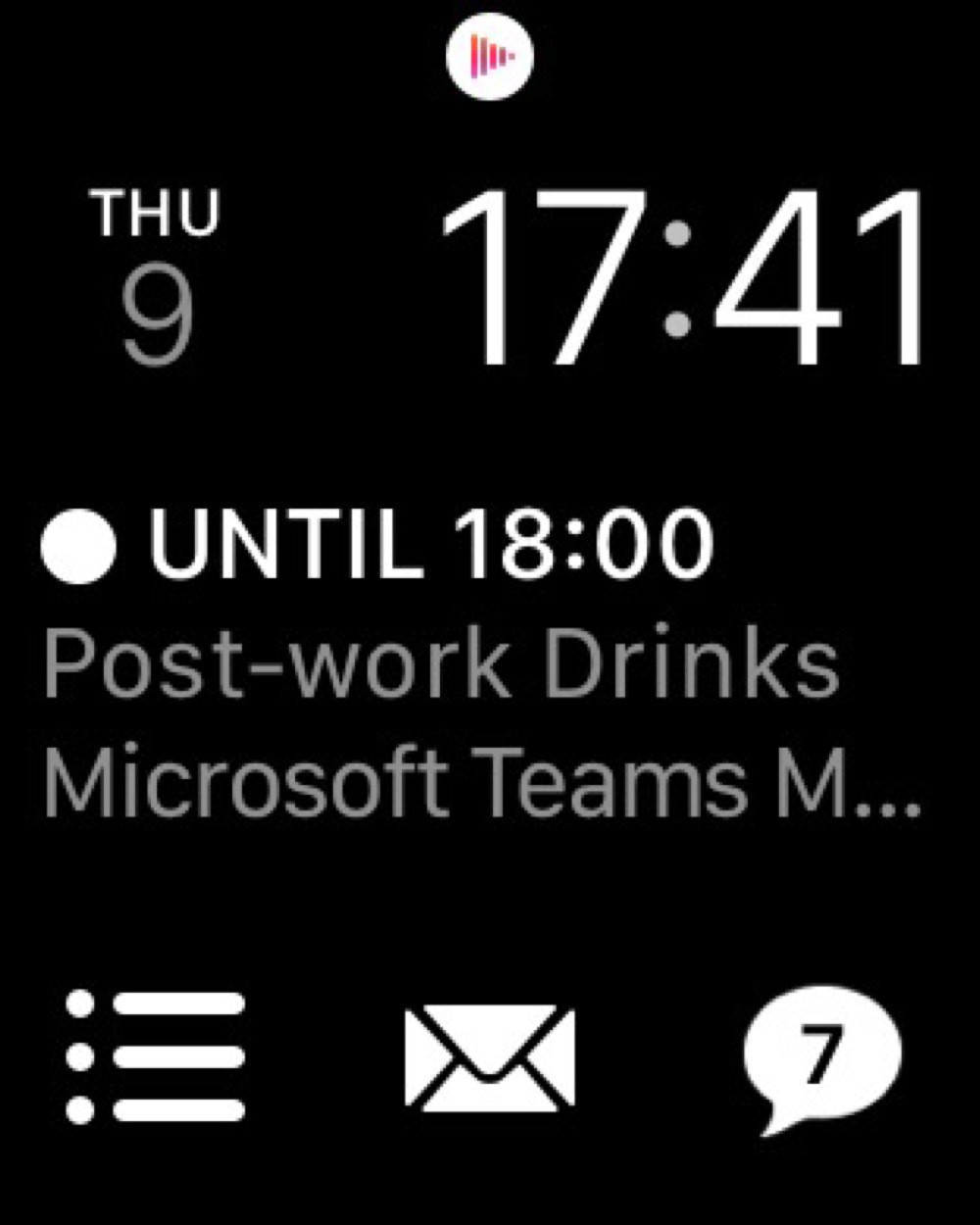
My days seem like such a whirlwind sometimes that I actually have trouble remembering what I did that day. So, my new habit is to scroll through my Today view in Agenda. This shows me all of my notes from the day’s meetings. I’ve also created a Shortcut that creates a new note in Agenda with all of my completed tasks from Reminders. This is a useful reminder of any non-meeting based things I’ve done (not everything is a meeting, yet).
I’m finding this new routine to be a very helpful part of my daily shutdown routine: I often identify the most important thing to do tomorrow by reviewing what I did today. And starting tomorrow off with my top priority already identified really helps get the day going quickly.
Different watch faces for work and home
watchOS 7 has some interesting new features for enhancing and sharing watch faces. After an initial explosion of developing many special purpose watch faces, I’ve settled on two: one for work and another for home.
Both watch faces use the Modular design with the date on the top left, time on the top right, and Messages on the bottom right. I like keeping the faces mostly the same for consistency and muscle memory.
My work watch face than adds the Fantastical complication right in the centre, since I often need to know which meeting I’m about to be late for. Reminders is on the bottom left and Mail in the bottom centre. I have this face set to white to not cause too much distraction.
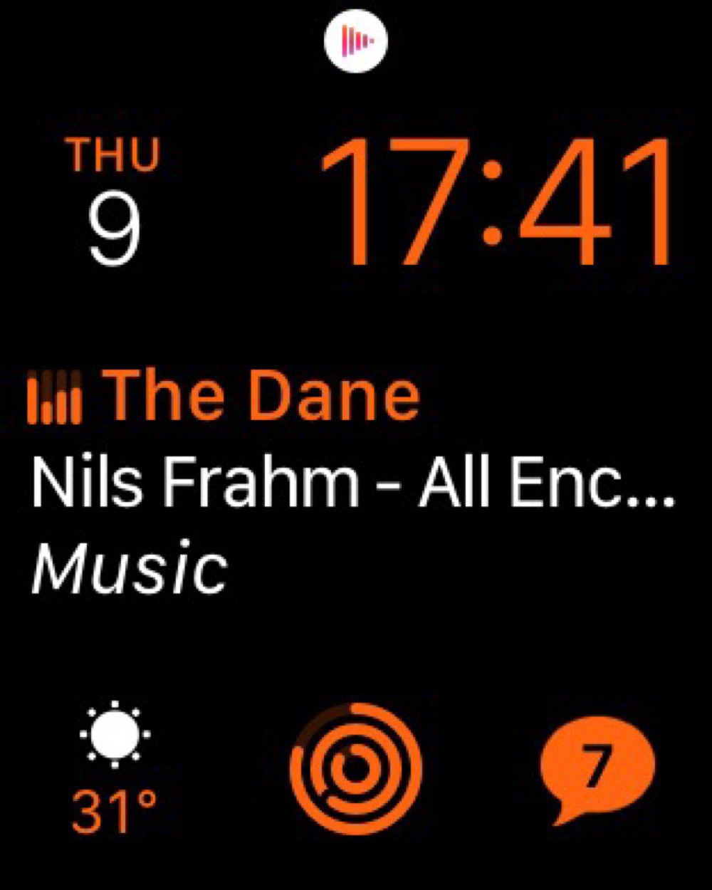
My home watch face swaps in Now Playing in the centre, since I’m often listening to music or podcasts. And I have Activity in the bottom centre. This face is in orange, mostly to distinguish it from the work watch face.
Surprisingly, I’ve found this distinction between a work and home watch face even more important in quarantine. Switching from one face to another really helps enforce the transition between work and non-work when everything is all done at home.
The watch face that I’d really like to use is the Siri watch face. This one is supposed to intelligently expose information based on my habits. Sounds great, but almost never actually works.
I'm not analyzing COVID data, though I'm impressed with Ontario's open data
I’m neither an epidemiologist nor a medical doctor. So, no one wants to see my amateur disease modelling.
That said, I’ve complained in the past about Ontario’s open data practices. So, I was very impressed with the usefulness of the data the Province is providing for COVID: a straightforward csv file that is regularly updated from a stable URL.
Using the data is easy. Here’s an example of creating a table of daily counts and cumulative totals:
data_source <- "[data.ontario.ca/dataset/f...](https://data.ontario.ca/dataset/f4112442-bdc8-45d2-be3c-12efae72fb27/resource/455fd63b-603d-4608-8216-7d8647f43350/download/conposcovidloc.csv)"
covid_data <- read_csv(data_source) %>%
  select(ACCURATE_EPISODE_DATE) %>%
  rename(date = ACCURATE_EPISODE_DATE) %>%
  group_by(date) %>%
  summarise(daily_count = n()) %>%
  mutate(cumulative_count = cumsum(daily_count))
From there we can make some simple plots to get a sense of how the case load is changing.
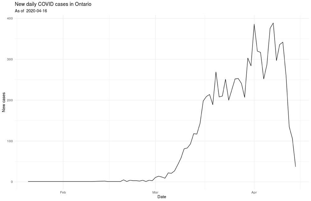
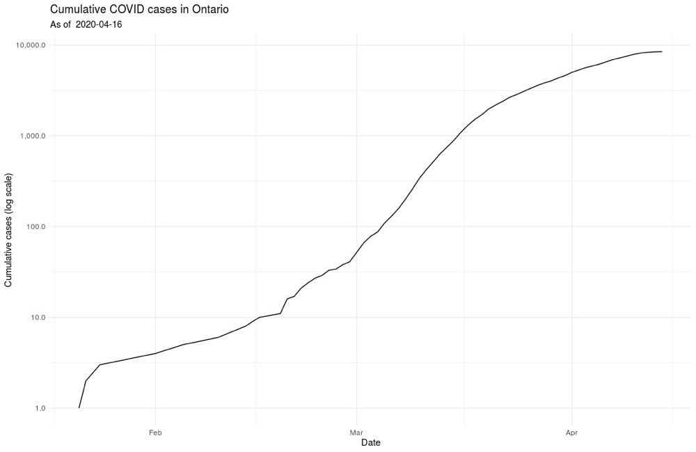
And, I’ll leave it at that, at least for public posting 🤓
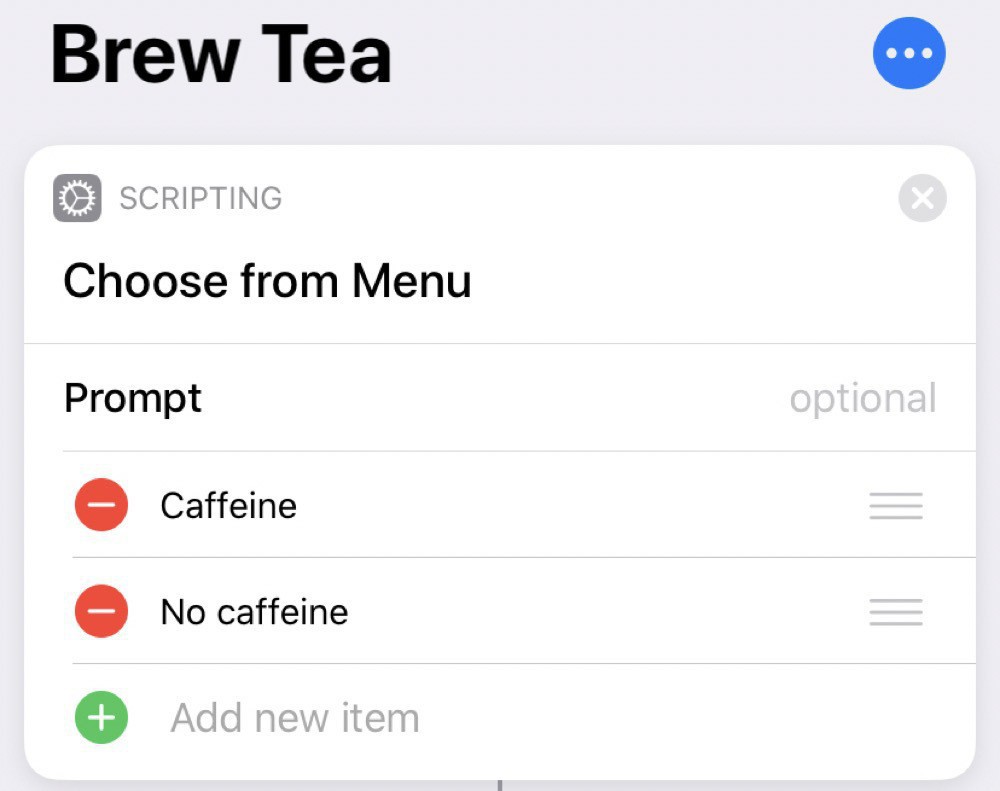
Simple brew tea shortcut
Since I’m mostly stuck inside these days, I find I’m drinking more tea than usual. So, as a modification of my brew coffee shortcut, I’ve created a brew tea shortcut.
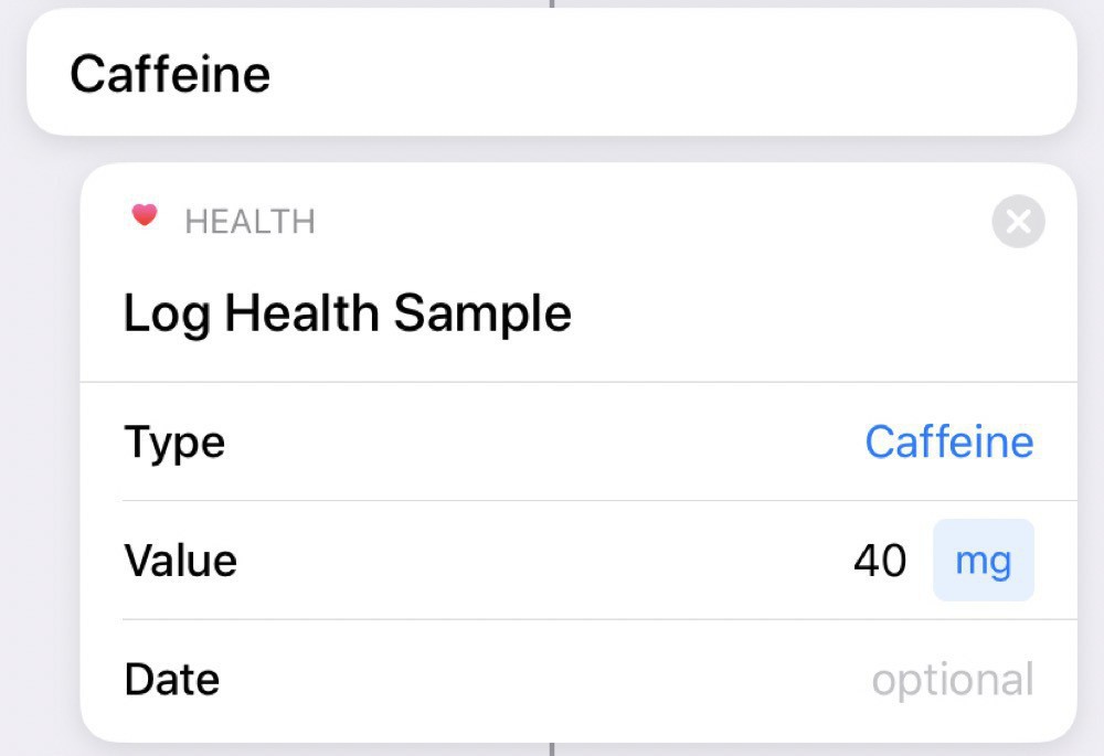
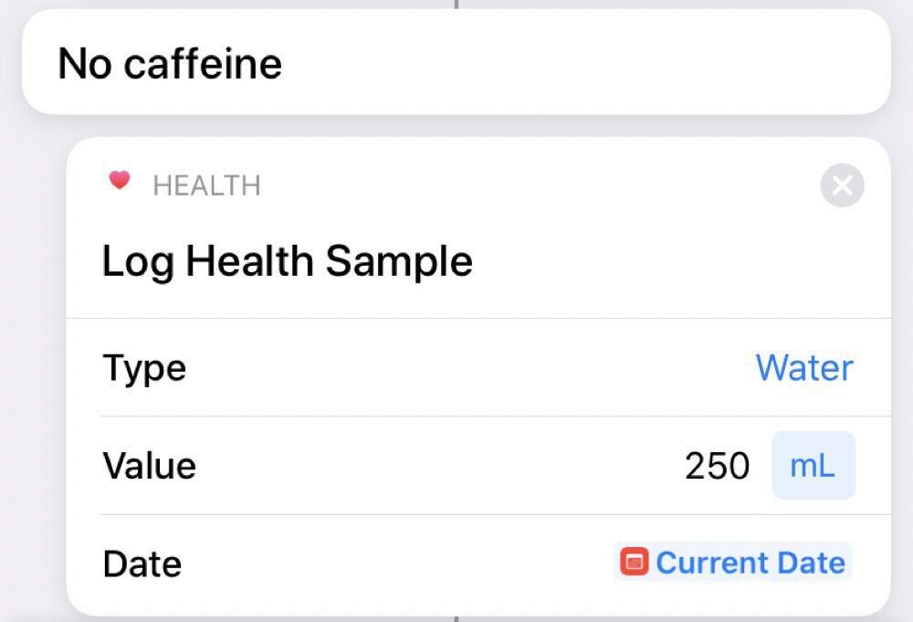
This one is slightly more complicated, since I want to do different things depending on if the tea is caffeinated or not.
We start by making this choice:
Then, if we choose caffeine, we log this to the Health app:
Uncaffeinated tea counts as water (at least for me):
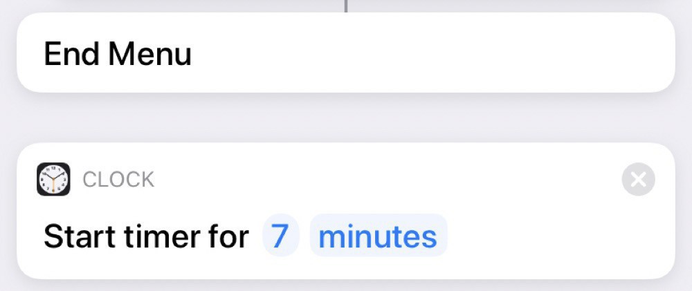
And, then, regardless of the type of tea, we set a timer for 7 minutes:
Running this one requires more interactions with Siri, since she’ll ask which type we want. We can either reply by voice or by pressing the option we want on the screen.
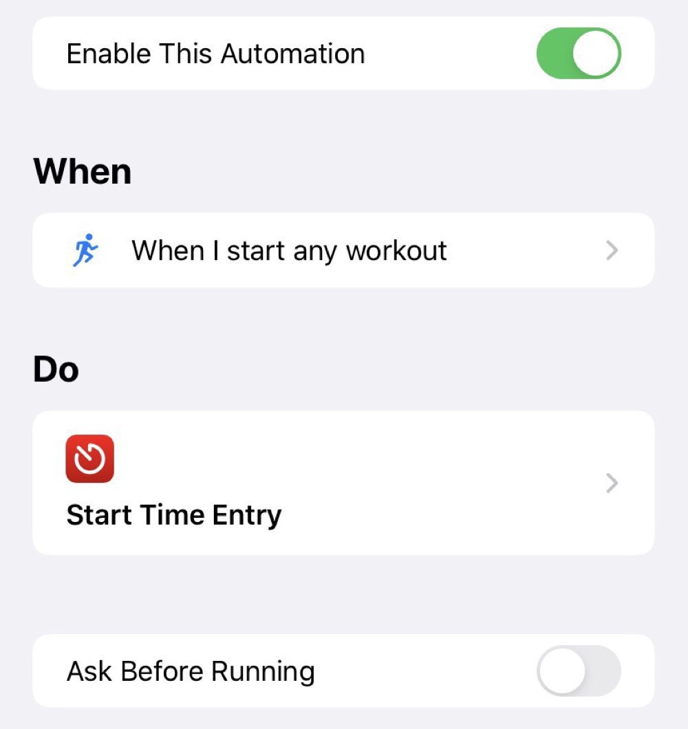
A simple Shortcut for tracking workout time
I’ve been tracking my time at work for a while now, with the help of Toggl and Timery. Now that I’m working from home, work and home life are blending together, making it even more useful to track what I’m doing.
Physical exercise is essential to my sanity. So, I wanted to integrate my Apple Watch workouts into my time tracking. I thought I’d be able to leverage integration with the Health app through Shortcuts to add in workout times. Turns out you can’t access this kind of information and I had to take a more indirect route using the Automation features in Shortcuts.
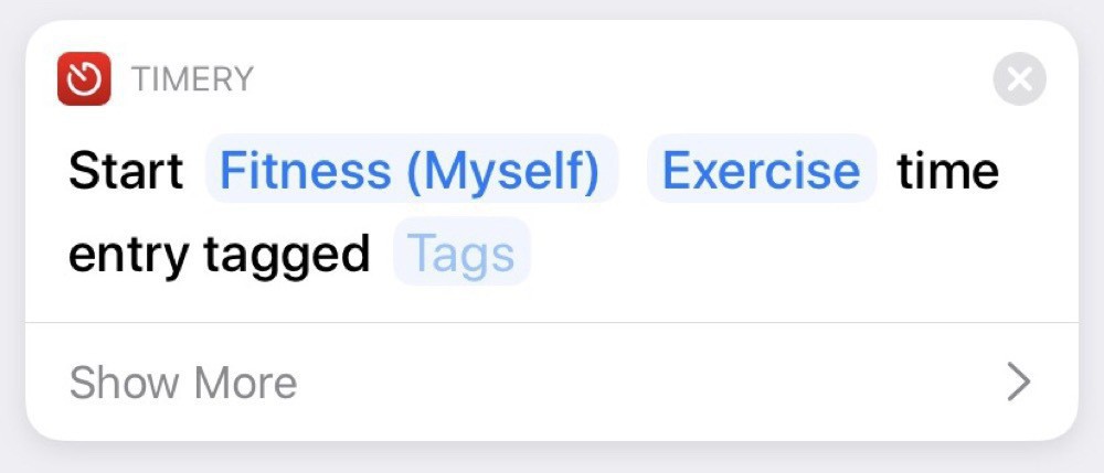
I’ve setup two automations: one for when I start an Apple Watch workout and the other for when I stop the workout:
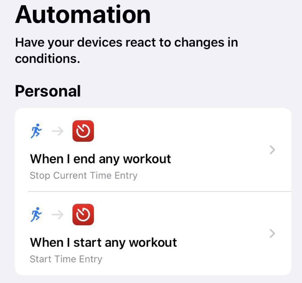
The starting automation just starts an entry in Timery:
The stopping automation, unsurprisingly, stops the running entry:

As with most of my Shortcuts, this is a simple one. Developing a portfolio of these simple automations is really helpful for optimizing my processes and freeing up time for my priorities.
Brew coffee shortcut
Shorcuts in iOS is a great tool. Automating tasks significantly boosts productivity and some really impressive shortcuts have been created.
That said, it is often the smaller automations that add up over time to make a big difference. My most used one is also the simplest in my Shortcuts Library. I use it every morning when I make my coffee. All the shortcut does is set a timer for 60 seconds (my chosen brew time for the Aeropress) and logs 90mg of caffeine into the Health app.
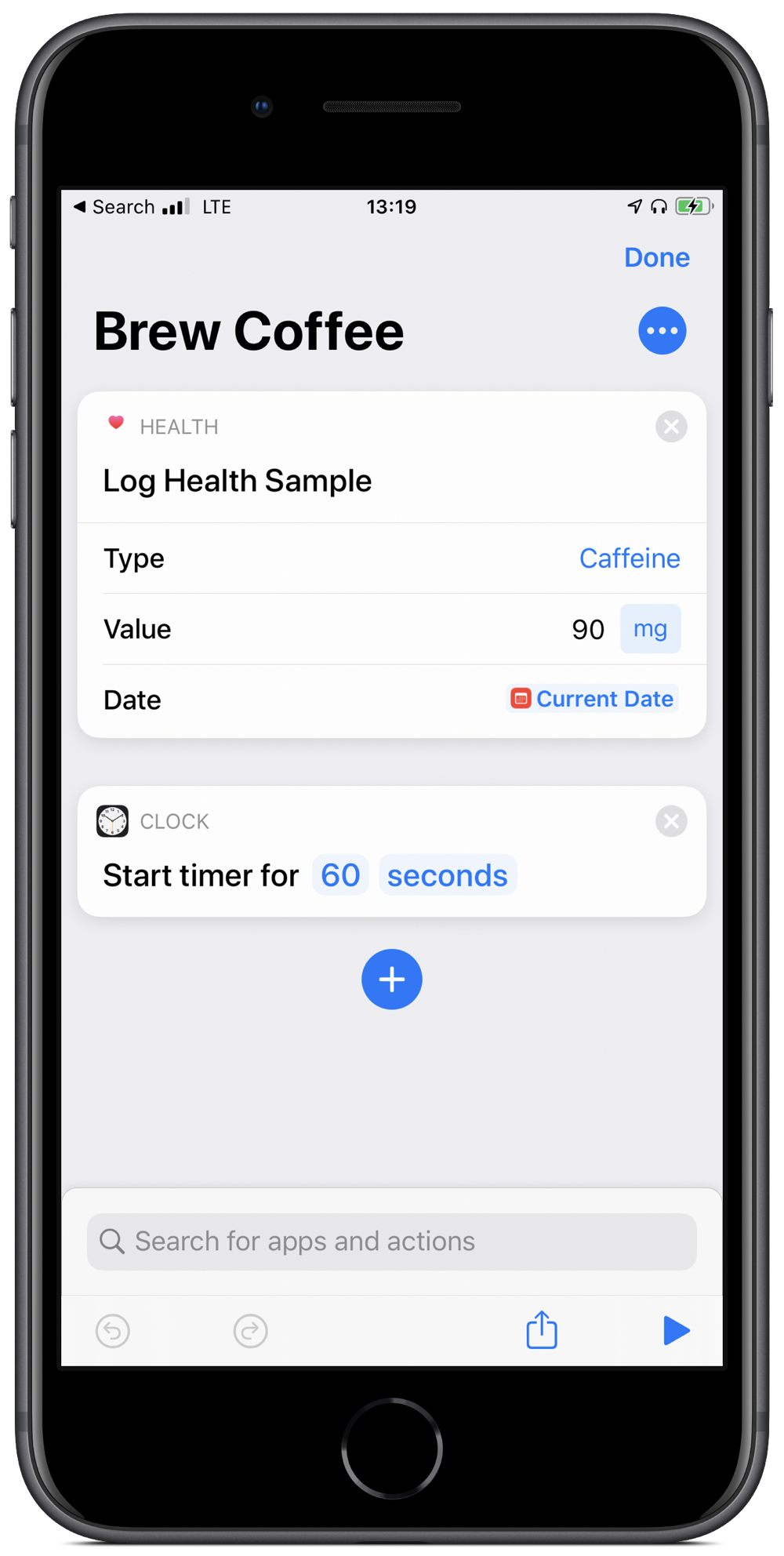
All I need to do is groggily say “Hey Siri, brew coffee” and then patiently wait for a minute. Well, that plus boil the water and grind the beans.
Simple, right? But that’s the point. Even simple tasks can be automated and yield consistencies and productivity gains.
Things cost more than they used to
I’m delivering a seminar on estimating capital costs for large transit projects soon. One of the main concepts that seems to confuse people is inflation (including the non-intuitive terms nominal and real costs). To guide this discussion, I’ve pulled data from Statistics Canada on the Consumer Price Index (CPI) to make a few points.
The first point is that, yes, things do cost more than they used to, since prices have consistently increased year over year (this is the whole point of monetary policy). I’m illustrating this with a long-term plot of CPI in Canada from 1914-01-01 to 2019-11-01.
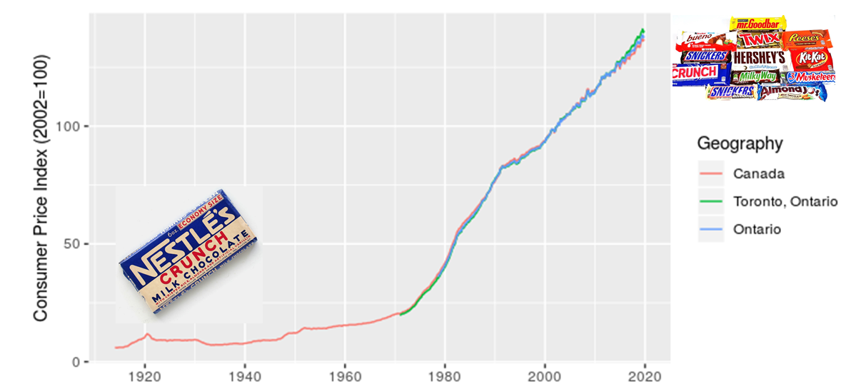
I added in the images of candy bars to acknowledge my grandmother’s observation that, when she was a kid, candy only cost a penny. I also want to make a point that although costs have increased, we also now have a much greater diversity of candy to choose from. There’s an important analogy here for estimating the costs of projects, particulary those with a significant portion of machinery or technology assets.
The next point I want to make is that location matters, which I illustrate with a zoomed in look at CPI for Canada, Ontario, and Toronto.
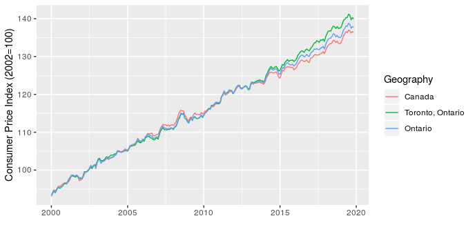
This shows that over the last five years Toronto has seen higher price increases than the rest of the province and country. This has implications for project costing, since we may need to consider the source of materials and location of the project to choose the most appropriate CPI adjustment.
The last point I want to make is that the type of product also matters. To start, I illustrate this by comparing CPI for apples and alcoholic beverages (why not, there are 330 product types in the data and I have to pick a couple of examples to start).
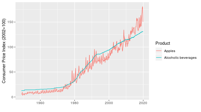
In addition to showing how relative price inflation between products can change over time (the line for apples crosses the one for alcoholic beverages several times), this chart shows how short-term fluctuations in price can also differ. For example, the line for apples fluctuates dramatically within a year (these are monthly values), while alcoholic beverages is very smooth over time.
Once I’ve made the point with a simple example, I can then follow up with something more relevant to transit planners by showing how the price of transportation, public transportation, and parking have all changed over time, relative to each other and all-items (the standard indicator).
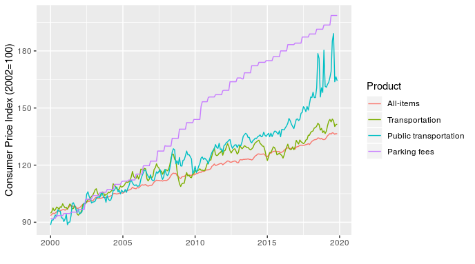
At least half of transit planning seems to actually be about parking, so that parking fees line is particularly relevant.
Making these charts is pretty straightforward, the only real challenge is that the data file is large and unwieldy. The code I used is here.