Things cost more than they used to
I’m delivering a seminar on estimating capital costs for large transit projects soon. One of the main concepts that seems to confuse people is inflation (including the non-intuitive terms nominal and real costs). To guide this discussion, I’ve pulled data from Statistics Canada on the Consumer Price Index (CPI) to make a few points.
The first point is that, yes, things do cost more than they used to, since prices have consistently increased year over year (this is the whole point of monetary policy). I’m illustrating this with a long-term plot of CPI in Canada from 1914-01-01 to 2019-11-01.
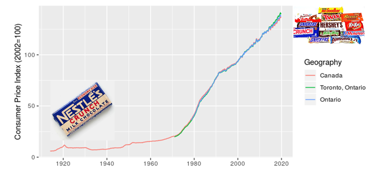
I added in the images of candy bars to acknowledge my grandmother’s observation that, when she was a kid, candy only cost a penny. I also want to make a point that although costs have increased, we also now have a much greater diversity of candy to choose from. There’s an important analogy here for estimating the costs of projects, particulary those with a significant portion of machinery or technology assets.
The next point I want to make is that location matters, which I illustrate with a zoomed in look at CPI for Canada, Ontario, and Toronto.
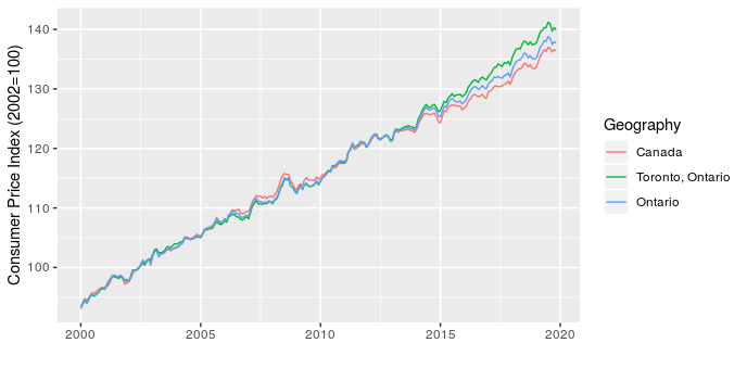
This shows that over the last five years Toronto has seen higher price increases than the rest of the province and country. This has implications for project costing, since we may need to consider the source of materials and location of the project to choose the most appropriate CPI adjustment.
The last point I want to make is that the type of product also matters. To start, I illustrate this by comparing CPI for apples and alcoholic beverages (why not, there are 330 product types in the data and I have to pick a couple of examples to start).
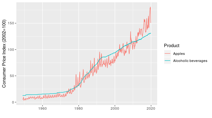
In addition to showing how relative price inflation between products can change over time (the line for apples crosses the one for alcoholic beverages several times), this chart shows how short-term fluctuations in price can also differ. For example, the line for apples fluctuates dramatically within a year (these are monthly values), while alcoholic beverages is very smooth over time.
Once I’ve made the point with a simple example, I can then follow up with something more relevant to transit planners by showing how the price of transportation, public transportation, and parking have all changed over time, relative to each other and all-items (the standard indicator).
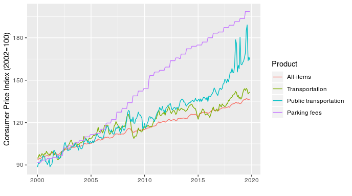
At least half of transit planning seems to actually be about parking, so that parking fees line is particularly relevant.
Making these charts is pretty straightforward, the only real challenge is that the data file is large and unwieldy. The code I used is here.