Different watch faces for work and home
watchOS 7 has some interesting new features for enhancing and sharing watch faces. After an initial explosion of developing many special purpose watch faces, I’ve settled on two: one for work and another for home.
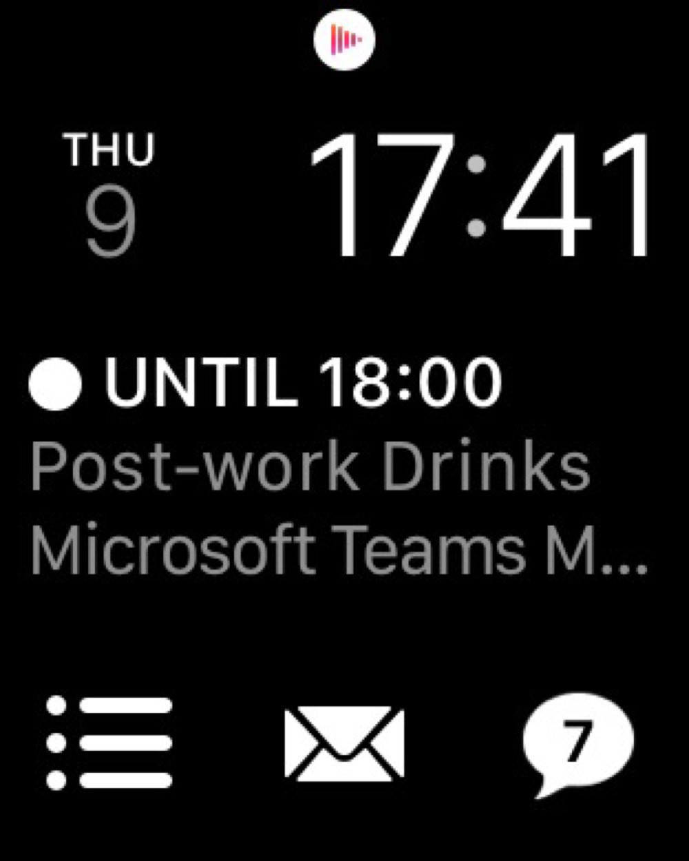
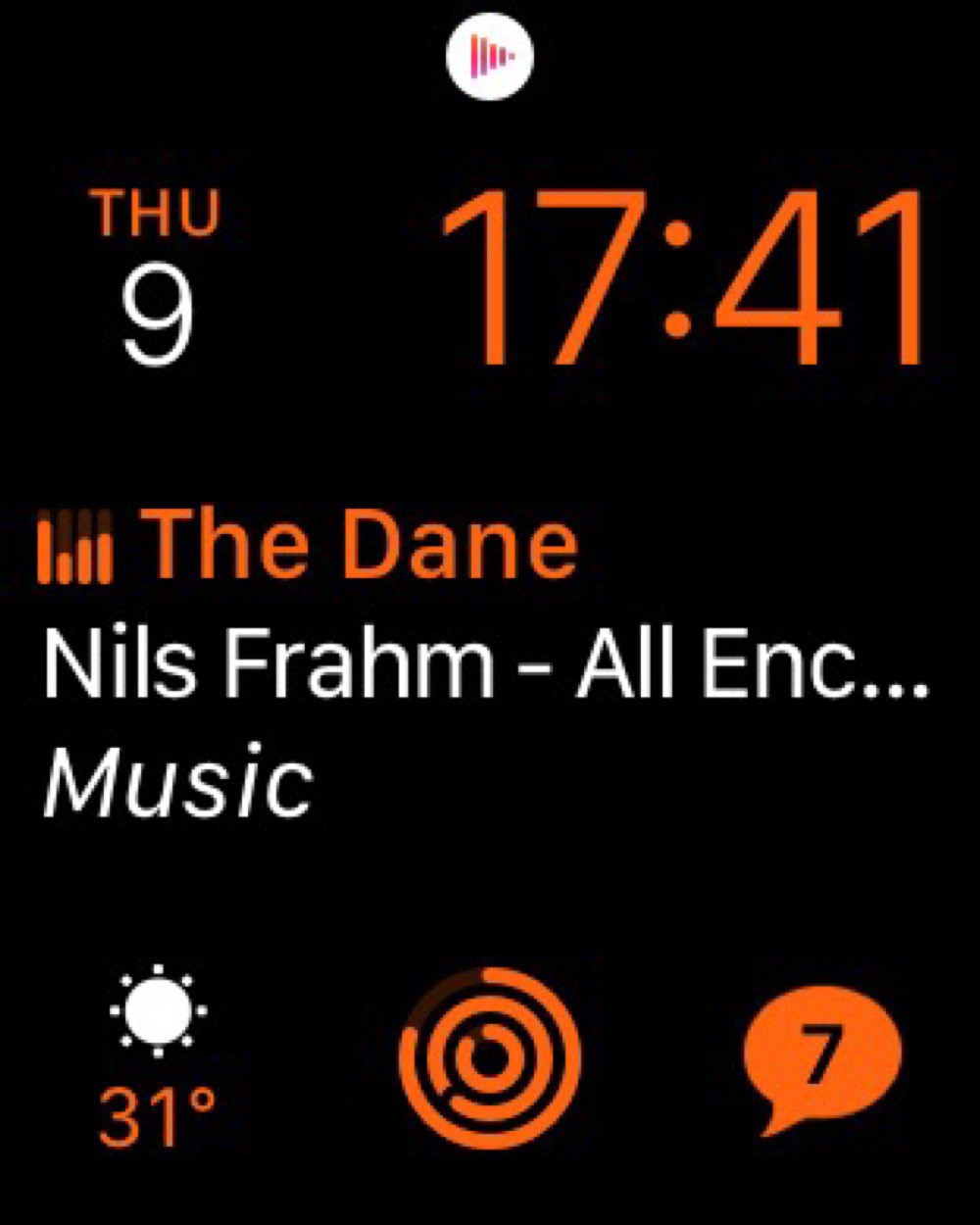
Both watch faces use the Modular design with the date on the top left, time on the top right, and Messages on the bottom right. I like keeping the faces mostly the same for consistency and muscle memory.
My work watch face than adds the Fantastical complication right in the centre, since I often need to know which meeting I’m about to be late for. Reminders is on the bottom left and Mail in the bottom centre. I have this face set to white to not cause too much distraction.

My home watch face swaps in Now Playing in the centre, since I’m often listening to music or podcasts. And I have Activity in the bottom centre. This face is in orange, mostly to distinguish it from the work watch face.

Surprisingly, I’ve found this distinction between a work and home watch face even more important in quarantine. Switching from one face to another really helps enforce the transition between work and non-work when everything is all done at home.
The watch face that I’d really like to use is the Siri watch face. This one is supposed to intelligently expose information based on my habits. Sounds great, but almost never actually works.