code
Things cost more than they used to
I’m delivering a seminar on estimating capital costs for large transit projects soon. One of the main concepts that seems to confuse people is inflation (including the non-intuitive terms nominal and real costs). To guide this discussion, I’ve pulled data from Statistics Canada on the Consumer Price Index (CPI) to make a few points.
The first point is that, yes, things do cost more than they used to, since prices have consistently increased year over year (this is the whole point of monetary policy). I’m illustrating this with a long-term plot of CPI in Canada from 1914-01-01 to 2019-11-01.
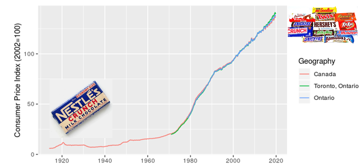
I added in the images of candy bars to acknowledge my grandmother’s observation that, when she was a kid, candy only cost a penny. I also want to make a point that although costs have increased, we also now have a much greater diversity of candy to choose from. There’s an important analogy here for estimating the costs of projects, particulary those with a significant portion of machinery or technology assets.
The next point I want to make is that location matters, which I illustrate with a zoomed in look at CPI for Canada, Ontario, and Toronto.
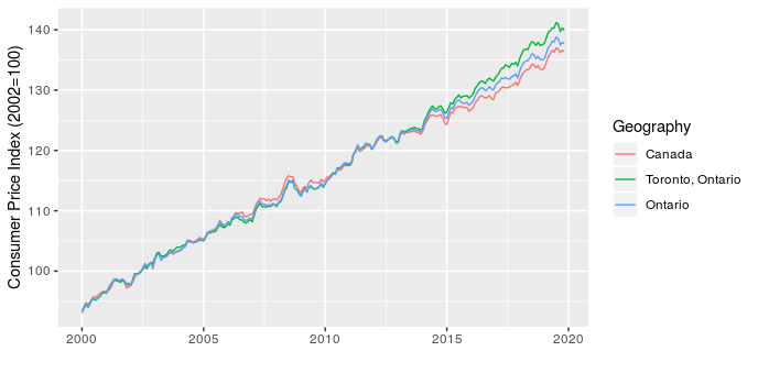
This shows that over the last five years Toronto has seen higher price increases than the rest of the province and country. This has implications for project costing, since we may need to consider the source of materials and location of the project to choose the most appropriate CPI adjustment.
The last point I want to make is that the type of product also matters. To start, I illustrate this by comparing CPI for apples and alcoholic beverages (why not, there are 330 product types in the data and I have to pick a couple of examples to start).
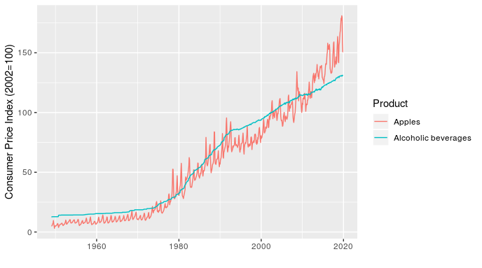
In addition to showing how relative price inflation between products can change over time (the line for apples crosses the one for alcoholic beverages several times), this chart shows how short-term fluctuations in price can also differ. For example, the line for apples fluctuates dramatically within a year (these are monthly values), while alcoholic beverages is very smooth over time.
Once I’ve made the point with a simple example, I can then follow up with something more relevant to transit planners by showing how the price of transportation, public transportation, and parking have all changed over time, relative to each other and all-items (the standard indicator).
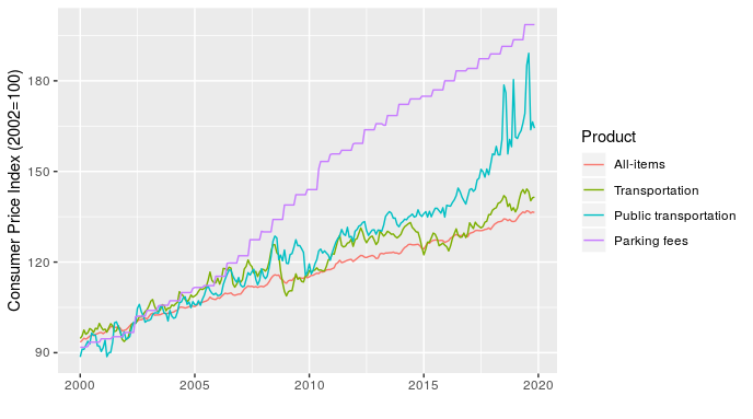
At least half of transit planning seems to actually be about parking, so that parking fees line is particularly relevant.
Making these charts is pretty straightforward, the only real challenge is that the data file is large and unwieldy. The code I used is here.
Task management with MindNode and Agenda
For several years now, I’ve been a very happy Things user for all of my task management. However, recent reflections on the nature of my work have led to some changes. My role now mostly entails tracking a portfolio of projects and making sure that my team has the right resources and clarity of purpose required to deliver them. This means that I’m much less involved in daily project management and have a much shorter task list than in the past. Plus, the vast majority of my time in the office is spent in meetings to coordinate with other teams and identify new projects.
As a result, in order to optimize my systems, I’ve switched to using a combination of MindNode and Agenda for my task managment.
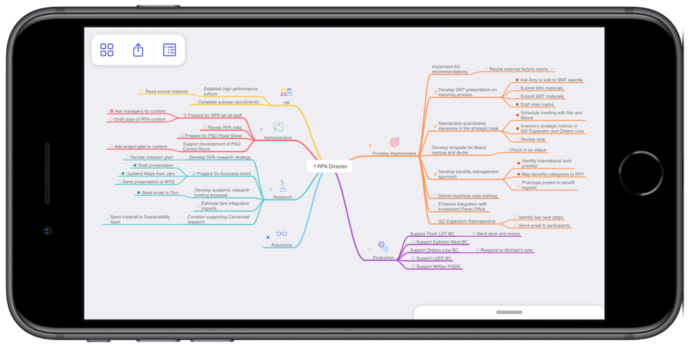
MindNode is an excellent app for mind mapping. I’ve created a mind map that contains all of my work-related projects across my areas of focus. I find this perspective on my projects really helpful when conducting a weekly review, especially since it gives me a quick sense of how well my projects are balanced across areas. As an example, the screenshot below of my mind map makes it very clear that I’m currently very active with Process Improvement, while not at all engaged in Assurance. I know that this is okay for now, but certainly want to keep an eye on this imbalance over time. I also find the visual presentation really helpful for seeing connections across projects.
MindNode has many great features that make creating and maintaining mind maps really easy. They look good too, which helps when you spend lots of time looking at them.
Agenda is a time-based note taking app. MacStories has done a thorough series of reviews, so I won’t describe the app in any detail here. There is a bit of a learning curve to get used to the idea of a time-based note, though it fits in really well to my meeting-dominated days and I’ve really enjoyed using it.
One point to make about both apps is that they are integrated with the new iOS Reminders system. The new Reminders is dramatically better than the old one and I’ve found it really powerful to have other apps leverage Reminders as a shared task database. I’ve also found it to be more than sufficient for the residual tasks that I need to track that aren’t in MindNode or Agenda.
I implemented this new approach a month ago and have stuck with it. This is at least three weeks longer than any previous attempt to move away from Things. So, the experiment has been a success. If my circumstances change, I’ll happily return to Things. For now, this new approach has worked out very well.
RStats on iPad
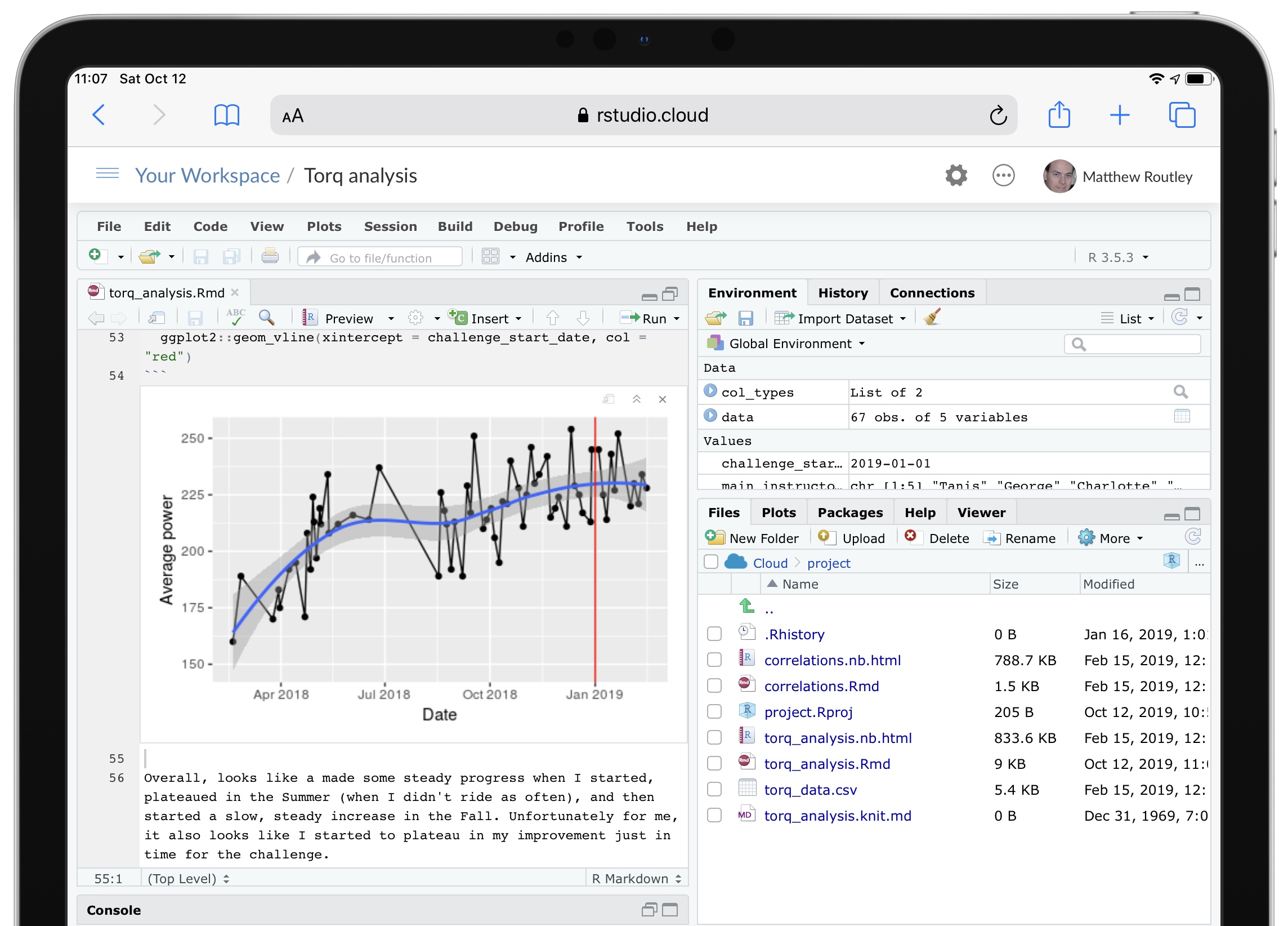
Among the many good new features in iPadOS, “Desktop Safari” has proven to be surprisingly helpful for my analytical workflows.
RStudio Cloud is a great service that provides a feature-complete version of RStudio in a web browser. In previous versions of Safari on iPad, RStudio Cloud was close to unusable, since the keyboard shortcuts didn’t work and they’re essential for using RStudio. In iPadOS, all of the shortcuts work as expected and RStudio Cloud is completely functional.
Although most of my analytical work will still be on my desktop, having RStudio on my iPad adds a very convenient option. RStudio Cloud also allows you to setup a project with an environment that persists across any device. So, now I can do most of my work at home, then fix a few issues at work, and refine at a coffee shop. Three different devices all using the exact same RStudio project.
One complexity with an RStudio Cloud setup is GitHub access. The usual approach of putting your git credentials in an .REnviron file (or equivalent) is a bad idea on a web service like RStudio Cloud. So, you need to type your git credentials into the console. To avoid having to do this very frequently, follow this advice and type this into the console:
git config --global credential.helper 'cache --timeout 3600'
My iPhone Home Screen
My goal for the home screen is to stay focused on action by making it easy to quickly capture my intentions and to minimize distractions. With previous setups I often found that I’d unlock the phone, be confronted by a screen full of apps with notification badges, and promptly forget what I had intended to do. So, I’ve reduced my home screen to just two apps.

Drafts is on the right and is likely my most frequently used app. As the tag line for the app says, this is where text starts. Rather than searching for a specific app, launching it, and then typing, Drafts always opens up to a blank text field. Then I type whatever is on my mind and send it from Drafts to the appropriate app. So, text messages, emails, todos, meeting notes, and random ideas all start in Drafts. Unfortunately my corporate iPhone blocks iCloud Drive, so I can’t use Drafts to share notes across my devices. Anything that I want to keep gets moved into Apple Notes.
Things is on the left and is currently my favoured todo app. All of my tasks, projects, and areas of focus are in there, tagged by context, and given due dates, if appropriate. If the Things app has a notification badge, then I’ve got work to do today. If you’re keen, The Sweet Setup has a great course on Things.
A few more notes on my setup:
- If Drafts isn’t the right place to start, I just pull down from the home screen to activate search and find the right app. I’ve found that the Siri Suggestions are often what I’m looking for (based on time of day and other context).
- Some apps are more important for their output than input. These include calendar, weather, and notes. I’ve set these up as widgets in the Today View. A quick slide to the right reveals these.
- I interact with several other apps through notifications, particularly for communication with Messages and Mail. But, I’ve set up VIPs in Mail to reduce these notifications to just the really important people.
I’ve been using this setup for a few months now and it certainly works for me. Even if this isn’t quite right for you, I’d encourage you to take a few minutes to really think through how you interact with your phone. I see far too many people with the default settings spending too much time scrolling around on their phones looking for the right app.
Fixing a hack finds a better solution
In my Elections Ontario official results post, I had to use an ugly hack to match Electoral District names and numbers by extracting data from a drop down list on the Find My Electoral District website. Although it was mildly clever, like any hack, I shouldn’t have relied on this one for long, as proven by Elections Ontario shutting down the website.
So, a more robust solution was required, which led to using one of Election Ontario’s shapefiles. The shapefile contains the data we need, it’s just in a tricky format to deal with. But, the sf package makes this mostly straightforward.
We start by downloading and importing the Elections Ontario shape file. Then, since we’re only interested in the City of Toronto boundaries, we download the city’s shapefile too and intersect it with the provincial one to get a subset:
download.file("[www.elections.on.ca/content/d...](https://www.elections.on.ca/content/dam/NGW/sitecontent/2016/preo/shapefiles/Polling%20Division%20Shapefile%20-%202014%20General%20Election.zip)",
              destfile = "data-raw/Polling%20Division%20Shapefile%20-%202014%20General%20Election.zip")
unzip("data-raw/Polling%20Division%20Shapefile%20-%202014%20General%20Election.zip",
      exdir = "data-raw/Polling%20Division%20Shapefile%20-%202014%20General%20Election")
prov_geo <- sf::st_read(“data-raw/Polling%20Division%20Shapefile%20-%202014%20General%20Election”,
layer = “PDs_Ontario”) %>%
sf::st_transform(crs = “+init=epsg:4326”)
download.file("opendata.toronto.ca/gcc/votin…",
destfile = “data-raw/voting_location_2014_wgs84.zip”)
unzip(“data-raw/voting_location_2014_wgs84.zip”, exdir=“data-raw/voting_location_2014_wgs84”)
toronto_wards <- sf::st_read(“data-raw/voting_location_2014_wgs84”, layer = “VOTING_LOCATION_2014_WGS84”) %>%
sf::st_transform(crs = “+init=epsg:4326”)
to_prov_geo <- prov_geo %>%
sf::st_intersection(toronto_wards)
Now we just need to extract a couple of columns from the data frame associated with the shapefile. Then we process the values a bit so that they match the format of other data sets. This includes converting them to UTF-8, formatting as title case, and replacing dashes with spaces:
electoral_districts <- to_prov_geo %>%
  dplyr::transmute(electoral_district = as.character(DATA_COMPI),
                   electoral_district_name = stringr::str_to_title(KPI04)) %>%
  dplyr::group_by(electoral_district, electoral_district_name) %>%
  dplyr::count() %>%
  dplyr::ungroup() %>%
  dplyr::mutate(electoral_district_name = stringr::str_replace_all(utf8::as_utf8(electoral_district_name), "\u0097", " ")) %>%
  dplyr::select(electoral_district, electoral_district_name)
electoral_districts
## Simple feature collection with 23 features and 2 fields
## geometry type: MULTIPOINT
## dimension: XY
## bbox: xmin: -79.61919 ymin: 43.59068 xmax: -79.12511 ymax: 43.83057
## epsg (SRID): 4326
## proj4string: +proj=longlat +datum=WGS84 +no_defs
## # A tibble: 23 x 3
## electoral_distri… electoral_distric… geometry
##
## 1 005 Beaches East York (-79.32736 43.69452, -79.32495 43…
## 2 015 Davenport (-79.4605 43.68283, -79.46003 43.…
## 3 016 Don Valley East (-79.35985 43.78844, -79.3595 43.…
## 4 017 Don Valley West (-79.40592 43.75026, -79.40524 43…
## 5 020 Eglinton Lawrence (-79.46787 43.70595, -79.46376 43…
## 6 023 Etobicoke Centre (-79.58697 43.6442, -79.58561 43.…
## 7 024 Etobicoke Lakesho… (-79.56213 43.61001, -79.5594 43.…
## 8 025 Etobicoke North (-79.61919 43.72889, -79.61739 43…
## 9 068 Parkdale High Park (-79.49944 43.66285, -79.4988 43.…
## 10 072 Pickering Scarbor… (-79.18898 43.80374, -79.17927 43…
## # ... with 13 more rows In the end, this is a much more reliable solution, though it seems a bit extreme to use GIS techniques just to get a listing of Electoral District names and numbers.
Elections Ontario official results
In preparing for some PsephoAnalytics work on the upcoming provincial election, I’ve been wrangling the Elections Ontario data. As provided, the data is really difficult to work with and we’ll walk through some steps to tidy these data for later analysis.
Here’s what the source data looks like:
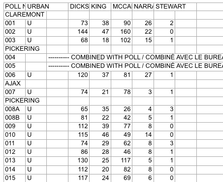
Screenshot of raw Elections Ontario data
A few problems with this:
- The data is scattered across a hundred different Excel files
- Candidates are in columns with their last name as the header
- Last names are not unique across all Electoral Districts, so can’t be used as a unique identifier
- Electoral District names are in a row, followed by a separate row for each poll within the district
- The party affiliation for each candidate isn’t included in the data
So, we have a fair bit of work to do to get to something more useful. Ideally something like:
## # A tibble: 9 x 5
##   electoral_district  poll candidate   party votes
##                <chr> <chr>     <chr>   <chr> <int>
## 1                  X     1         A Liberal    37
## 2                  X     2         B     NDP    45
## 3                  X     3         C      PC    33
## 4                  Y     1         A Liberal    71
## 5                  Y     2         B     NDP    37
## 6                  Y     3         C      PC    69
## 7                  Z     1         A Liberal    28
## 8                  Z     2         B     NDP    15
## 9                  Z     3         C      PC    34
This is much easier to work with: we have one row for the votes received by each candidate at each poll, along with the Electoral District name and their party affiliation.
Candidate parties
As a first step, we need the party affiliation for each candidate. I didn’t see this information on the Elections Ontario site. So, we’ll pull the data from Wikipedia. The data on this webpage isn’t too bad. We can just use the table xpath selector to pull out the tables and then drop the ones we aren’t interested in.
``` candidate_webpage <- "https://en.wikipedia.org/wiki/Ontario_general_election,_2014#Candidates_by_region" candidate_tables <- "table" # Use an xpath selector to get the drop down list by IDcandidates <- xml2::read_html(candidate_webpage) %>% rvest::html_nodes(candidate_tables) %>% # Pull tables from the wikipedia entry .[13:25] %>% # Drop unecessary tables rvest::html_table(fill = TRUE)
</pre> <p>This gives us a list of 13 data frames, one for each table on the webpage. Now we cycle through each of these and stack them into one data frame. Unfortunately, the tables aren’t consistent in the number of columns. So, the approach is a bit messy and we process each one in a loop.</p> <pre class="r"><code># Setup empty dataframe to store results candidate_parties <- tibble::as_tibble( electoral_district_name = NULL, party = NULL, candidate = NULL ) for(i in seq_along(1:length(candidates))) { # Messy, but works this_table <- candidates[[i]] # The header spans mess up the header row, so renaming names(this_table) <- c(this_table[1,-c(3,4)], "NA", "Incumbent") # Get rid of the blank spacer columns this_table <- this_table[-1, ] # Drop the NA columns by keeping only odd columns this_table <- this_table[,seq(from = 1, to = dim(this_table)[2], by = 2)] this_table %<>% tidyr::gather(party, candidate, -`Electoral District`) %>% dplyr::rename(electoral_district_name = `Electoral District`) %>% dplyr::filter(party != "Incumbent") candidate_parties <- dplyr::bind_rows(candidate_parties, this_table) } candidate_parties</code></pre> <pre># A tibble: 649 x 3
electoral_district_name party candidate
1 Carleton—Mississippi Mills Liberal Rosalyn Stevens
2 Nepean—Carleton Liberal Jack Uppal
3 Ottawa Centre Liberal Yasir Naqvi
4 Ottawa—Orléans Liberal Marie-France Lalonde
5 Ottawa South Liberal John Fraser
6 Ottawa—Vanier Liberal Madeleine Meilleur
7 Ottawa West—Nepean Liberal Bob Chiarelli
8 Carleton—Mississippi Mills PC Jack MacLaren
9 Nepean—Carleton PC Lisa MacLeod
10 Ottawa Centre PC Rob Dekker
# … with 639 more rows
</pre> </div> <div id="electoral-district-names" class="section level2"> <h2>Electoral district names</h2> <p>One issue with pulling party affiliations from Wikipedia is that candidates are organized by Electoral District <em>names</em>. But the voting results are organized by Electoral District <em>number</em>. I couldn’t find an appropriate resource on the Elections Ontario site. Rather, here we pull the names and numbers of the Electoral Districts from the <a href="https://www3.elections.on.ca/internetapp/FYED_Error.aspx?lang=en-ca">Find My Electoral District</a> website. The xpath selector is a bit tricky for this one. The <code>ed_xpath</code> object below actually pulls content from the drop down list that appears when you choose an Electoral District. One nuisance with these data is that Elections Ontario uses <code>--</code> in the Electoral District names, instead of the — used on Wikipedia. We use <code>str_replace_all</code> to fix this below.</p> <pre class="r"><code>ed_webpage <- "https://www3.elections.on.ca/internetapp/FYED_Error.aspx?lang=en-ca" ed_xpath <- "//*[(@id = \"ddlElectoralDistricts\")]" # Use an xpath selector to get the drop down list by ID electoral_districts <- xml2::read_html(ed_webpage) %>% rvest::html_node(xpath = ed_xpath) %>% rvest::html_nodes("option") %>% rvest::html_text() %>% .[-1] %>% # Drop the first item on the list ("Select...") tibble::as.tibble() %>% # Convert to a data frame and split into ID number and name tidyr::separate(value, c("electoral_district", "electoral_district_name"), sep = " ", extra = "merge") %>% # Clean up district names for later matching and presentation dplyr::mutate(electoral_district_name = stringr::str_to_title( stringr::str_replace_all(electoral_district_name, "--", "—"))) electoral_districts</code></pre> <pre># A tibble: 107 x 2
electoral_district electoral_district_name
1 001 Ajax—Pickering
2 002 Algoma—Manitoulin
3 003 Ancaster—Dundas—Flamborough—Westdale
4 004 Barrie
5 005 Beaches—East York
6 006 Bramalea—Gore—Malton
7 007 Brampton—Springdale
8 008 Brampton West
9 009 Brant
10 010 Bruce—Grey—Owen Sound
# … with 97 more rows
</pre> <p>Next, we can join the party affiliations to the Electoral District names to join candidates to parties and district numbers.</p> <pre class="r"><code>candidate_parties %<>% # These three lines are cleaning up hyphens and dashes, seems overly complicated dplyr::mutate(electoral_district_name = stringr::str_replace_all(electoral_district_name, "—\n", "—")) %>% dplyr::mutate(electoral_district_name = stringr::str_replace_all(electoral_district_name, "Chatham-Kent—Essex", "Chatham—Kent—Essex")) %>% dplyr::mutate(electoral_district_name = stringr::str_to_title(electoral_district_name)) %>% dplyr::left_join(electoral_districts) %>% dplyr::filter(!candidate == "") %>% # Since the vote data are identified by last names, we split candidate's names into first and last tidyr::separate(candidate, into = c("first","candidate"), extra = "merge", remove = TRUE) %>% dplyr::select(-first)</code></pre> <pre><code>## Joining, by = "electoral_district_name"</code></pre> <pre class="r"><code>candidate_parties</code></pre> <pre># A tibble: 578 x 4
electoral_district_name party candidate electoral_district
*
1 Carleton—Mississippi Mills Liberal Stevens 013
2 Nepean—Carleton Liberal Uppal 052
3 Ottawa Centre Liberal Naqvi 062
4 Ottawa—Orléans Liberal France Lalonde 063
5 Ottawa South Liberal Fraser 064
6 Ottawa—Vanier Liberal Meilleur 065
7 Ottawa West—Nepean Liberal Chiarelli 066
8 Carleton—Mississippi Mills PC MacLaren 013
9 Nepean—Carleton PC MacLeod 052
10 Ottawa Centre PC Dekker 062
# … with 568 more rows
</pre> <p>All that work just to get the name of each candiate for each Electoral District name and number, plus their party affiliation.</p> </div> <div id="votes" class="section level2"> <h2>Votes</h2> <p>Now we can finally get to the actual voting data. These are made available as a collection of Excel files in a compressed folder. To avoid downloading it more than once, we wrap the call in an <code>if</code> statement that first checks to see if we already have the file. We also rename the file to something more manageable.</p> <pre class="r"><code>raw_results_file <- "[www.elections.on.ca/content/d...](http://www.elections.on.ca/content/dam/NGW/sitecontent/2017/results/Poll%20by%20Poll%20Results%20-%20Excel.zip)" zip_file <- "data-raw/Poll%20by%20Poll%20Results%20-%20Excel.zip" if(file.exists(zip_file)) { # Only download the data once # File exists, so nothing to do } else { download.file(raw_results_file, destfile = zip_file) unzip(zip_file, exdir="data-raw") # Extract the data into data-raw file.rename("data-raw/GE Results - 2014 (unconverted)", "data-raw/pollresults") }</code></pre> <pre><code>## NULL</code></pre> <p>Now we need to extract the votes out of 107 Excel files. The combination of <code>purrr</code> and <code>readxl</code> packages is great for this. In case we want to filter to just a few of the files (perhaps to target a range of Electoral Districts), we declare a <code>file_pattern</code>. For now, we just set it to any xls file that ends with three digits preceeded by a “_“.</p> <p>As we read in the Excel files, we clean up lots of blank columns and headers. Then we convert to a long table and drop total and blank rows. Also, rather than try to align the Electoral District name rows with their polls, we use the name of the Excel file to pull out the Electoral District number. Then we join with the <code>electoral_districts</code> table to pull in the Electoral District names.</p> <pre class="r">file_pattern <- “*_[[:digit:]]{3}.xls” # Can use this to filter down to specific files poll_data <- list.files(path = “data-raw/pollresults”, pattern = file_pattern, full.names = TRUE) %>% # Find all files that match the pattern purrr::set_names() %>% purrr::map_df(readxl::read_excel, sheet = 1, col_types = “text”, .id = “file”) %>% # Import each file and merge into a dataframe
Specifying sheet = 1 just to be clear we’re ignoring the rest of the sheets
Declare col_types since there are duplicate surnames and map_df can’t recast column types in the rbind
For example, Bell is in both district 014 and 063
dplyr::select(-starts_with(“X__")) %>% # Drop all of the blank columns dplyr::select(1:2,4:8,15:dim(.)[2]) %>% # Reorganize a bit and drop unneeded columns dplyr::rename(poll_number =
POLL NO.) %>% tidyr::gather(candidate, votes, -file, -poll_number) %>% # Convert to a long table dplyr::filter(!is.na(votes), poll_number != “Totals”) %>% dplyr::mutate(electoral_district = stringr::str_extract(file, “[[:digit:]]{3}"), votes = as.numeric(votes)) %>% dplyr::select(-file) %>% dplyr::left_join(electoral_districts) poll_data</pre> <pre># A tibble: 143,455 x 5
poll_number candidate votes electoral_district electoral_district_name
1 001 DICKSON 73 001 Ajax—Pickering
2 002 DICKSON 144 001 Ajax—Pickering
3 003 DICKSON 68 001 Ajax—Pickering
4 006 DICKSON 120 001 Ajax—Pickering
5 007 DICKSON 74 001 Ajax—Pickering
6 008A DICKSON 65 001 Ajax—Pickering
7 008B DICKSON 81 001 Ajax—Pickering
8 009 DICKSON 112 001 Ajax—Pickering
9 010 DICKSON 115 001 Ajax—Pickering
10 011 DICKSON 74 001 Ajax—Pickering
# … with 143,445 more rows
</pre> <p>The only thing left to do is to join <code>poll_data</code> with <code>candidate_parties</code> to add party affiliation to each candidate. Because the names don’t always exactly match between these two tables, we use the <code>fuzzyjoin</code> package to join by closest spelling.</p> <pre class="r"><code>poll_data_party_match_table <- poll_data %>% group_by(candidate, electoral_district_name) %>% summarise() %>% fuzzyjoin::stringdist_left_join(candidate_parties, ignore_case = TRUE) %>% dplyr::select(candidate = candidate.x, party = party, electoral_district = electoral_district) %>% dplyr::filter(!is.na(party)) poll_data %<>% dplyr::left_join(poll_data_party_match_table) %>% dplyr::group_by(electoral_district, party) tibble::glimpse(poll_data)</code></pre> <pre>Observations: 144,323
Variables: 6
$ poll_number
“001”, “002”, “003”, “006”, “007”, “00… $ candidate
“DICKSON”, “DICKSON”, “DICKSON”, “DICK… $ votes
73, 144, 68, 120, 74, 65, 81, 112, 115… $ electoral_district
“001”, “001”, “001”, “001”, “001”, “00… $ electoral_district_name
“Ajax—Pickering”, “Ajax—Pickering”, “A… $ party
“Liberal”, “Liberal”, “Liberal”, “Libe… </pre> <p>And, there we go. One table with a row for the votes received by each candidate at each poll. It would have been great if Elections Ontario released data in this format and we could have avoided all of this work.</p> </div>
Charity donations by province
This tweet about the charitable donations by Albertans showed up in my timeline and caused a ruckus.
Albertans give the most to charity in Canada, 50% more than the national average, even in tough economic times. #CdnPoli pic.twitter.com/keKPzY8brO
— Oil Sands Action (@OilsandsAction) August 31, 2017
Many people took issue with the fact that these values weren’t adjusted for income. Seems to me that whether this is a good idea or not depends on what kind of question you’re trying to answer. Regardless, the CANSIM table includes this value. So, it is straightforward to calculate. Plus CANSIM tables have a pretty standard structure and showing how to manipulate this one serves as a good template for others.
library(tidyverse)
# Download and extract
url <- "[www20.statcan.gc.ca/tables-ta...](http://www20.statcan.gc.ca/tables-tableaux/cansim/csv/01110001-eng.zip)"
zip_file <- "01110001-eng.zip"
download.file(url,
              destfile = zip_file)
unzip(zip_file)
# We only want two of the columns. Specifying them here.
keep_data <- c("Median donations (dollars)",
               "Median total income of donors (dollars)")
cansim <- read_csv("01110001-eng.csv") %>%
  filter(DON %in% keep_data,
         is.na(`Geographical classification`)) %>% # This second filter removes anything that isn't a province or territory
  select(Ref_Date, DON, Value, GEO) %>%
  spread(DON, Value) %>%
  rename(year = Ref_Date,
         donation = `Median donations (dollars)`,
         income = `Median total income of donors (dollars)`) %>%
  mutate(donation_per_income = donation / income) %>%
  filter(year == 2015) %>%
  select(GEO, donation, donation_per_income)
cansim
## # A tibble: 16 x 3
## GEO donation donation_per_income
##
## 1 Alberta 450 0.006378455
## 2 British Columbia 430 0.007412515
## 3 Canada 300 0.005119454
## 4 Manitoba 420 0.008032129
## 5 New Brunswick 310 0.006187625
## 6 Newfoundland and Labrador 360 0.007001167
## 7 Non CMA-CA, Northwest Territories 480 0.004768528
## 8 Non CMA-CA, Yukon 310 0.004643499
## 9 Northwest Territories 400 0.003940887
## 10 Nova Scotia 340 0.006505932
## 11 Nunavut 570 0.005651398
## 12 Ontario 360 0.005856515
## 13 Prince Edward Island 400 0.008221994
## 14 Quebec 130 0.002452830
## 15 Saskatchewan 410 0.006910501
## 16 Yukon 420 0.005695688 Curious that they dropped the territories from their chart, given that Nunavut has such a high donation amount.
Now we can plot the normalized data to find how the rank order changes. We’ll add the Canadian average as a blue line for comparison.
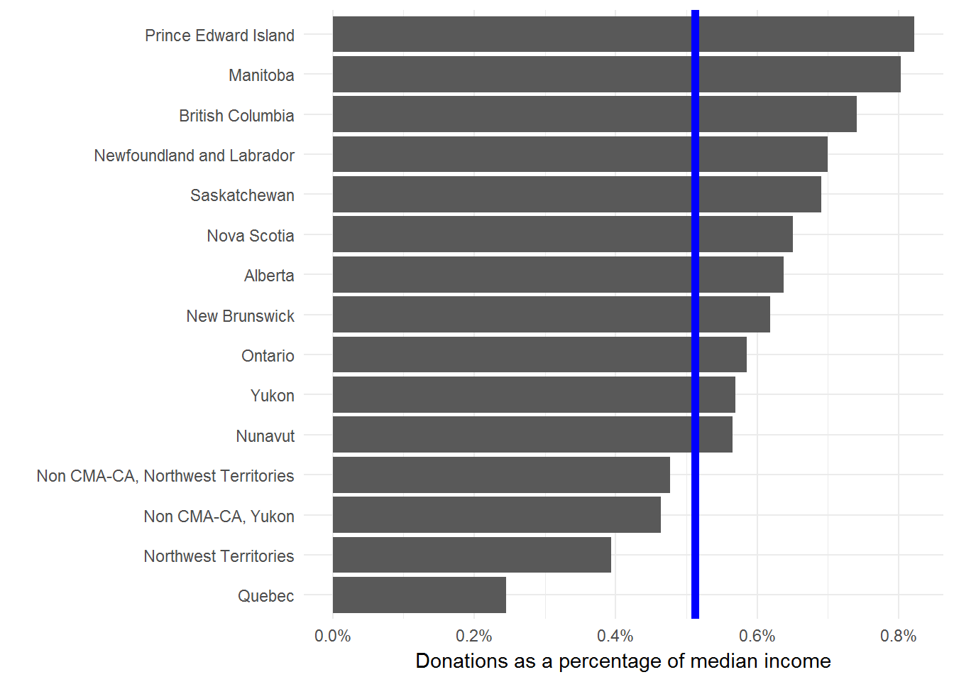
I’m not comfortable with using median donations (adjusted for income or not) to say anything in particular about the residents of a province. But, I’m always happy to look more closely at data and provide some context for public debates.
One major gap with this type of analysis is that we’re only looking at the median donations of people that donated anything at all. In other words, we aren’t considering anyone who donates nothing. We should really compare these median donations to the total population or the size of the economy. This Stats Can study is a much more thorough look at the issue.
For me the interesting result here is the dramatic difference between Quebec and the rest of the provinces. But, I don’t interpret this to mean that Quebecers are less generous than the rest of Canada. Seems more likely that there are material differences in how the Quebec economy and social safety nets are structured.
Canada LEED projects
The CaGBC maintains a list of all the registered LEED projects in Canada. This is a great resource, but rather awkward for analyses. I’ve copied these data into a DabbleDB application with some of the maps and tabulations that I frequently need to reference.
Here for example is a map of the density of LEED projects in each province. While here is a rather detailed view of the kinds of projects across provinces. There are several other views available. Are there any others that might be useful?
Instapaper Review
Instapaper is an integral part of my web-reading routine. Typically, I have a few minutes early in the morning and scattered throughout the day for quick scans of my favourite web sites and news feeds. I capture anything worth reading with Instapaper’s bookmarklet to create a reading queue of interesting articles. Then with a quick update to the iPhone app this queue is available whenever I find longer blocks of time for reading, particularly during the morning subway ride to work or late at night.
I also greatly appreciate Instapaper’s text view, which removes all the banners, ads, and link lists from the articles to present a nice and clean text view of the content only. I often find myself saving an article to Instapaper even when I have the time to read it, just so I can use this text-only view.
Instapaper is one of my favourite tools and the first iPhone application I purchased.
Stikkit from the command line
Note – This post has been updated from 2007-03-20 to describe new installation instructions.
Overview
I’ve integrated Stikkit into most of my workflow and am quite happy with the results. However, one missing piece is quick access to Stikkit from the command line. In particular, a quick list of my undone todos is quite useful without having to load up a web browser. To this end, I’ve written a Ruby script for interacting with Stikkit. As I mentioned, my real interest is in listing undone todos. But I decided to make the script more general, so you can ask for specific types of stikkits and restrict the stikkits with specific parameters. Also, since the stikkit api is so easy to use, I added in a method for creating new stikkits.
Usage
The general use of the script is to list stikkits of a particular type, filtered by a parameter. For example,
ruby stikkit.rb --list calendar dates=todaywill show all of today’s calendar events. While,
ruby stikkit.rb -l todos done=0lists all undone todos. The use of -l instead of --list is simply a standard convenience. Furthermore, since this last example comprises almost all of my use for this script, I added a convenience method to get all undone todos
ruby stikkit.rb -tA good way to understand stikkit types and parameters is to keep an eye on the url while you interact with Stikkit in your browser.
To create a new stikkit, use the --create flag,
ruby stikkit.rb -c 'Remember me.'The text you pass to stikkit.rb will be processed as usual by Stikkit.
Installation
Grab the script from the Google Code project and put it somewhere convenient. Making the file executable and adding it to your path will cut down on the typing. The script reads from a .stikkit file in your path that contains your username and password. Modify this template and save it as ~/.sikkit
     ---
     username: me@domain.org
     password: superSecret
The script also requires the atom gem, which you can grab with
gem install atomI’ve tried to include some flexibility in the processing of stikkits. So, if you don’t like using atom, you can switch to a different format provided by Stikkit. The text type requires no gems, but makes picking out pieces of the stikkits challenging.
Feedback
This script serves me well, but I’m interested in making it more useful. Feel free to pass along any comments or feature requests.
Yahoo Pipes and the Globe and Mail
Most of my updates arrive through feeds to NetNewsWire. Since my main source of national news and analysis is the Globe and Mail, I’m quite happy that they provide many feeds for accessing their content. The problem is that many news stories are duplicated across these feeds. Furthermore, tracking all of the feeds of interest is challenging.
The new Yahoo Pipes offer a solution to these problems. Without providing too much detail, pipes are a way to filter, connect, and generally mash-up the web with a straightforward interface. I’ve used this service to collect all of the Globe and Mail feeds of interest, filter out the duplicates, and produce a feed I can subscribe to. Nothing fancy, but quite useful. The pipe is publicly available and if you don’t agree with my choice of news feeds, you are free to clone mine and create your own. There are plenty of other pipes available, so take a look to see if anything looks useful to you. Even better, create your own.
If you really want those details, Tim O'Reilly has plenty.
Stikkit Todos in GMail
I find it useful to have a list of my unfinished tasks generally, but subtley, available. To this end, I’ve added my unfinished todos from Stikkit to my Gmail web clips. These are the small snippets of text that appear just above the message list in GMail.
All you need is the subscribe link from your todo page with the ‘not done’ button toggled. The url should look something like:
http://stikkit.com/todos.atom?api_key={}&done=0
Paste this into the 'Search by topic or URL:’ box of Web Clips tab in GMail settings.
DabbleDB
My experiences helping people manage their data has repeatedly shown that databases are poorly understood. This is well illustrated by the rampant abuses of spreadsheets for recording, manipulating, and analysing data.
Most people realise that they should be using a database, the real issue is the difficulty of creating a proper database. This is a legitimate challenge. Typically, you need to carefully consider all of the categories of data and their relationships when creating the database, which makes the upfront costs quite significant. Why not just start throwing data into a spreadsheet and worry about it later?
I think that DabbleDB can solve this problem. A great strength of Dabble –- and the source of its name — is that you can start with a simple spreadsheet of data and progressively convert it to a database as you begin to better understand the data and your requirements.
Dabble also has a host of great features for working with data. I’ll illustrate this with a database I created recently when we were looking for a new home. This is a daunting challenge. We looked at dozens of houses each with unique pros and cons in different neighbourhoods and with different price ranges. I certainly couldn’t keep track of them all.
I started with a simple list of addresses for consideration. This was easily imported into Dabble and immediately became useful. Dabble can export to Google Earth, so I could quickly have an overview of the properties and their proximity to amenities like transit stops and parks. Next, I added in a field for asking price and MLS url which were also exported to Google Earth. Including price gave a good sense of how costs varied with location, while the url meant I could quickly view the entire listing for a property.
Next, we started scheduling appointments to view properties. Adding this to Dabble immediately created a calendar view. Better yet, Dabble can export this view as an iCal file to add into a calendaring program.
Once we started viewing homes, we began to understand what we really were looking for in terms of features. So, add these to Dabble and then start grouping, searching, and sorting by these attributes.
All of this would have been incredibly challenging without Dabble. No doubt, I would have simply used a spreadsheet and missed out on the rich functionality of a database.
Dabble really is worth a look. The best way to start is to watch the seven minute demo and then review some of the great screencasts.
Stikkit-- Out with the mental clutter
I like to believe that my brain is useful for analysis, synthesis, and creativity. Clearly it is not proficient at storing details like specific dates and looming reminders. Nonetheless, a great deal of my mental energy is devoted to trying to remember such details and fearing the consequences of the inevitable “it slipped my mind”. As counselled by GTD, I need a good and trustworthy system for removing these important, but distracting, details and having them reappear when needed. I’ve finally settled in on the new product from values of n called Stikkit.
Stikkit appeals to me for two main reasons: easy data entry and smart text processing. Stikkit uses the metaphor of the yellow sticky note for capturing text. When you create a new note, you are presented with a simple text field — nothing more. However, Stikkit parses your note for some key words and extracts information to make the note more useful. For example, if you type:
Phone call with John Smith on Feb 1 at 1pm
Stikkit realises that you are describing an event scheduled for February 1st at one in the afternoon with a person (“peep” in Stikkit slang) named John Smith. A separate note will be created to track information about John Smith and will be linked to the phone call note. If you add the text “remind me” to the note, Stikkit will send you an email and SMS message prior to the event. You can also include tags to group notes together with the keywords “tag as”.
A recent update to peeps makes them even more useful. Stikkit now collects information about people as you create notes. So, for example, if I later post:
- Send documents to John Smith john@smith.net
Stikkit will recognise John Smith and update my peep for him with the email address provided. In this way, Stikkit becomes more useful as you continue to add information to notes. Also, the prefixed “-” causes Stikkit to recognise this note as a todo. I can then list all of my todos and check them off as they are completed.
This text processing greatly simplifies data entry, since I don’t need to click around to create todos are choose dates from a calendar picker. Just type in the text, hit save, and I’m done. Fortunately, Stikkit has been designed to be smart rather than clever. The distinction here is that Stikkit relies on some key words (such as at, for, to) to mark up notes consistently and reliably. Clever software is exemplified by Microsoft Word’s autocorrect or clipboard assistant. My first goal when encountering these “features” is to turn them off. I find they rarely do the right thing and end up being a hindrance. Stikkit is well worth a look. For a great overview check out the screencasts in the forum.
Mac vs. PC Remotes

I grabbed this image while preparing a new Windows machine. This seems to be an interesting comparison of the difference in design approaches between Apple and PC remotes. Both provide essentially the same functions. Clearly, however, one is more complex than the other. Which would you rather use?
Plantae's continued development
Prior to general release, plantae is moving web hosts. This seems like a good time to point out that all of plantae’s code is hosted at Google Code. The project has great potential and deserves consistent attention. Unfortunately, I can’t continue to develop the code. So, if you have an interest in collaborative software, particularly in the scientific context, I encourage you to take a look.
Text processing with Unix
I recently helped someone process a text file with the help of Unix command line tools. The job would have been quite challenging otherwise, and I think this represents a useful demonstration of why I choose to use Unix.
The basic structure of the datafile was:
; A general header file ;
1
sample: 0.183 0.874 0.226 0.214 0.921 0.272 0.117
2
sample: 0.411 0.186 0.956 0.492 0.150 0.278 0.110
3
...
In this case the only important information is the second number of each line that begins with “sample:”. Of course, one option is to manually process the file, but there are thousands of lines, and that’s just silly.
We begin by extracting only the lines that begin with “sample:”. grep will do this job easily:
grep "^sample" input.txt
grep searches through the input.txt file and outputs any matching lines to standard output.
Now, we need the second number. sed can strip out the initial text of each line with a find and replace while tr compresses any strange use of whitespace:
sed 's/sample: //g' | tr -s ' '
Notice the use of the pipe (|) command here. This sends the output of one command to the input of the next. This allows commands to be strung together and is one of the truly powerful tools in Unix.
Now we have a matrix of numbers in rows and columns, which is easily processed with awk.
awk '{print $2;}'
Here we ask awk to print out the second number of each row.
So, if we string all this together with pipes, we can process this file as follows:
grep "^sample" input.txt | sed 's/sample: //g' | tr -s ' ' | awk '{print $2;}' > output.txt
Our numbers of interest are in output.txt.
Principles of Technology Adoption
Choosing appropriate software tools can be challenging. Here are the principles I employ when making the decision:
- Simple: This seems obvious, but many companies fail here. Typically, their downfall is focussing on a perpetual increase in feature quantity. I don’t evaluate software with feature counts. Rather, I value software that performs a few key operations well. Small, focussed tools result in much greater productivity than overly-complex, all-in-one tools. 37 Signals’ Writeboard is a great example of a simple, focussed tool for collaborative writing.
Open formats: I will not choose software that uses proprietary or closed data formats. Closed formats cause two main difficulties:
I must pay the proprietor of a closed format for the privilege of accessing my data. Furthermore, switching to a new set of software may require translating my data or, even worse, losing access altogether. Open formats allow me to access my data at any time and with any appropriate tool.
My tools are limited to the range of innovations that the proprietor deems important. Open formats allow me to take advantage of any great new tools that come available.
Flexible: As my requirements ebb and flow, I shouldn’t be locked into the constraints of a particular tool. The best options are internet-based, subscription plans. If I need more storage space or more access for collaborators, I simply choose a new subscription plan. Then, if things slow down, I can move back down to a basic plan and save money. The online backup service Strongpace, for example, has a subscription plan tied to the amount of storage and number of users required.
- Network: A good tool must be fully integrated into the network. The ability to collaborate with anyone or access my data from any computer are great boons to productivity. Many of the best tools are completely internet based; all that is required to use them is a web browser. This also means that the tool is monitored and maintained by a collection of experts and that the tool can be upgraded at any time without being locked into a version-number update. Furthermore, with data maintained on a network, many storage and backup problems are addressed. GMail, for example, stores over 2GB of email, free of charge with an innovative user interface.
Exemplars
These are some of my favourite adherents to the principles outlined above:
RSiteSearch
I’m not sure how this escaped my notice until now, but `RSiteSearch` is a very useful command in R. Passing a string to this function loads up your web browser with search results from the R documentation and mailing list. So, for example:
RSiteSearch("glm")
will show you everything you need to know about using R for generalised linear models.
R module for ConTeXt
I generally write my documents in Sweave format. This approach allows me to embed the code for analyses directly in the report derived from the analyses, so that all results and figures are generated dynamically with the text of the report. This provides both great documentation of the analyses and the convenience of a single file to keep track of and work with.
Now there is a new contender for integrating analysis code and documentation with the release of an R module for ConTeXt. I prefer the clean implementation and modern features of ConTeXt to the excellent, but aging, LaTeX macro package that Sweave relies on. So, using ConTeXt for my documents is a great improvement.
Here’s a simple example of using this new module. I create two randomly distributed, normal variables, test for a correlation between them, and plot their distribution.
\usemodule[r]

\starttext
Describe the motivation of the analyses first.

Now create some variables.

\startRhidden
x <- rnorm(1000, 0, 1)
y <- rnorm(1000, 0, 1)
\stopRhidden

Are they correlated?

\startR
model <- lm(y ~ x, data = test)
summary(model)
\stopR

Now we can include a figure.

\startR
pdf("testFigure.pdf")
plot(x, y)
dev.off()
\stopR

\startbuffer
\placefigure{Here it is}{\externalfigure[testFigure]}
\stopbuffer
\getbuffer

\stoptext
Processing this code produces a pdf file with all of the results produced from R, including the figure.
I had some minor difficulties getting this to work on my OS X machine, through no fault of the r module itself. There are two problems. The first is that, by default, write18 is not enabled, so ConTeXt can’t access R directly. Fix this by editing /usr/local/teTeX/texmf.cnf so that “shell_escape = t”. The next is that the R module calls @texmfstart@ which isn’t directly accessible from a stock installation of TeX. The steps required are described in the “Configuration of texmfstart” section of the ConTeXt wiki. I modified this slightly by placing the script in ~/bin so that I didn’t interfere with the installed teTeX tree. Now everything should work.