MindNode is indispensable to my workflow. My main use for it is in tracking all of my projects and tasks, supported by MindNode’s Reminders integration. I can see all of my projects, grouped by areas of focus, simultaneously which is great for weekly reviews and for prioritizing my work.
I’ve also found it really helpful for sketching out project plans. I can get ideas out of my head easily with quick entry and then drag and drop nodes to explore connections. Seeing connections among items and rearranging them really brings out the critical elements.
I’m very excited to be recruiting for a Data Governance Sponsor to join my team and help enhance the use of good data analytics in our decisions at Metrolinx.
I’m looking for someone that enjoys telling compelling stories with data and has a passion for collaborating to build clean and reliable analytical processes. If you know someone that could fit (maybe you!), please pass along the job ad
I’ve been negligent in supporting some of my favourite apps on the App Store. In many cases, I reviewed the app a few years ago and then never refreshed my ratings. So, I’m making a new commitment to updating my reviews for apps by picking at least one each month to refresh.
First up is Fantastical. This one took a real hit when they switched to a subscription pricing model. I get the controversy with subscriptions in general. For me, Fantastical has earned a spot on my short list of apps that I support with an ongoing subscription.
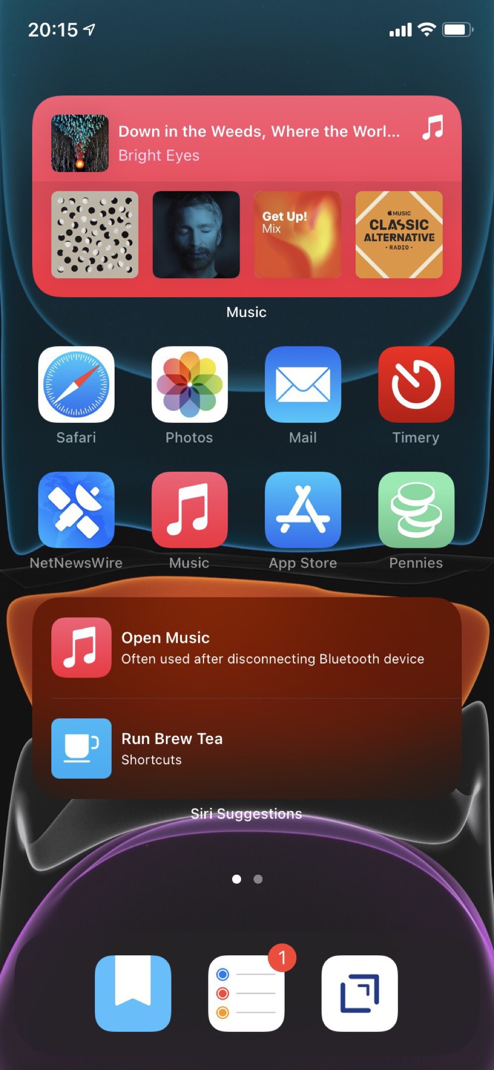
With the release of iOS 7, I’m reconsidering my earlier approach to the Home Screen. So far I’m trying out a fully automated first screen that uses the Smart Stack, Siri Suggestions, and Shortcut widgets. These are all automatically populated, based on anticipated use and have been quite prescient.
My second screen is all widgets with views from apps that I want to have always available. Although the dynamic content on the first screen has been really good, I do want some certainty about accessing specific content. This second screen replaces how I was using the Today View. I’m not really sure what to do with that feature anymore.
Skipping past the unnecessarily dramatic title, The Broken Algorithm That Poisoned American Transportation does make some useful points. As seems typical though these days, the good points are likely not the ones a quick reader would take away. My guess is most people see the headline and think that transportation demand models (TDMs) are inherently broken. Despite my biases, I don’t think this is actually true.
For me, the most important point is about a third of the way through:
I haven’t yet adopted the minimalist style of my iPhone for my iPad. Rather, I’ve found that setting up “task oriented” Shortcuts on my home screen is a good alternative to arranging lots of app icons.
The one I use the most is a “Reading” Shortcut, since this is my dominant use of the iPad. Nothing particularly fancy. Just a list of potential reading sources and each one starts up a Timery timer, since I like to track how much time I’m reading.
I’ve been keeping a “director’s commentary” of my experiences in Day One since August 2, 2012 (5,882 entries and counting). I’ve found this incredibly helpful and really enjoy the “On This Day” feature that shows all of my past entries on a particular day.
For the past few months, I’ve added in a routine based on the “5 minute PM” template which prompts me to add three things that happened that day and one thing I could have done to make the day better. This is a great point of reflection and will build up a nice library of what I’ve been doing over time.
watchOS 7 has some interesting new features for enhancing and sharing watch faces. After an initial explosion of developing many special purpose watch faces, I’ve settled on two: one for work and another for home.
Both watch faces use the Modular design with the date on the top left, time on the top right, and Messages on the bottom right. I like keeping the faces mostly the same for consistency and muscle memory.
Our predictions for the 2019 Federal race in Toronto were generated by our agent-based model that uses demographic characteristics and results from previous elections. Now that the final results are available, we can see how our predictions performed at the Electoral District level.
For this analysis, we restrict the comparison to just the major parties, as they were the only parties for which we estimated vote share. We also only compare the actual results to the predictions of our base scenario. In the future, our work will focus much more on scenario planning to explain political campaigns.
I’m neither an epidemiologist nor a medical doctor. So, no one wants to see my amateur disease modelling.
That said, I’ve complained in the past about Ontario’s open data practices. So, I was very impressed with the usefulness of the data the Province is providing for COVID: a straightforward csv file that is regularly updated from a stable URL.
Using the data is easy. Here’s an example of creating a table of daily counts and cumulative totals:
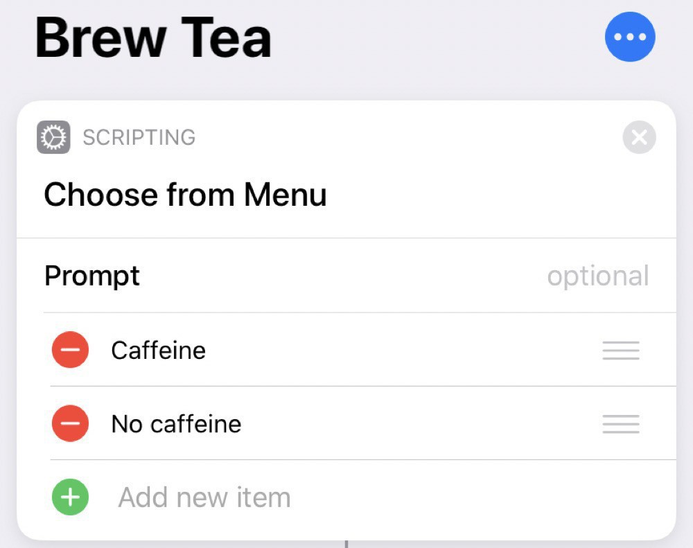
Since I’m mostly stuck inside these days, I find I’m drinking more tea than usual. So, as a modification of my brew coffee shortcut, I’ve created a brew tea shortcut.
This one is slightly more complicated, since I want to do different things depending on if the tea is caffeinated or not.
I’ve been tracking my time at work for a while now, with the help of Toggl and Timery. Now that I’m working from home, work and home life are blending together, making it even more useful to track what I’m doing.
Physical exercise is essential to my sanity. So, I wanted to integrate my Apple Watch workouts into my time tracking. I thought I’d be able to leverage integration with the Health app through Shortcuts to add in workout times. Turns out you can’t access this kind of information and I had to take a more indirect route using the Automation features in Shortcuts.
That said, it is often the smaller automations that add up over time to make a big difference. My most used one is also the simplest in my Shortcuts Library. I use it every morning when I make my coffee. All the shortcut does is set a timer for 60 seconds (my chosen brew time for the Aeropress) and logs 90mg of caffeine into the Health app.
I’m delivering a seminar on estimating capital costs for large transit projects soon. One of the main concepts that seems to confuse people is inflation (including the non-intuitive terms nominal and real costs). To guide this discussion, I’ve pulled data from Statistics Canada on the Consumer Price Index (CPI) to make a few points.
The first point is that, yes, things do cost more than they used to, since prices have consistently increased year over year (this is the whole point of monetary policy). I’m illustrating this with a long-term plot of CPI in Canada from 1914-01-01 to 2019-11-01.
Podcasts are great. I really enjoy being able to pick and choose interesting conversations from such a broad swath of topics. Somewhere along the way though, I managed to subscribe to way more than I could ever listen to and the unlistened count was inducing anxiety (I know, a real first world problem).
So, time to start all over again and only subscribe to a chosen few:
Quirks & Quarks is the one I’ve been subscribed to the longest and is a reliable overview of interesting science stories. I’ve been listening to this one for so long that I used to rely on an AppleScript to get episodes into my original scroll wheel iPod, well before podcasts were embraced by Apple.
In Our Time is another veteran on my list. I really like the three-academics format and Melvyn Bragg is a great moderator. This show has a fascinating diversity of topics in science, history, and literature.
All Songs Considered has helped me keep up with the latest music and Bob Boilen is a very good interviewer.
The Talk Show has kept me up to date on the latest in Apple and related news since at least 2007.
Exponent has really helped me think more clearly about strategy with discussions of tech and society.
Focused has been a very helpful biweekly reminder to think more carefully about what I’m working on and how to optimize my systems.
Making Sense has had reliably interesting discussions from Sam Harris. It just recently went behind a paywall. But I’m happy to pay for it, which comes with access to the Waking Up app.
I admire what Jesse Brown has built with CANADALAND and happily support it.
Mindscape has had some of the most interesting episodes of any of my subscriptions in the last several months. There’s definitely a bias towards quantum mechanics and physics, but there’s nothing wrong with that.
As outlined in our last two posts, our algorithm has “learned” how to simulate the behavioural traits of over 2 million voters in Toronto. This allows us to turn their behavioural “dials” and see what happens.
To demonstrate, we’ll simulate three scenarios:
The “likeability” of the Liberal Party falls by 10% from the baseline (i.e., continues to fall);
The Conservative Party announces a policy stance regarding climate change much more aligned with the other parties; and
People don’t vote strategically and no longer consider the probability of each candidate winning in their riding (i.e., they are free to vote for whomever they align with and like the most, somewhat as if proportional representation were a part of our voting system).
In our last post, our analysis assumed that voters had a very good sense of the winning probabilities for each candidate in their ridings. This was probably an unfair assumption to make - voters have a sense of which two parties might be fighting for the seat, but unlikely that they know the z-scores based on good sample size polls.
So, we’ve loosened that statistical knowledge a fair amount, whereby voters only have some sense of who is really in the running in their ridings. While that doesn’t change the importance of “likeability” (still averaging around 50% of each vote), it does change which parties’ votes are driven by “likeability” more than their policies.
The goal of PsephoAnalytics is to model voting behaviour in order to accurately explain political campaigns. That is, we are not looking to forecast ongoing campaigns – there are plenty of good poll aggregators online that provide such estimation. But if we can quantitatively explain why an ongoing campaign is producing the polls that it is, then we have something unique.
That is why agent-based modeling is so useful to us. Our model – as a proof of concept – can replicate the behaviour of millions of individual voters in Toronto in a parameterized way. Once we match their voting patterns to those suggested by the polls (specifically those from CalculatedPolitics, which provides riding-level estimates), we can compare the various parameters that make up our agents behaviour and say something about them.
For several years now, I’ve been a very happy Things user for all of my task management. However, recent reflections on the nature of my work have led to some changes. My role now mostly entails tracking a portfolio of projects and making sure that my team has the right resources and clarity of purpose required to deliver them. This means that I’m much less involved in daily project management and have a much shorter task list than in the past. Plus, the vast majority of my time in the office is spent in meetings to coordinate with other teams and identify new projects.
RStudio Cloud is a great service that provides a feature-complete version of RStudio in a web browser. In previous versions of Safari on iPad, RStudio Cloud was close to unusable, since the keyboard shortcuts didn’t work and they’re essential for using RStudio. In iPadOS, all of the shortcuts work as expected and RStudio Cloud is completely functional.
My goal for the home screen is to stay focused on action by making it easy to quickly capture my intentions and to minimize distractions. With previous setups I often found that I’d unlock the phone, be confronted by a screen full of apps with notification badges, and promptly forget what I had intended to do. So, I’ve reduced my home screen to just two apps.
Drafts is on the right and is likely my most frequently used app. As the tag line for the app says, this is where text starts. Rather than searching for a specific app, launching it, and then typing, Drafts always opens up to a blank text field. Then I type whatever is on my mind and send it from Drafts to the appropriate app. So, text messages, emails, todos, meeting notes, and random ideas all start in Drafts. Unfortunately my corporate iPhone blocks iCloud Drive, so I can’t use Drafts to share notes across my devices. Anything that I want to keep gets moved into Apple Notes.
Like many of us, my online presence had become scattered across many sites: Twitter, Instagram, LinkedIn, Tumblr, and a close-to-defunct personal blog. So much of my content has been locked into proprietary services, each of which seemed like a good idea to start with.
Looking back at it now, I’m not happy with this and wanted to gather everything back into something that I could control. Micro.blog seems like a great home for this, as well described in this post from Manton Reece (micro.blog’s creator). So, I’ve consolidated almost everything here. All that’s left out is Facebook, which I may just leave alone.
I’m very keen on backups. So many important things are digital now and, as a result, ephemeral. Fortunately you can duplicate digital assets, which makes backups helpful for preservation.
Most of my backup strategy was aimed at recovering from catastrophic loss, like a broken hard drive or stolen computer. I wasn’t sufficiently prepared for more subtle, corrosive loss of files. As a result, many videos of my kids’ early years were lost. This was really hard to take, especially given that I thought I was so prepared with backups.
My favourite spin studio has put on a fitness challenge for 2019. It has many components, one of which is improving your performance by 3% over six weeks. I’ve taken on the challenge and am now worried that I don’t know how reasonable this increase actually is. So, a perfect excuse to extract my metrics and perform some excessive analysis.
We start by importing a CSV file of my stats, taken from Torq’s website. We use readr for this and set the col_types in advance to specify the type for each column, as well as skip some extra columns with col_skip. I find doing this at the same time as the import, rather than later in the process, more direct and efficient. I also like the flexibility of the col_date import, where I can convert the source data (e.g., “Mon 11/02/19 - 6:10 AM”) into a format more useful for analysis (e.g., “2019-02-11”).
This is a “behind the scenes” elaboration of the geospatial analysis in our recent post on evaluating our predictions for the 2018 mayoral election in Toronto. This was my first, serious use of the new sf package for geospatial analysis. I found the package much easier to use than some of my previous workflows for this sort of analysis, especially given its integration with the tidyverse.
We start by downloading the shapefile for voting locations from the City of Toronto’s Open Data portal and reading it with the read_sf function. Then, we pipe it to st_transform to set the appropriate projection for the data. In this case, this isn’t strictly necessary, since the shapefile is already in the right projection. But, I tend to do this for all shapefiles to avoid any oddities later.
Our predictions for the 2018 mayoral race in Toronto were generated by our new agent-based model that used demographic characteristics and results of previous elections.
Now that the final results are available, we can see how our predictions performed at the census tract level.
For this analysis, we restrict the comparison to just Tory and Keesmaat, as they were the only two major candidates and the only two for which we estimated vote share. Given this, we start by just plotting the difference between the actual votes and the predicted votes for Keesmaat. The distribution for Tory is simply the mirror image, since their combined share of votes always equals 100%.
Thanks to generous support, the 4th Axe Pancreatic Cancer fundraiser was a great success. We raised over $32K this year and all funds support the PancOne Network. So far, we’ve raised close to $120K in honour of my Mom. Thanks to everyone that has supported this important cause!
It’s been a while since we last posted – largely for personal reasons, but also because we wanted to take some time to completely retool our approach to modeling elections.
In the past, we’ve tried a number of statistical approaches. Because every election is quite different to its predecessors, this proved unsatisfactory – there are simply too many things that change which can’t be effectively measured in a top-down view. Top-down approaches ultimately treat people as averages. But candidates and voters do not behave like averages; they have different desires and expectations.