I enjoyed reading this article on solitude in the woods and can particularly relate to:
this anxiety, which amounts to a sort of cost-benefit analysis of every passing moment, is a quintessentially modern predicament
I enjoyed reading this article on solitude in the woods and can particularly relate to:
this anxiety, which amounts to a sort of cost-benefit analysis of every passing moment, is a quintessentially modern predicament
Interrupting the usual feed content with a work announcement to say that I’m hiring. Anyone interested in cultivating a culture of evidence for transit decisions should take a look at this LinkedIn post for the Manager of Planning Analytics 🚉 🚃 🚌 🚲
Although difficult to choose, Death’s End by Cixin Liu is the best book of the trilogy. Incredibly imaginative and immense in scope with a hopeful end, despite some grim content. 📚
Some heavy snow flakes today

There was a raccoon in our office ceiling making all sorts of noise and commotion. As soon as the peanut butter trap was setup, the raccoon vanished. Must have been caught before and is wise to our tricks.
I upgraded from an iPhone 7 to 11. Now I’m back to having the best phone in the house, which is how it should be. I felt strange (jealous?) when my kids had better phones than me 😏
An interesting article on neurons being more complicated processors than originally thought: Neural Dendrites Reveal Their Computational Power - Quanta Magazine
After 13 years in our house, we’re starting a big renovation that requires moving out. I’m amazed (though shouldn’t be) at how cathartic it is to purge the accumulated junk. I hope that, as a family, we can be mindful about what we allow in, once the renovation is complete.
A good historical perspective on the Hubble constant: How they pinned a single, momentous number on the Universe
A good article on the importance of concentration: Playing chess is an essential life lesson in concentration
There are smiles under those scarves ⛷ ❄️

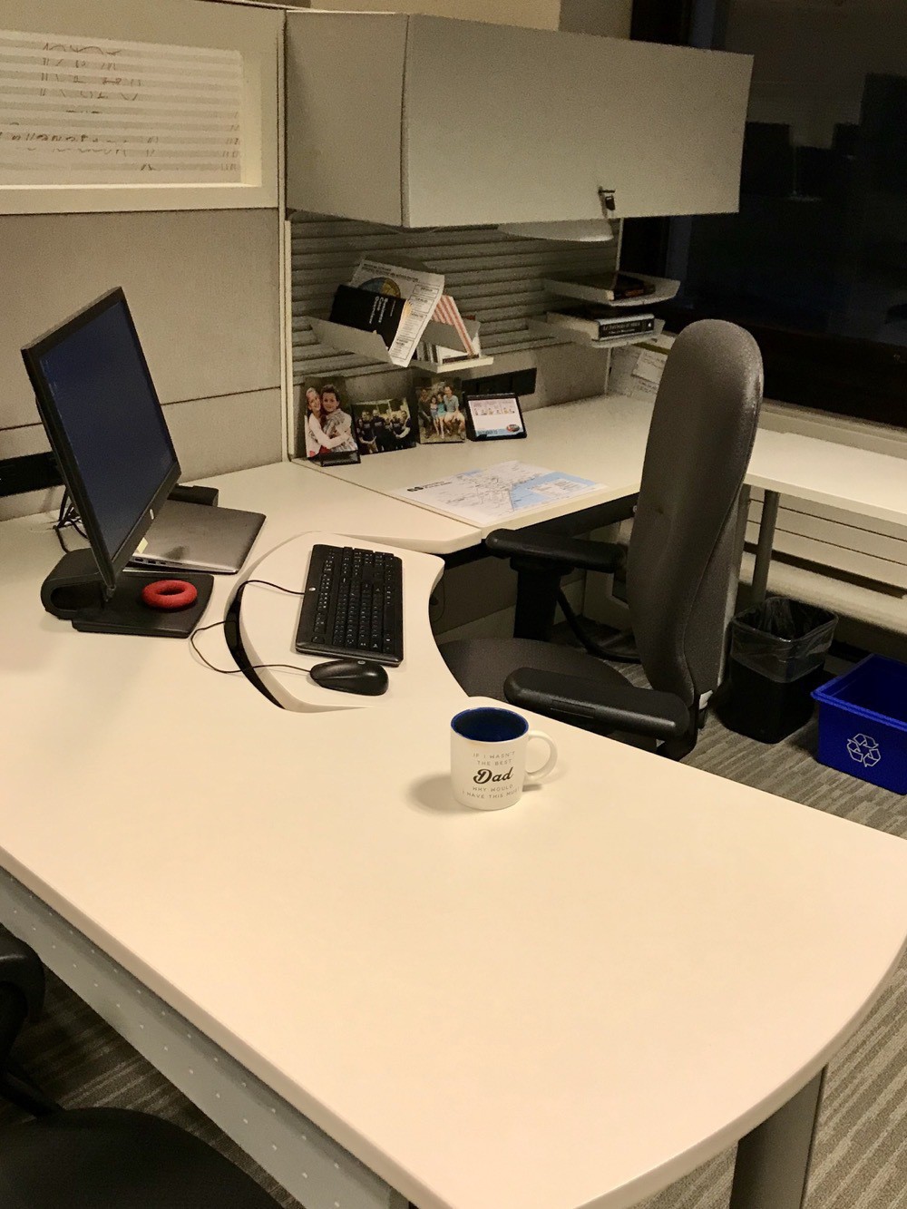
Our records management team is holding a “clean desk” contest to promote good practice.
Here’s my before image:
And, thanks to significant effort, the after:
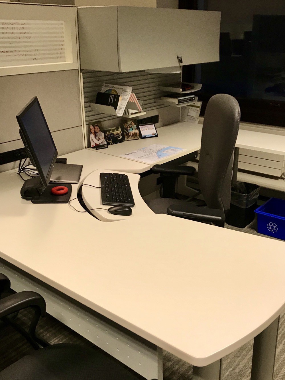
Maybe I’ll get most improved? 😀
Shorcuts in iOS is a great tool. Automating tasks significantly boosts productivity and some really impressive shortcuts have been created.
That said, it is often the smaller automations that add up over time to make a big difference. My most used one is also the simplest in my Shortcuts Library. I use it every morning when I make my coffee. All the shortcut does is set a timer for 60 seconds (my chosen brew time for the Aeropress) and logs 90mg of caffeine into the Health app.
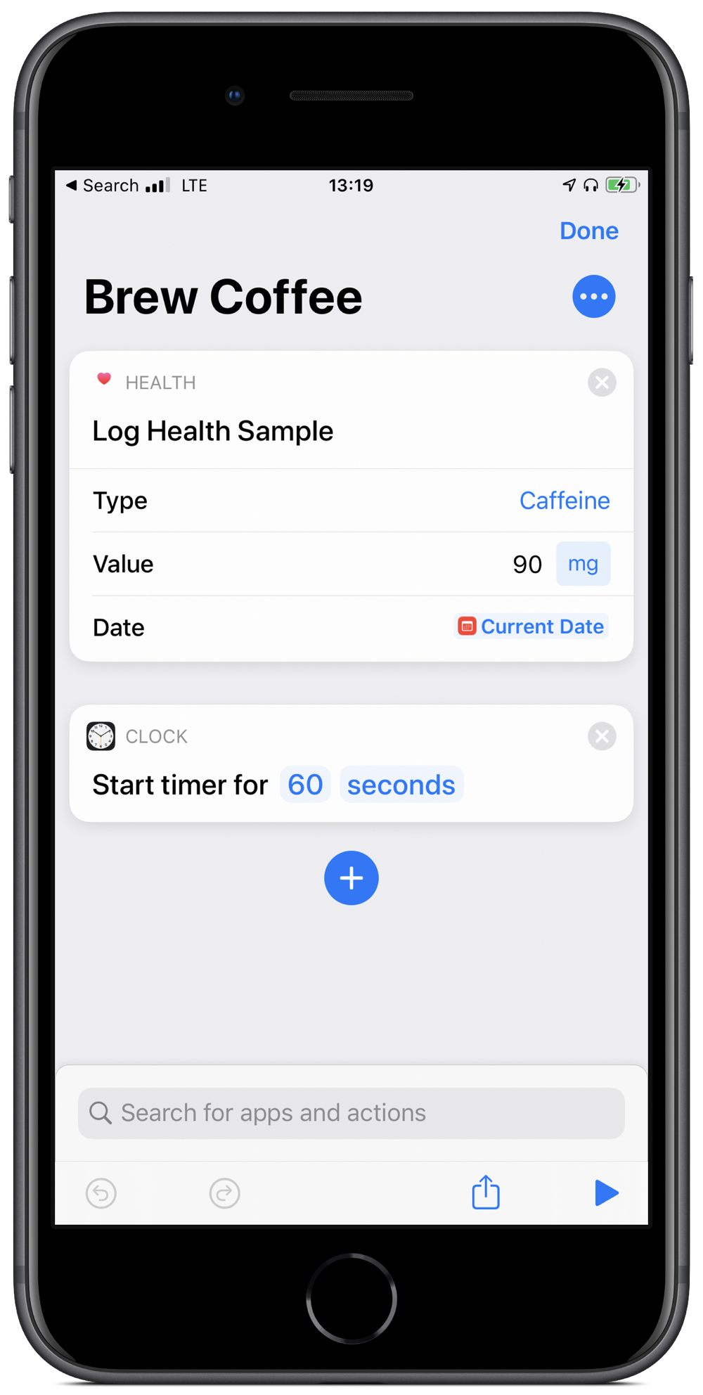
All I need to do is groggily say “Hey Siri, brew coffee” and then patiently wait for a minute. Well, that plus boil the water and grind the beans.
Simple, right? But that’s the point. Even simple tasks can be automated and yield consistencies and productivity gains.
With the hope that some public accountability will help, I’m declaring a 30-day ban on my use of the following sentence phrasing:
Something, but something else
I write this phrase often, but it is a lazy construction (okay, that was the last one 😀)
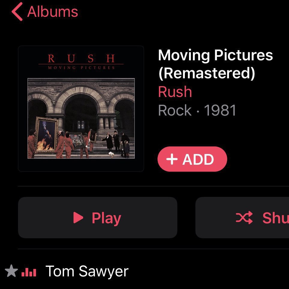
I’ve listened to more Rush in the past few days than in the last several years. I regret neglecting their music and am glad to have them back
This Micro Monday I’d like to suggest @Dominikhoecht for a good mix of interesting photos, parenting observations, and geekery.
Something Deeply Hidden by Sean Carroll is the best kind of non-fiction: engagingly written, sophisticated enough to take the audience seriously, and about a fascinating topic 📚
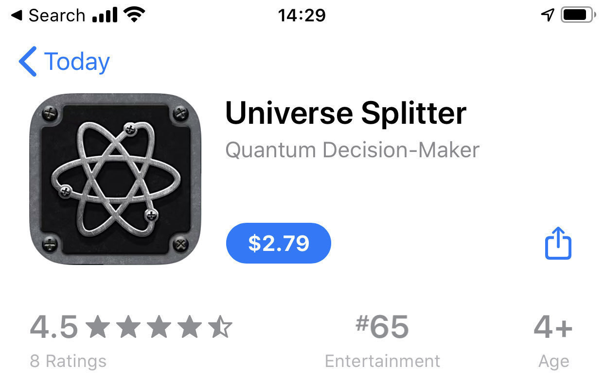
I find it amusing that the Universe Splitter app is categorized as entertainment: it splits the entire universe with the tap of a button! Should at least be a utility 😀
Farewell to Neil Peart. His music has been part of my life from the start. 🥁😢
I’m delivering a seminar on estimating capital costs for large transit projects soon. One of the main concepts that seems to confuse people is inflation (including the non-intuitive terms nominal and real costs). To guide this discussion, I’ve pulled data from Statistics Canada on the Consumer Price Index (CPI) to make a few points.
The first point is that, yes, things do cost more than they used to, since prices have consistently increased year over year (this is the whole point of monetary policy). I’m illustrating this with a long-term plot of CPI in Canada from 1914-01-01 to 2019-11-01.
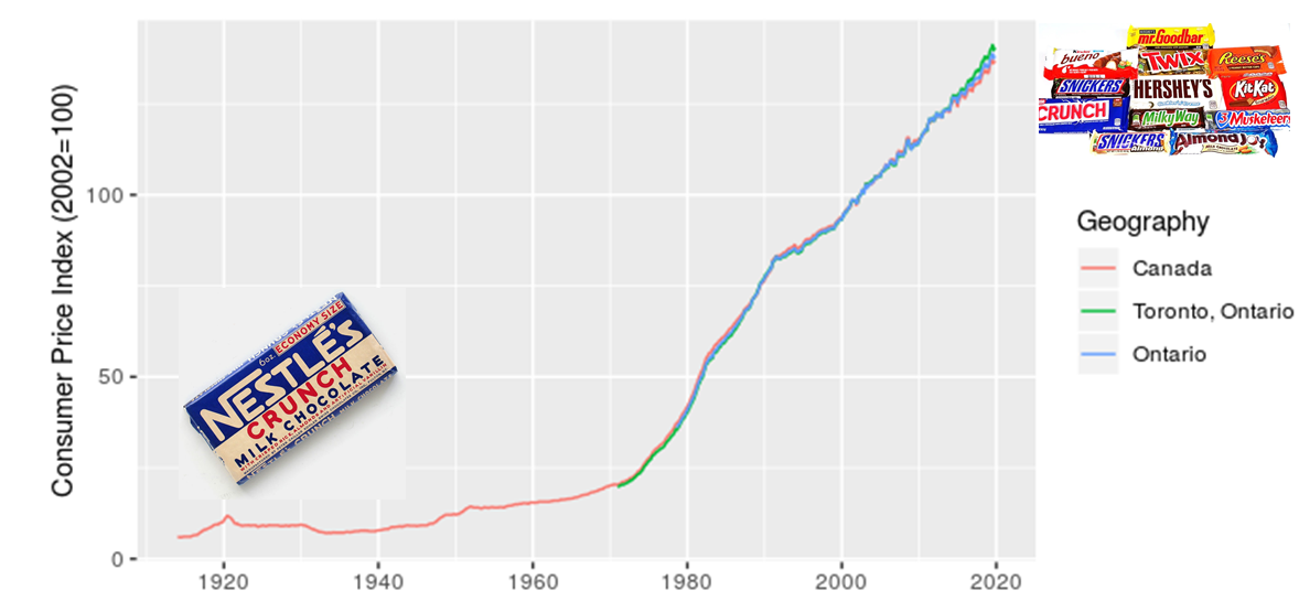
I added in the images of candy bars to acknowledge my grandmother’s observation that, when she was a kid, candy only cost a penny. I also want to make a point that although costs have increased, we also now have a much greater diversity of candy to choose from. There’s an important analogy here for estimating the costs of projects, particulary those with a significant portion of machinery or technology assets.
The next point I want to make is that location matters, which I illustrate with a zoomed in look at CPI for Canada, Ontario, and Toronto.
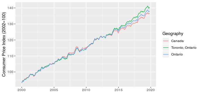
This shows that over the last five years Toronto has seen higher price increases than the rest of the province and country. This has implications for project costing, since we may need to consider the source of materials and location of the project to choose the most appropriate CPI adjustment.
The last point I want to make is that the type of product also matters. To start, I illustrate this by comparing CPI for apples and alcoholic beverages (why not, there are 330 product types in the data and I have to pick a couple of examples to start).
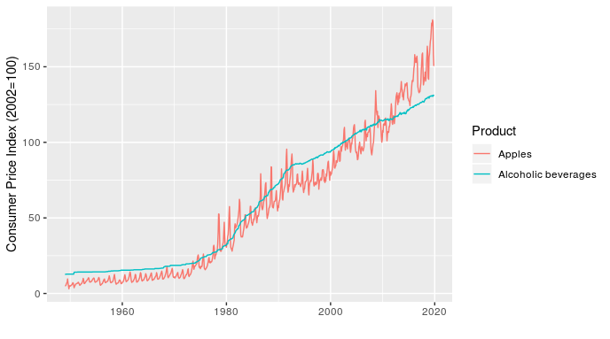
In addition to showing how relative price inflation between products can change over time (the line for apples crosses the one for alcoholic beverages several times), this chart shows how short-term fluctuations in price can also differ. For example, the line for apples fluctuates dramatically within a year (these are monthly values), while alcoholic beverages is very smooth over time.
Once I’ve made the point with a simple example, I can then follow up with something more relevant to transit planners by showing how the price of transportation, public transportation, and parking have all changed over time, relative to each other and all-items (the standard indicator).
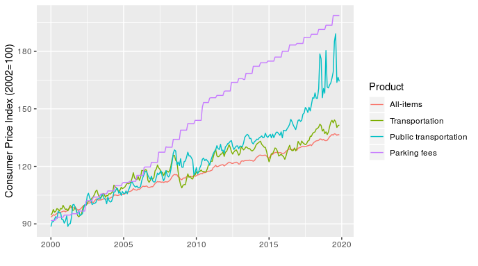
At least half of transit planning seems to actually be about parking, so that parking fees line is particularly relevant.
Making these charts is pretty straightforward, the only real challenge is that the data file is large and unwieldy. The code I used is here.