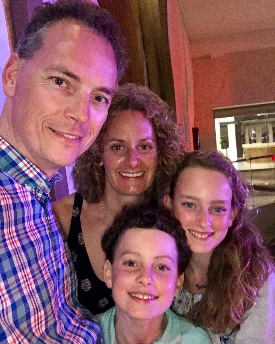
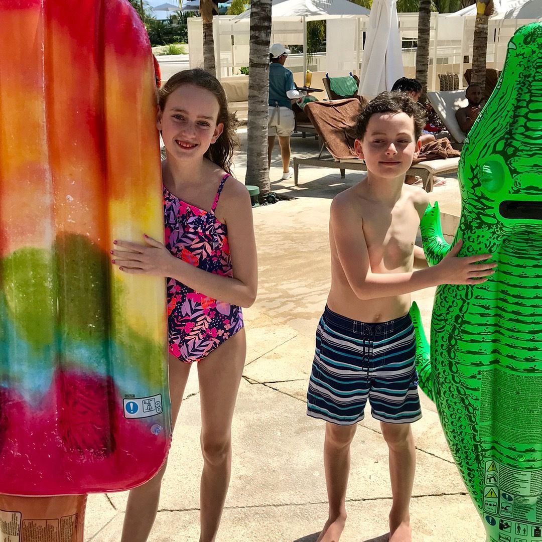
Sunday, May 27, 2018 →
Monday, May 21, 2018 →
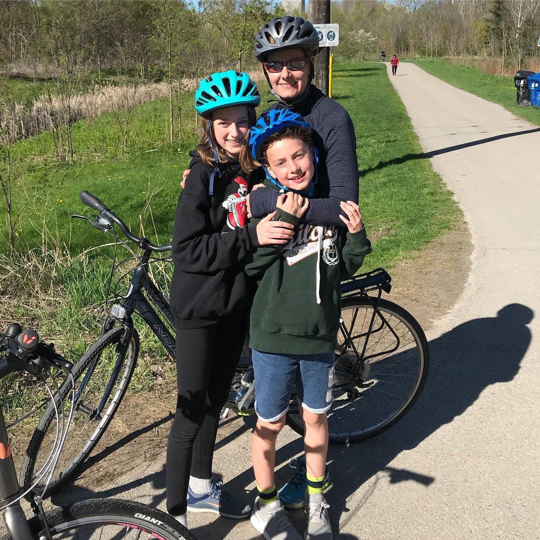
Saturday, May 12, 2018 →
Biking the Don Valley trail
Friday, May 4, 2018 →
Farewell Ron
Wednesday, May 2, 2018 →
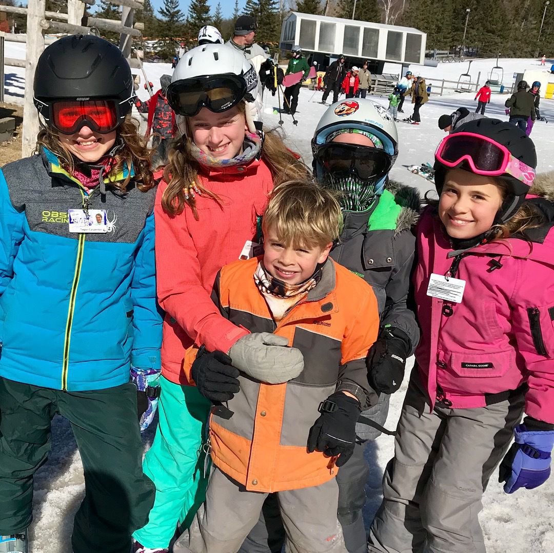
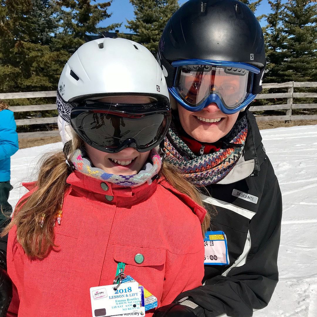
Saturday, March 24, 2018 →
Monday, March 12, 2018 →
Friday, March 9, 2018 →
Saturday, February 17, 2018 →
Thursday, February 15, 2018 →
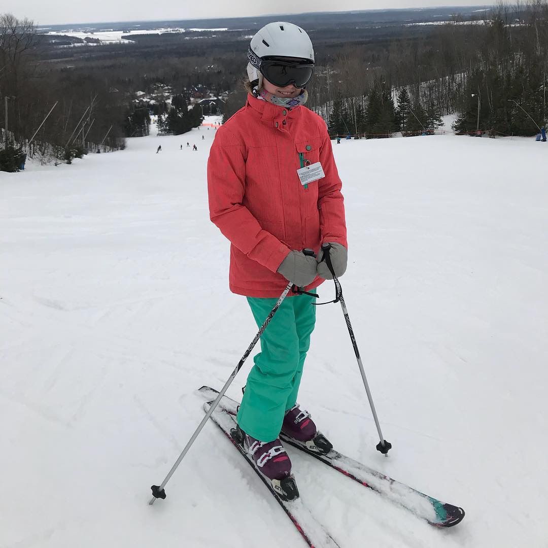
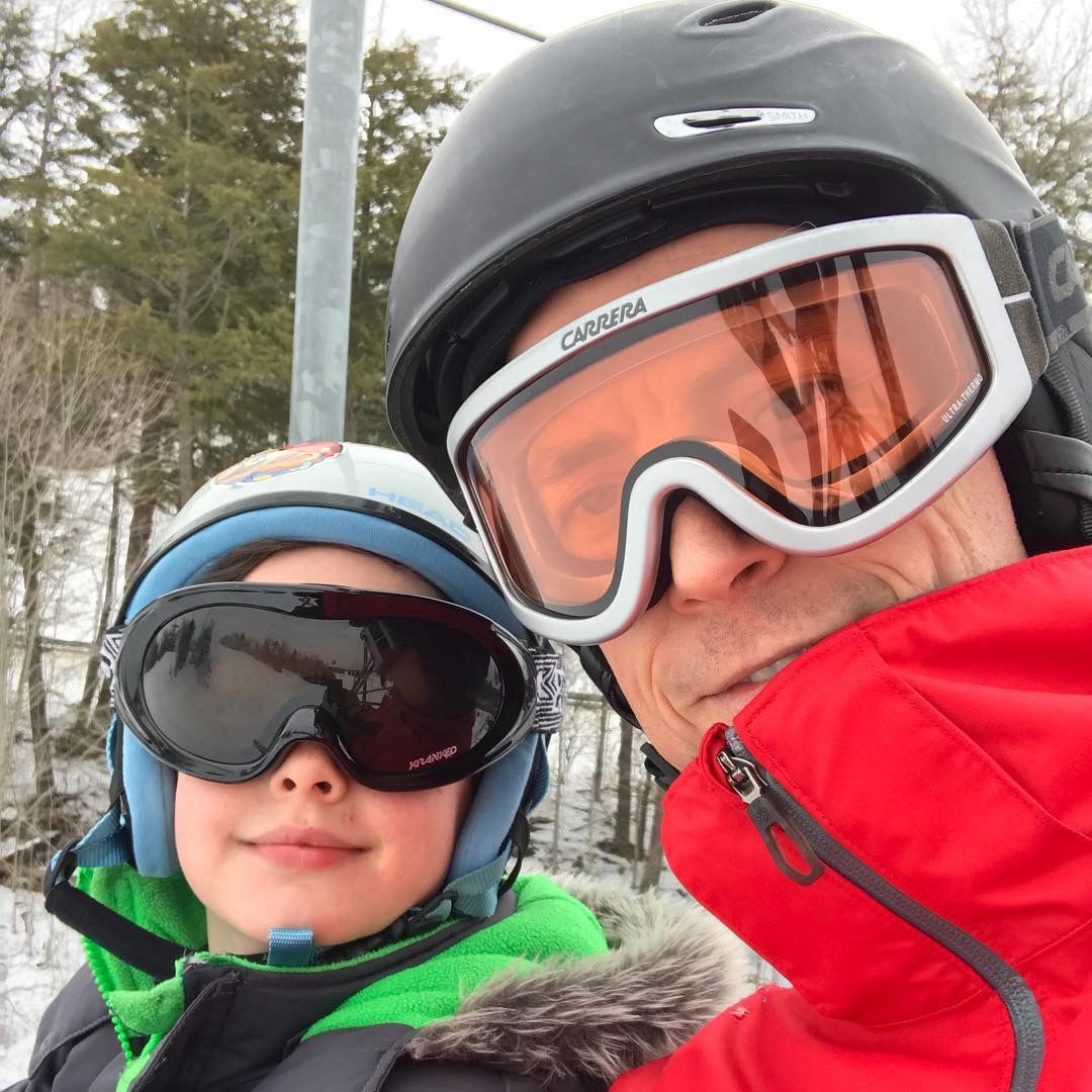
Ski day