Staying in touch with my team is important. So, I schedule a skip-level meeting with someone on the team each week. These informal conversations are great for getting to know everyone, finding out about new ideas, and learning about recent achievements.
Getting these organized across a couple of dozen people is logistically challenging and I’ve developed a Shortcut to automate most of the process.
Borrowing from Scotty Jackson, I have a base in AirTable with a record for each team member. I use this to store all sorts of useful information about everyone, including when we last had a skip-level meeting. The Shortcut uses this field to pull out team members that I haven’t met with in the past four months and then randomizes the list of names. Then it passes each name over to Fantastical while also incrementing the date by a week. The end result is a recurring set of weekly meetings, randomized across team members.
The hardest part of the Shortcut development was figuring out how to get the names in a random order. A big thank you to sylumer in the Automators forum for pointing out that the Files action can randomly sort any list, not just lists of files.
I’m not sharing the Shortcut here, since the implementation is very specific to my needs. Rather, I’m sharing some of the thinking behind the code, since I think that it demonstrates the general utility of something like Shortcuts for managing routine tasks with just a small amount of upfront effort.
Currently reading: Blueprint by Nicholas A. Christakis 📚
Thanks to Federico Vittici’s Apple Music Wrapped shortcut for analyzing my music library.
I enjoyed season 1 of The Man in the High Castle. A suitably realistic alternative history with an intriguing mystery of the strange films. I’ve heard seasons 3 and 4 are disappointing, so I’ll likely stop at the end of season 2 📺
20 Macs for 2020 was a fun series and, overall, I agree with the ranking.
Strictly for nostalgic reasons, I would have included the PowerBook G3. This was the first Mac I ever bought and I spent a lot of time with it in the first few years of grad school.
I ran the public beta of Mac OS X which was both incredibly slow and amazingly interesting. My recollection is that I only used AppleWorks and Audion. But, it led to a long interest in and use of open source software like R and LaTeX that continues to this day.
The Value of Everything by Mariana Mazzucato is an effective description of how our economy is constructed by decisions and assumptions over time. By defining value as the same as price, we confuse value creation and value extraction, which leads to many of the problems we see in today’s economic structures. Her proposals for change would help us achieve the world we’re striving for. 📚
Inspired by Coretex, I’m declaring Tangible as my theme for 2021.
I’ve chosen this theme because I want to spend less time looking at a screen and more time with “tangible stuff”. I’m sure that this is a common sentiment and declaring this theme will keep me focused on improvements.
Since working from home with an iPad, I’m averaging about 9 hours a day with an iOS device. This isn’t just a vague estimate; Screen Time gives me to-the-minute tracking of every app I’m actively using.
I’m certainly not a Luddite! The ability of these rectangles of glass to take on so many functions and provide so much meaningful content is astounding. There’s just something unsettling about the dominant role they play.
So, a few things I plan to try:
Although I’ll continue reading ebooks, since the convenience is so great, I’ll be rotating paper books into the queue regularly.
I’ve lost my running outdoor routine. Getting that back will be a nice addition to the Zoom classes and add in some very much needed fresh air.
As a family, we’ve been enjoying playing board games on weekends, just not routinely. Making sure we play at least one game a week will be good for all of us.
My son is keen on electronics. We’re going to try assembling a gaming PC for him from components, as well as learn some basic electronics with a breadboard and Arduino.
Our dog will be excited to get out for more regular walks with especially long ones on the weekend.
I’ll be adding much of this to Streaks, an app that I’ve found really helpful for building habits. I’ll also add a “tangible” tag to my time tracker to quantify the shift.
My hope is that I can find the right balance of screen time and tangible activities with intention.
Merry Christmas! 🎄🎅
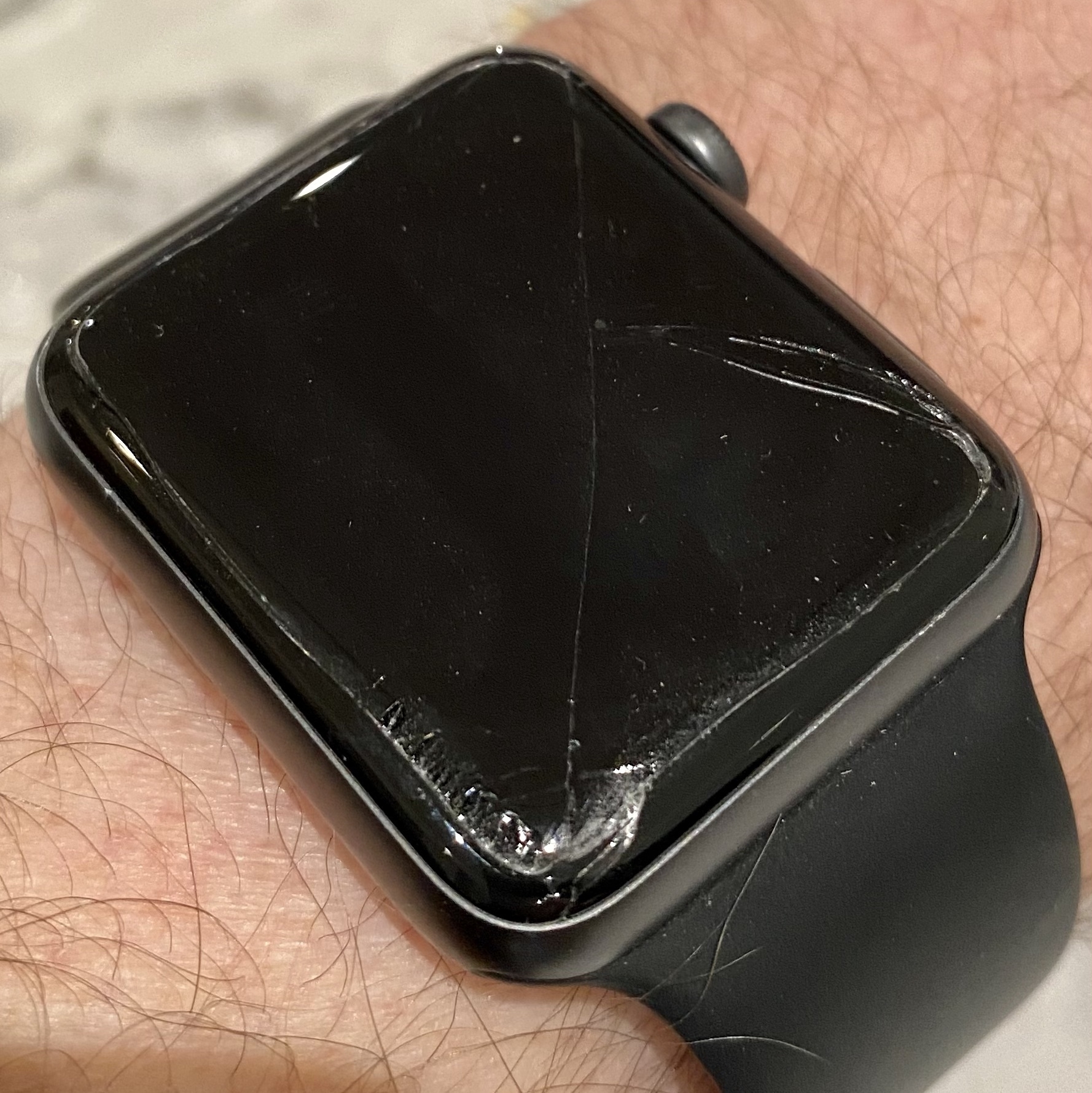
Quite disconcerting that I don’t know how or when I cracked the screen on my Apple Watch. The top left half still works, so not completely broken 😢
Three episodes in and I’m really enjoying season 5 of The Expanse 🚀🪐📺
I’m very happy that Tripping with Nils Frahm is released. Great music for working at home with headphones 🎧🎹
I’m catching up on 20 Macs for 2020 and just listened to the episode on the iMac G4. Brought back vivid memories of two intense months of finishing the writing of my thesis. I was sequestered in a small room with the lab’s iMac G4 and still remember how great it was to be able to move the screen around so easily. Super helpful when sitting at a desk typing for hours on end.
This video from Matt Parker on Excel is fantastic. Be sure to keep an eye on the chyron
MindNode is indispensable to my workflow. My main use for it is in tracking all of my projects and tasks, supported by MindNode’s Reminders integration. I can see all of my projects, grouped by areas of focus, simultaneously which is great for weekly reviews and for prioritizing my work.
I’ve also found it really helpful for sketching out project plans. I can get ideas out of my head easily with quick entry and then drag and drop nodes to explore connections. Seeing connections among items and rearranging them really brings out the critical elements.
MindNode’s design is fantastic and the app makes it really easy to apply styles across nodes. The relatively recent addition of tags has been great too. Overall, one of my most used apps.
I’m really looking forward to the live album Tripping with Nils Frahm being released soon. I’m impressed with how well he can translate his studio albums into a solo live show 🎵
Learning that Growl is retiring after 17 years really reinforces the notion that the legacy of a good project is so much more than just the code and application #mbnov
As the COVID lockdown continues, I miss being a pedestrian in the city. There’s nowhere to go! #mbnov