2021 iPhone Home Screens
My iPhone Home Screen continues to evolve and, now that we have Focus Modes, I’ve made some further adjustments.

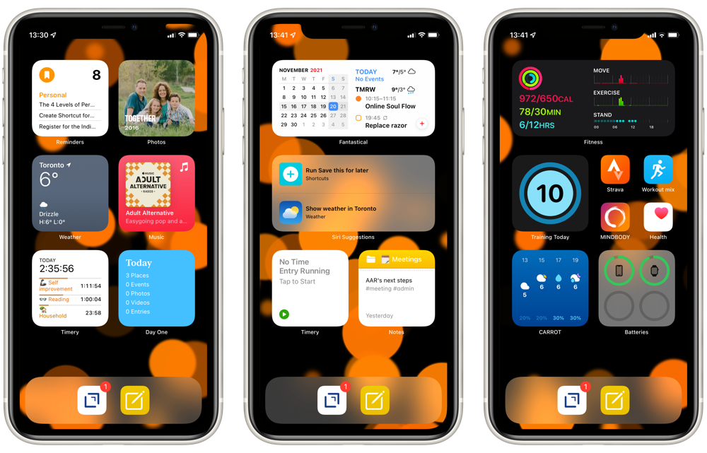
From left to right, I’m using three different Focus Modes: Personal, Work, and Fitness. The first two are entirely widget focused, while Fitness has a few app icons as well.
The dock has Drafts which, as the tagline says, is where text starts. This hasn’t changed from my earlier setups. The second icon launches a front-end Shortcut for Apple Notes. As I described in my Apple Note overview, this is an idea that I’ve borrowed from Matthew Cassinelli and provides a flexible interface to the app.
Personal
From top left, my Personal Home Screen starts with a stack of Reminders filtered to my Personal list, Fantastical, and Streaks. This is essentially my “what should I be doing” stack.
Next is a stack with Photos and Siri Suggestions. The Photos widget consistently surfaces delightful photos, so I’ve given it a prominent spot. While the usefulness of Siri Suggestions are variable, I like the idea of my phone learning my habits and showing me relevant actions.
Through the middle, I have Weather on the left and the right is a stack of Apple Music and Overcast, which are my options for listening to something.
On the bottom left is a stack of Timery and Screen Time. These are there to keep me mindful of what I’m actually doing, especially on weekends. The Timery widget shows me a summary view of my projects. So, in this screenshot I’ve put in an hour on exercise, another hour on reading, and 20 minutes with some household chores. The Screen Time widget helps keep me honest about how much I’m using my devices, especially on weekends when I really should be looking at something besides a screen.
And on the bottom right is a stack of Day One and Notes, filtered to my Personal folder. Day One is there for capturing family events and reflections. While the Notes folder often has some useful reference material for our weekend activities.
Work
Curiously, my Work Home Screen is less complicated than my Personal one.
The top is a stack with Fantastical and Mail’s VIP widget. I’m not entirely convinced that the Mail widget is useful here. I almost always just want Fantastical reminding me of my next meeting or task.
Given the more variable number of tasks I tend to be doing while in work mode, I’ve got the Siri Suggestions widget in the middle. I took this screenshot on the weekend, so it isn’t indicative of what it usually shows, which tends to be one of the Shortcuts that I’m often launching to manage my workday.
Intentionally mirroring my Personal HomeScreen, the bottom row is a stack with two Timery widgets and a stack of two Notes widgets, one filtered to my Work folder and the other to my Meetings folder.
Fitness
The Fitness Home Screen is mostly an experiment. I spend the vast majority of my time in one of the other two Focus Modes, so I’m not yet convinced that I need any other Home Screens.
Regardless, this one has the Fitness widget at the top for seemingly obvious reasons.
The middle row has the Training Today widget to help keep me honest about rest. And then a cluster of icons on the right. The only one that is non-standard is “Workout mix”, which is just a Shortcut to launch a good playlist in Apple Music.
The bottom row has Carrot Weather to make sure I’m not about to get rained on when heading out for a run. I’ve also added the Batteries widget there to make sure my Apple Watch and AirPods are ready for action.
I’ve set up Personal Automations to automatically switch between my Personal and Work Home Screens at 8:45 and 17:30. I’ve found these good reminders to keep my work activities within reasonable office hours. Starting a Workout automatically switches to the Fitness Home Screen.
There’s almost endless scope for fiddling with these. So, by writing them here, I’m adding some accountability to just stop that and use them for a while before making further changes.