Chernobyl on HBO is well worth checking out. Once you’re hooked, the associated podcast is a great companion
Chernobyl on HBO is well worth checking out. Once you’re hooked, the associated podcast is a great companion
Happy birthday Emma!


Going Critical is a great overview of diffusion in networks

Happy birthday to Kelly! 🎉


This conversation with Stuart Russell on the After On podcast is a fascinating discussion of important topics in AI 🎙
Emma and her puppy

I found The Strange Order of Things by Antonio Damasio surprisingly difficult to read. This Mindscape episode was a much more accessible introduction to the topic via a good conversation with Sean Carroll
The Hidden Reality by Brian Greene is a fascinating and clearly written tour of the many multiverse theories. Really mind bending stuff 📚
Morbid Stuff by PUP is oddly cheerful, nihilistic punk rock itunes.apple.com/ca/album/…
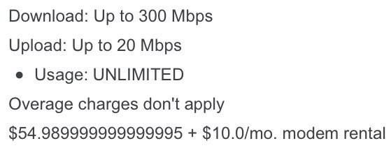
Seems like an unnecessarily precise monthly fee

A great discussion about Incredibles 2 on The Incomparable podcast. I agree with the overall assessment that it had many great moments, but didn’t hold together overall.
The mystery of computation, as something our brains do, is well described in this Aeon Essay
I’m very keen on backups. So many important things are digital now and, as a result, ephemeral. Fortunately you can duplicate digital assets, which makes backups helpful for preservation.
I have Backblaze, iCloud Drive, and Time Machine backups. I should be safe. But, I wasn’t.
Most of my backup strategy was aimed at recovering from catastrophic loss, like a broken hard drive or stolen computer. I wasn’t sufficiently prepared for more subtle, corrosive loss of files. As a result, many videos of my kids' early years were lost. This was really hard to take, especially given that I thought I was so prepared with backups.
Fortunately, I found an old Mac Mini in a closet that had most of the missing files! This certainly wasn’t part of my backup strategy, but I’ll take it.
So, just a friendly reminder to make sure your backups are actually working as you expect. We all know this. But, please check.
Wonderfully rich detail in the 5 podcast series from Brady Heywood on Apollo 13 🎙
The Travellers finale is a very satisfying ending to a great TV series 📺
There are useful lessons in this discussion of statistical significance for any evidence-informed process. There’s no magic number, uncertainty matters, and judgement is required.
Ancillary Justice by Ann Leckie is a great book with an intriguing main character, compelling plot, and fascinating world building 📚
Interested in transportation demand modelling and geospatial analysis? I’m looking for a Manager, Modelling & Geomatics to lead a team of passionate and effective analysts to help generate and communicate evidence for project evaluation
Garry Kasparov: The 8-year-old chess champion’s story is quintessentially American
Talent is universal, but opportunity is not, and talent cannot thrive in a vacuum.