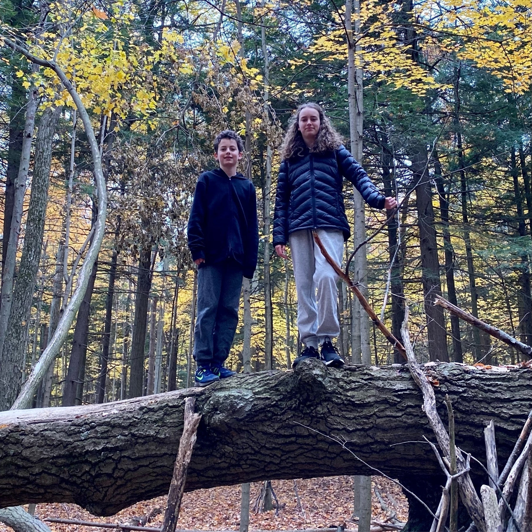
I often miss the days when I had to stoop down to pick up my kids for a hug. Though I’m very proud of the teenagers they have become #mbnov
I often miss the days when I had to stoop down to pick up my kids for a hug. Though I’m very proud of the teenagers they have become #mbnov
Hexagons are the Bestagons is good fun
Yesterday’s #mbnov word “astonish” would have been a great one for today, given how near the US presidential election is today
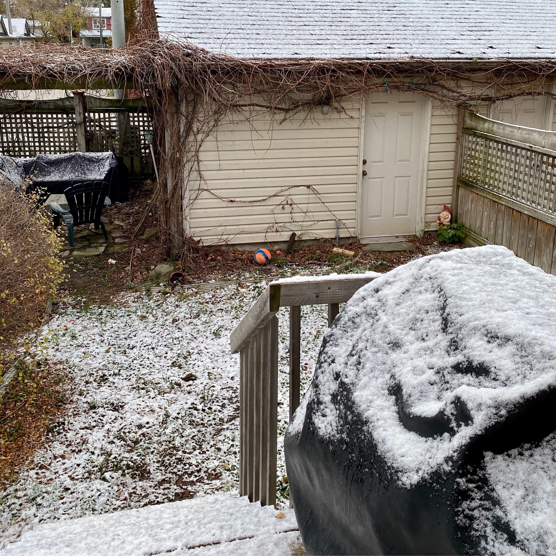
Every year I’m astonished by the first snowfall #mbnov
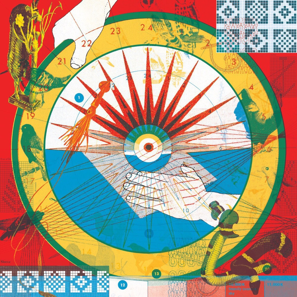
“We follow this new type of leader through upheaval. Because we have confidence. Not in their map, but in their compass”
Amy C Edmondson, How to lead in a crisis

Currently reading: Breath by James Nestor 📚
Having just finished a collection of quick, urgent projects, I’m looking forward to some time to concentrate on the big picture #mbnov
A couple of episodes in and I’m enjoying Long Way Up on Apple TV+. Relying on electric vehicles really adds to the adventure
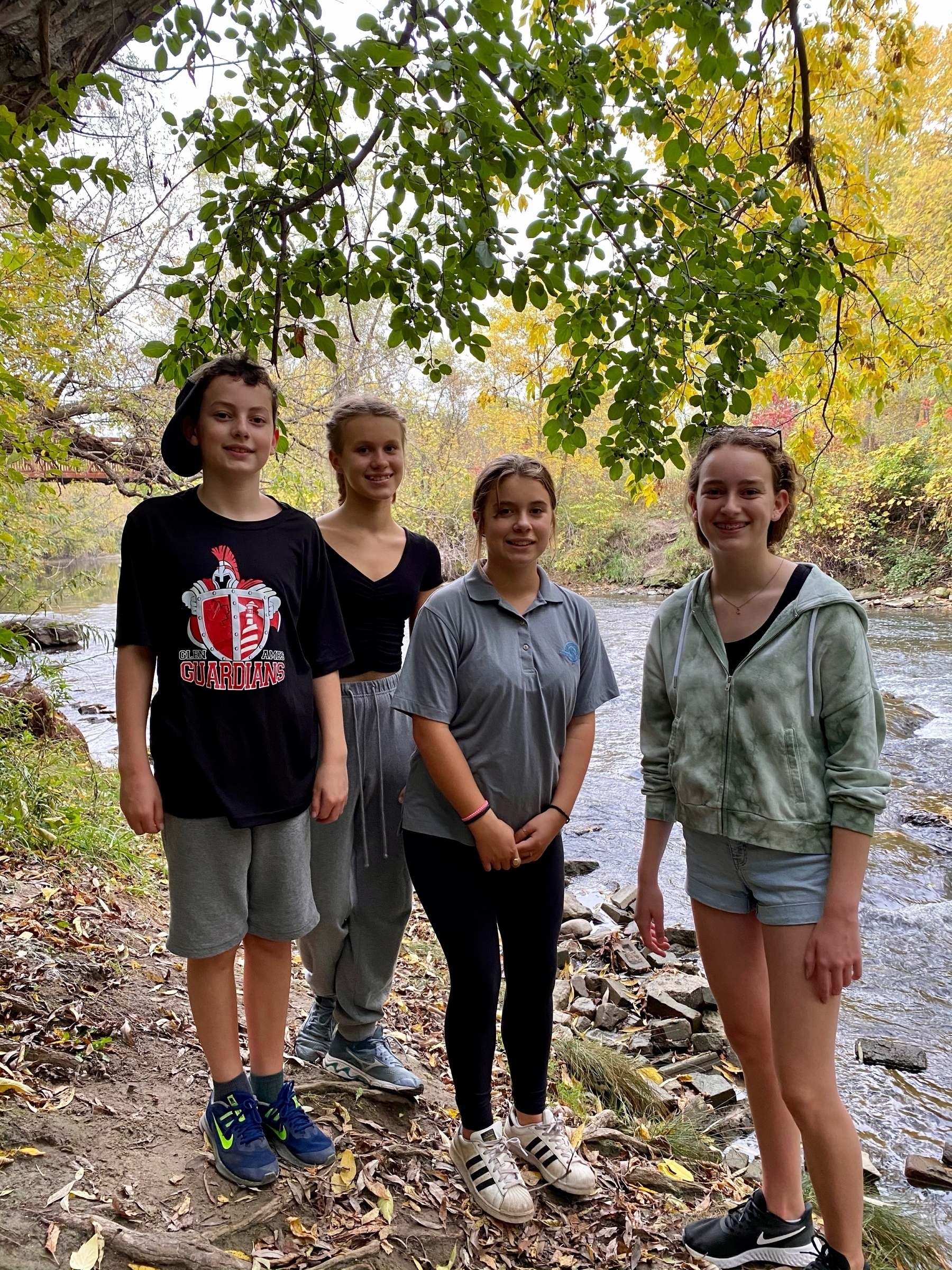
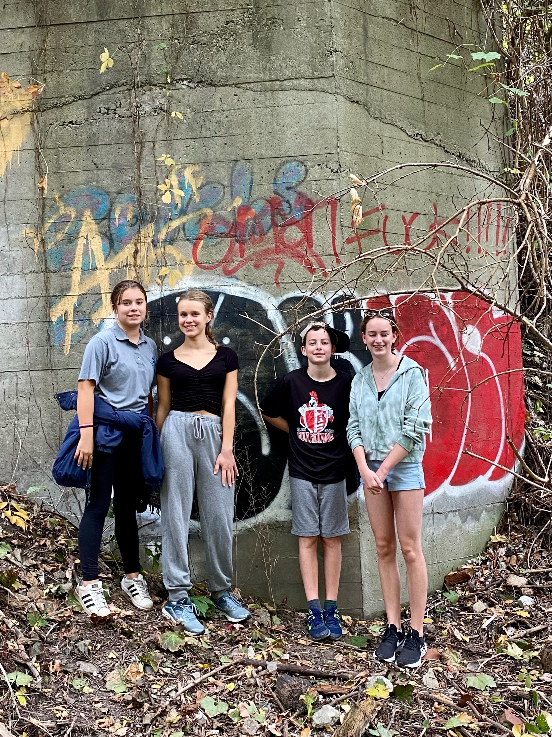
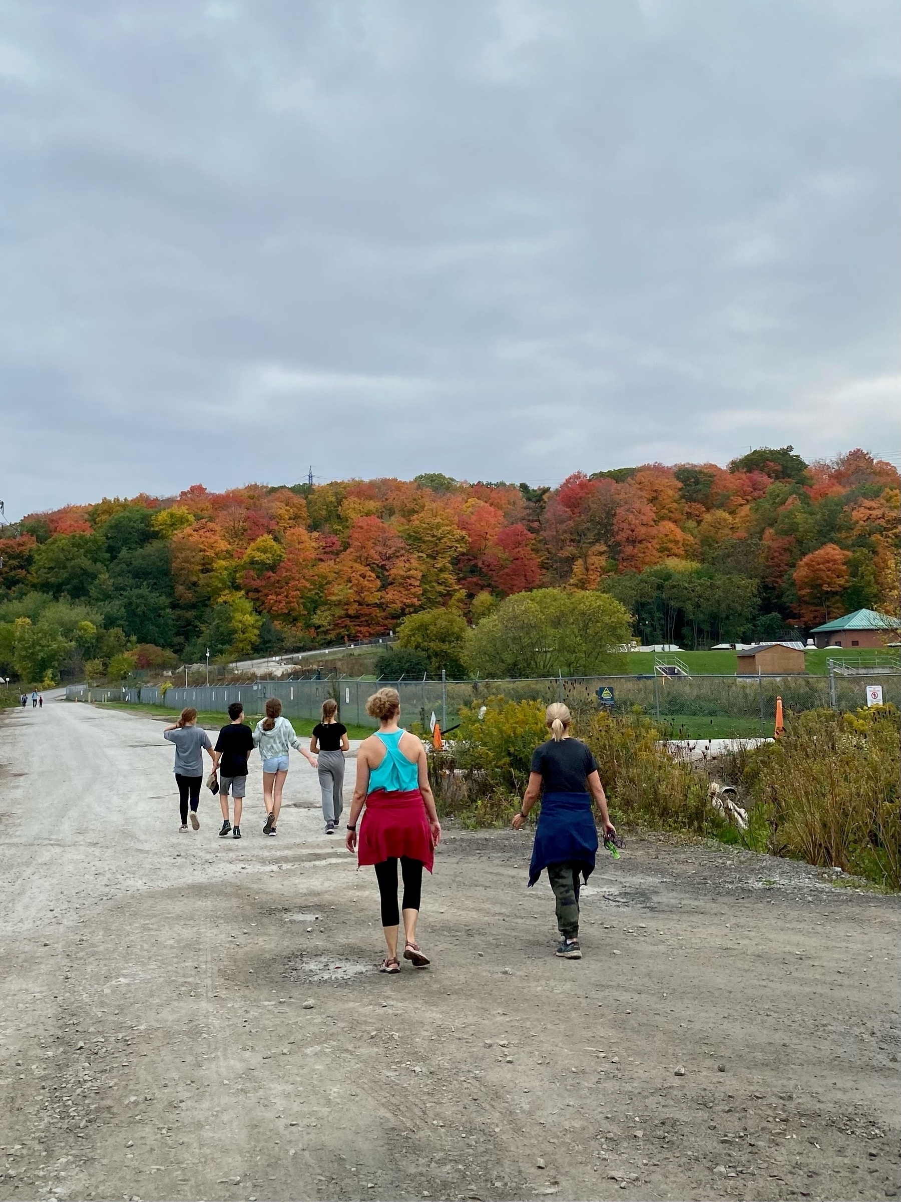
Rouge River hike

An impressive attempt to visualize the standard model of particle physics by Quanta Magazine
More quantum weirdness: tunnelling particles can exceed the speed of light
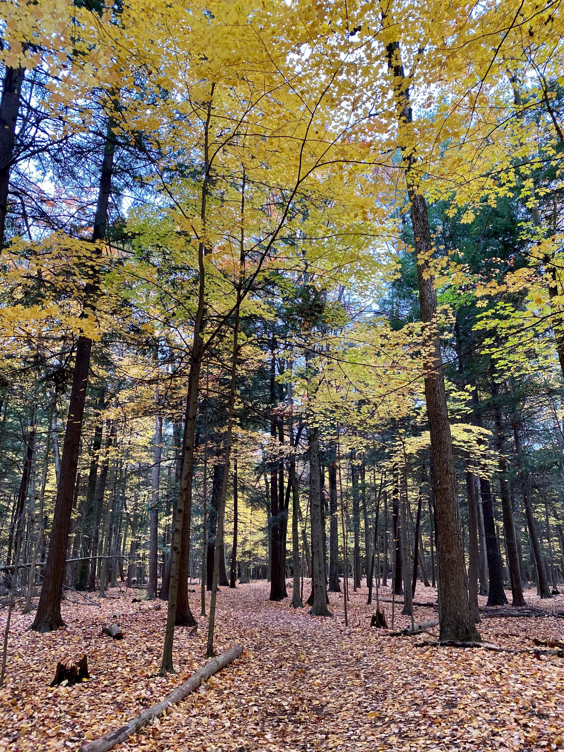
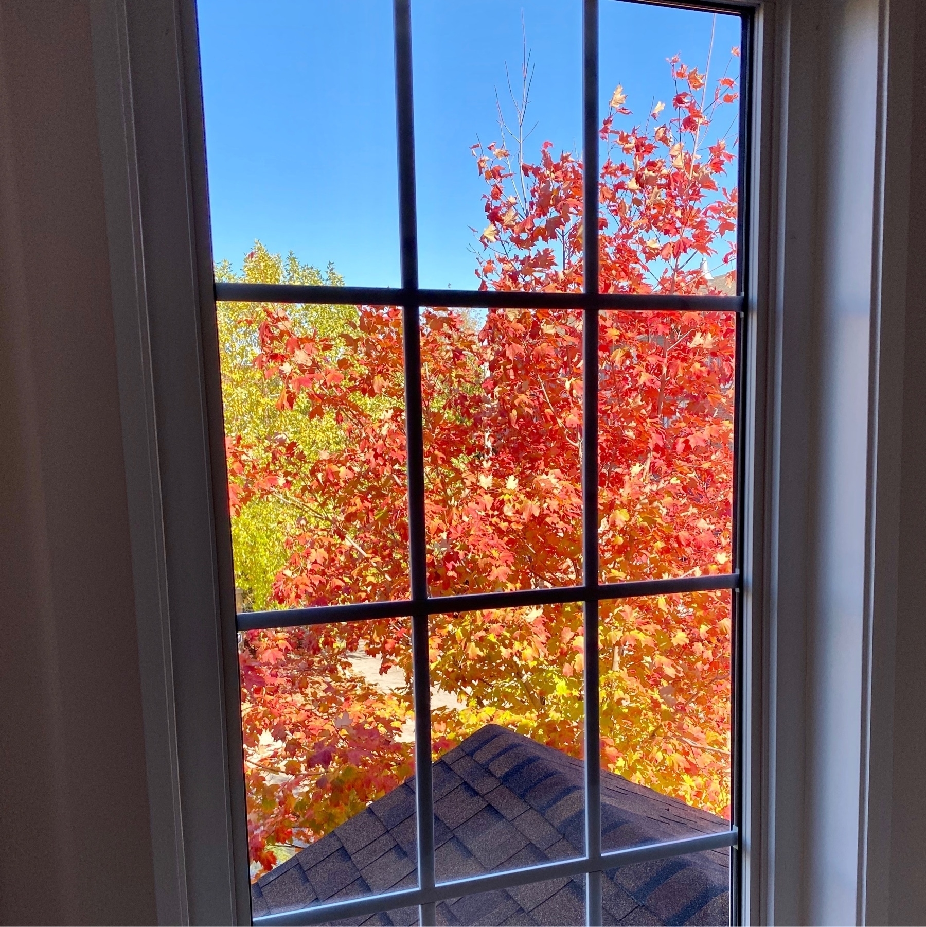
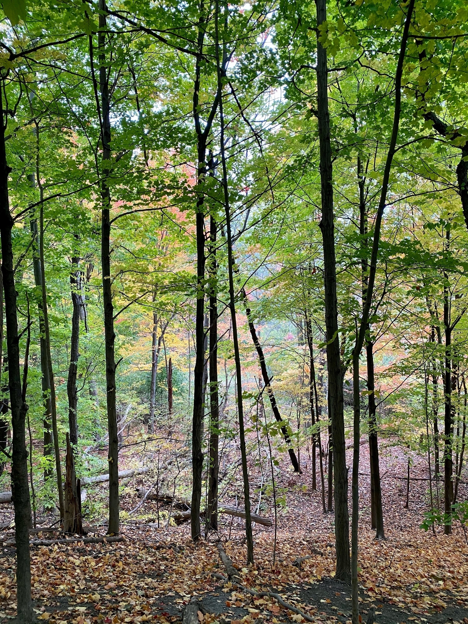
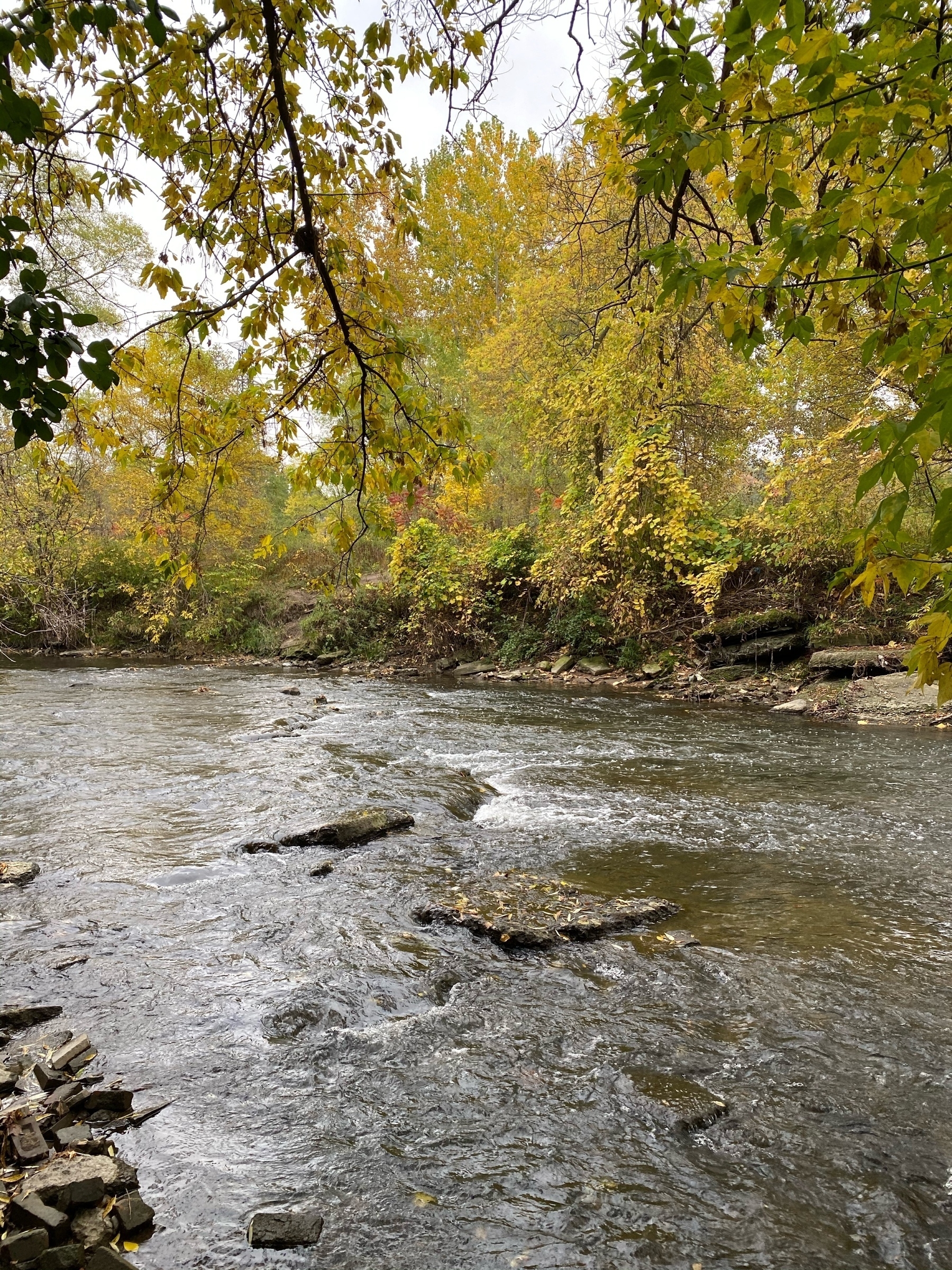
Some great colours on the neighborhood trees 🍁🇨🇦

For my “A Day In The Life” photo, here’s a look out my window at a beautiful Fall day here in Toronto, Canada at noon
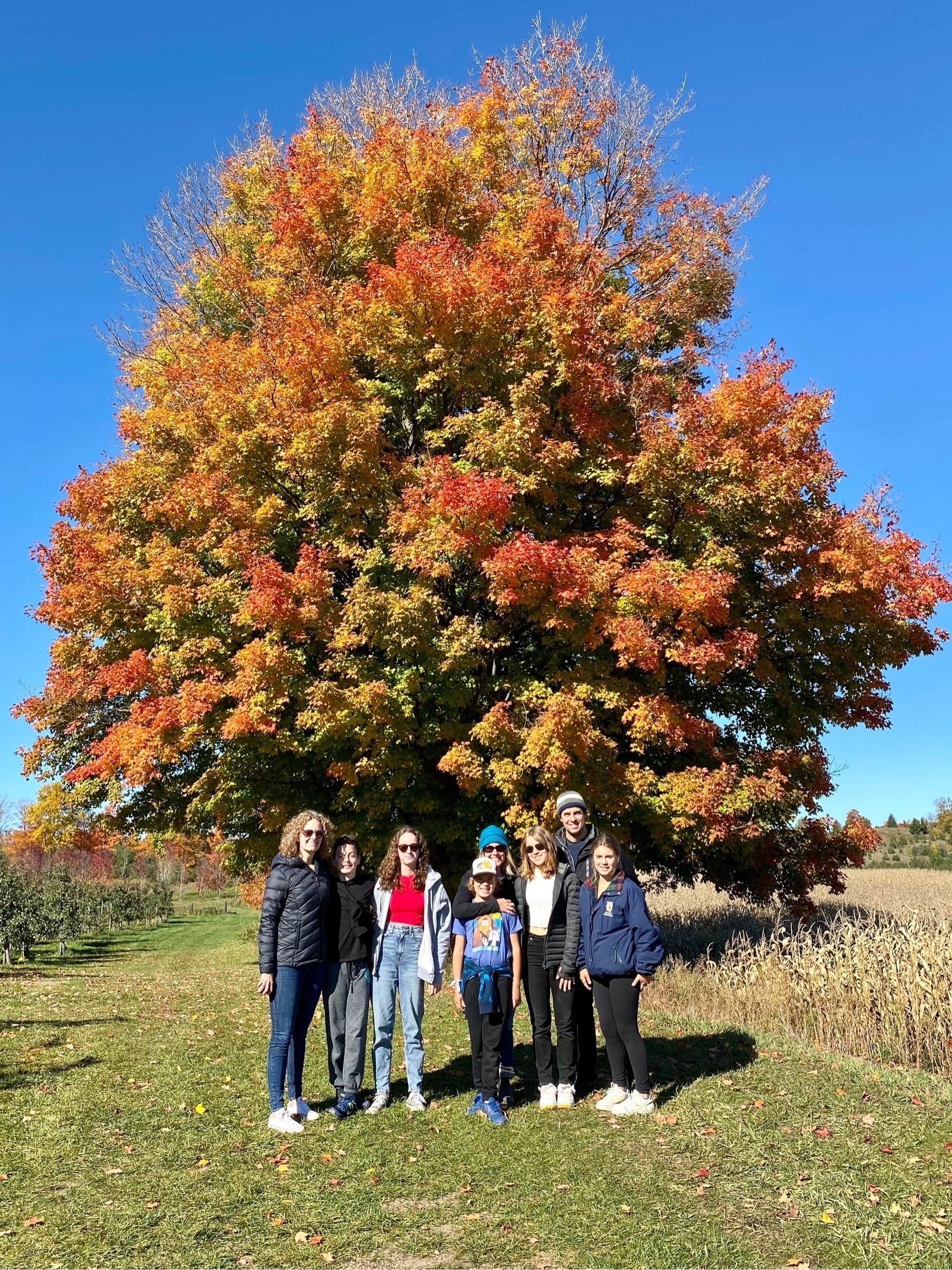
A great day for apple picking 🍎 🌳
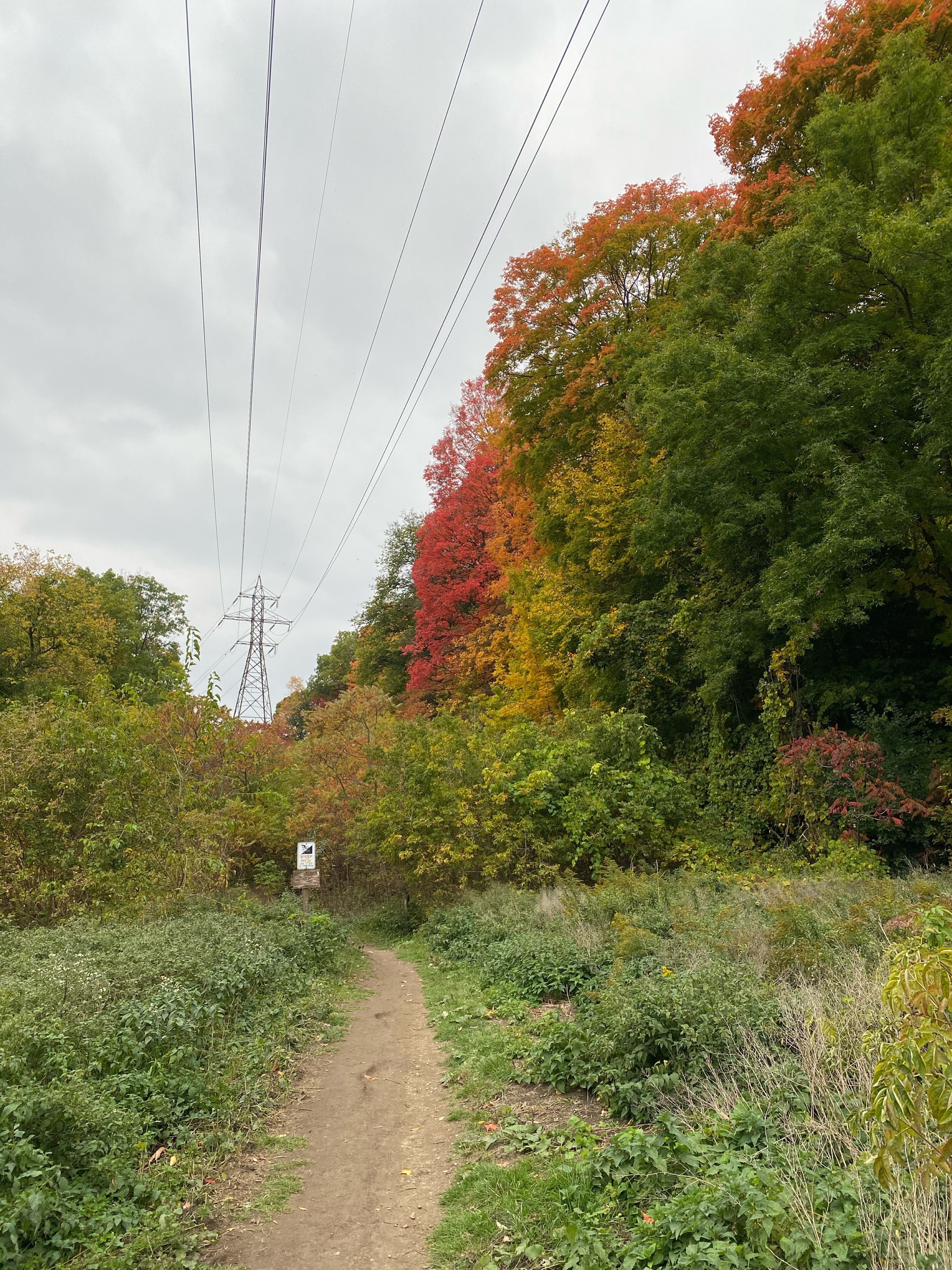
A nice hike through Crother’s Woods
This agenda shortcut from Matthew Cassinelli is a useful way to start my day. I modified it to include flagged reminders and just have it appear as text, rather than be read aloud by Siri.
I’m very excited to be recruiting for a Data Governance Sponsor to join my team and help enhance the use of good data analytics in our decisions at Metrolinx.
I’m looking for someone that enjoys telling compelling stories with data and has a passion for collaborating to build clean and reliable analytical processes. If you know someone that could fit (maybe you!), please pass along the job ad
Although waiting can be annoying, How to Wait Well makes some good points:
Waiting pulls us into the present unlike any other experience of time. In the waiting, we realise that this moment is meaningful as it exists, not as some step toward a future moment. Waiting is present tense, and its meanings are full of the potential to transform the ways in which we see the world. Each moment is its own experience and its own fulfilment.
If you’re at all curious about physics, I strongly recommend you consider watching Sean Carroll’s Biggest Ideas in the Universe. Well worth the investment of time to watch
I’m listening to The Jungle by Plants and Animals a lot this week 🎧🎵