Heart rate distribution in HealthFit ❤️
I like the new heart rate distribution graphs in HealthFit.
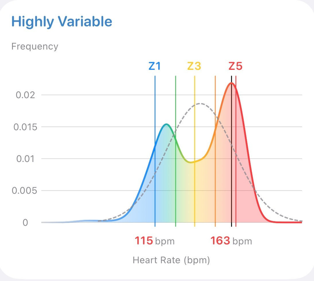
Here’s an example from a recent intervals run that shows decent recovery back to Zone 2 in between each hard effort. This helps me make sure I’m neither pushing too hard nor slacking in those intervals.
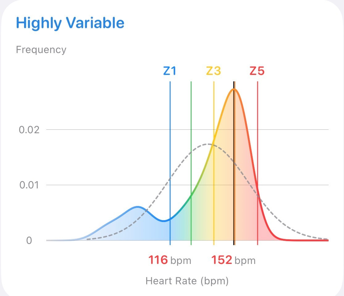
There’s a different profile for a recent HIT session that kept me in a pretty steady high effort once the warmup was done.
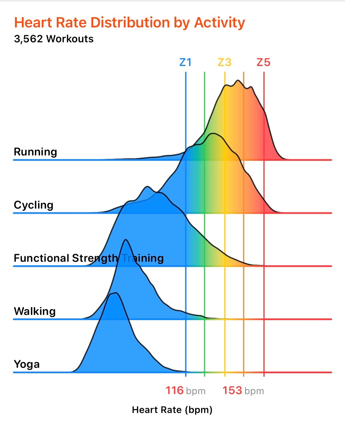
The overall distributions by activity type are fun. Although no one is surprised to see that yoga is less intensive than running or cycling.
HealthFit remains my app of choice for integrating all of my fitness data.