An interesting observation from my coach today:
We must stop searching for progress through punishment
An interesting observation from my coach today:
We must stop searching for progress through punishment
Why modern Buddhists should take reincarnation seriously | Aeon Essays:
Thinking about reincarnation today is, first of all, a reminder of the complexity of Buddhism, and the fact that individual practices can’t be neatly separated from broader institutional histories. Any change in our personal lives is inseparable from change in the world around us. Second, reincarnation offers a way of thinking about the present as connected to the deep past and to any potential futures as well. We needn’t think of the specifics of the reincarnation doctrine to realise that we’re all the inheritors of a past that we didn’t create and the bequeathers of a future we won’t live to see. Third, this temporal relation is also an ethical one, because it suggests that we’re the products of other lives and the creators of other futures, and thus share a global and temporal interdependence. And fourth, it follows that part of our task as humans is to be aware of what we might accidentally replicate from our past and thus unknowingly recreate in the future.
Assuming this is true, great news that Ontario’s summer camps for kids will be allowed to open again. My kids really need this (their parents would benefit too!)
I’ve found my new power up song 🔥 🏃♂️ 🎵

Fleeting confirmation that spring weather has arrived
Clever:
Scientific efforts to shed light on the prehistory of clothes have received an unexpected boost from another line of research, the study of clothing lice, or body lice. These blood-sucking insects make their home mainly on clothes and they evolved from head lice when people began to use clothes on a regular basis. Research teams in Germany and the United States analysed the genomes of head and clothing lice to estimate when the clothing parasites split from the head ones.
How clothing and climate change kickstarted agriculture | Aeon Essays
Currently reading: Green Mars by Kim Stanley Robinson 📚
First vaccine dose administered! A very efficient process.

An excellent For All Mankind season finale. I’m looking forward to season 3 and further divergence from our timeline
Well S2E9 of For All Mankind certainly ended on a cliff hanger! How are they going to wrap all this up in just one last episode? 📺 🚀
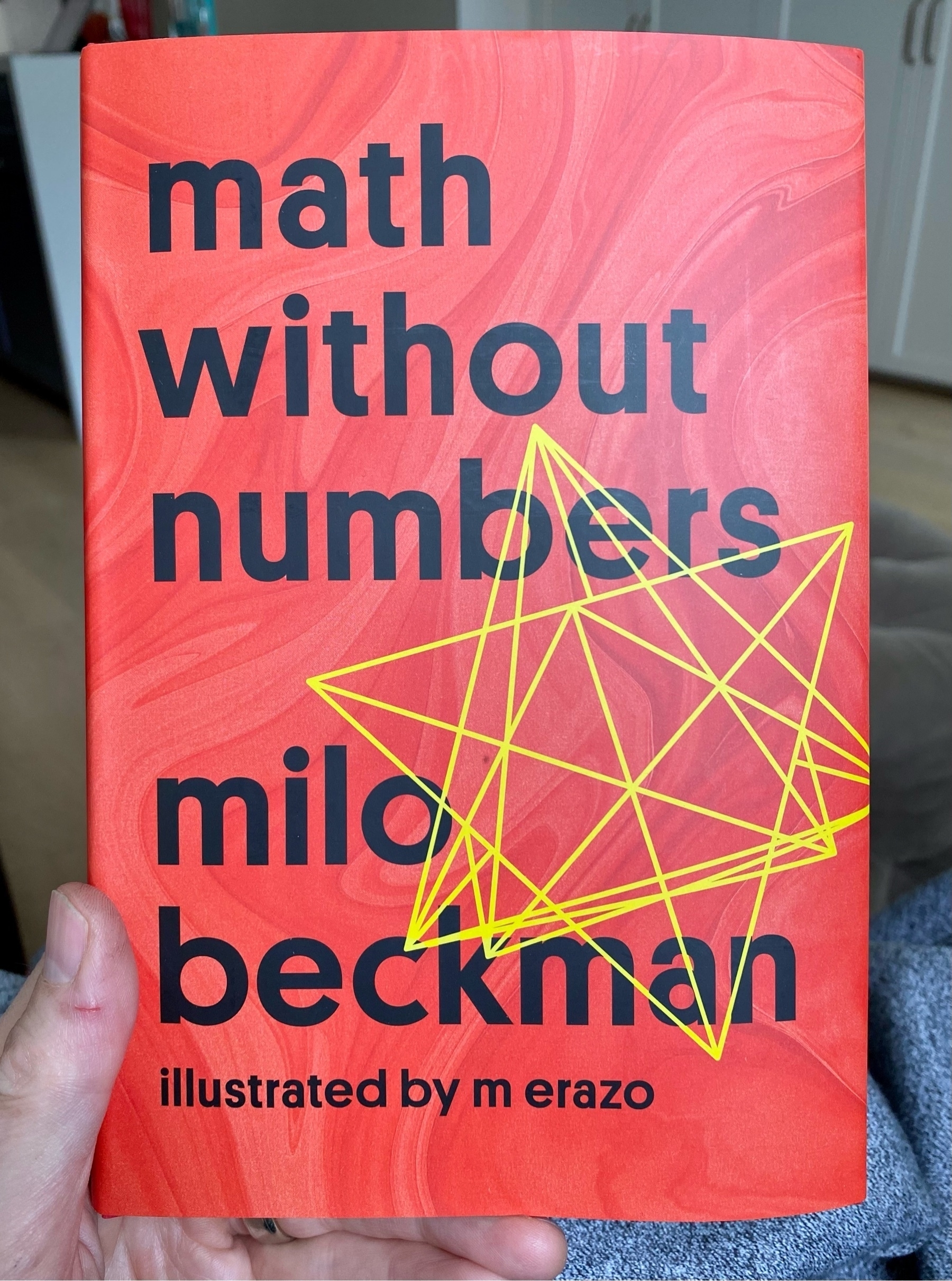
Math Without Numbers by Milo Beckman takes a conversational approach to math, saying as much about how mathematicians think as it does about the math. Removing numbers helps focus on the concepts and the delightful illustrations are just whimsical enough to match the prose📚
There are some great observations about data in Why the Pandemic Experts Failed that apply in any context.
I won’t spoil the list, other than to say that I strongly agree with the first one: All data are created; data never simply exist. We rarely put enough thought or effort into planning how data will be generated, and then have to make up for this in the modelling phase.
Our models are always dependent on the quality of data we put into them. And, yet, we often spend much more time refining and testing our models than we do with our input data and the production process that generates them.
Life Is About What We Can Do For Each Other - RyanHoliday.net
All of this is a way of dodging the reality of the choice in front of us: Can you subjugate your own interests—if only temporarily—for the sake of someone else? Countless someone else’s. Most of whom you will never know or even meet. Can you serve them? Can you sacrifice for any of them? Can you hear what they’re saying? Can you care?
I’m looking forward to starting Math Without Numbers by Milo Beckman 📚
Happy Easter from Lucy

Currently reading: Limitless by Jim Kwik 📚
I’ve reached the F barre chord stage of my guitar lessons. A tough spot! 🎸
Thanks @jean! Stickers arrived


Currently reading: Stillness Is the Key by Ryan Holiday 📚

Humble Pi by Matt Parker is a very entertaining book about math errors. His irreverent personality really comes through and the stories make the important point about how essential math is to our everyday lives. 📚