psepho
Posts archived from the PsephoAnalytics project, after allowing the domain name to expire. The goal of PsephoAnalytics was to model voting behaviour in order to accurately explain political campaigns.
Tuesday, June 9, 2020
Our predictions for the 2019 Federal race in Toronto were generated by our agent-based model that uses demographic characteristics and results from previous elections. Now that the final results are available, we can see how our predictions performed at the Electoral District level.
For this analysis, we restrict the comparison to just the major parties, as they were the only parties for which we estimated vote share. We also only compare the actual results to the predictions of our base scenario. In the future, our work will focus much more on scenario planning to explain political campaigns.
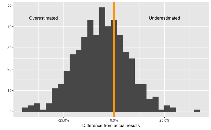
We start by plotting the difference between the actual votes and the predicted votes at the party and district level.
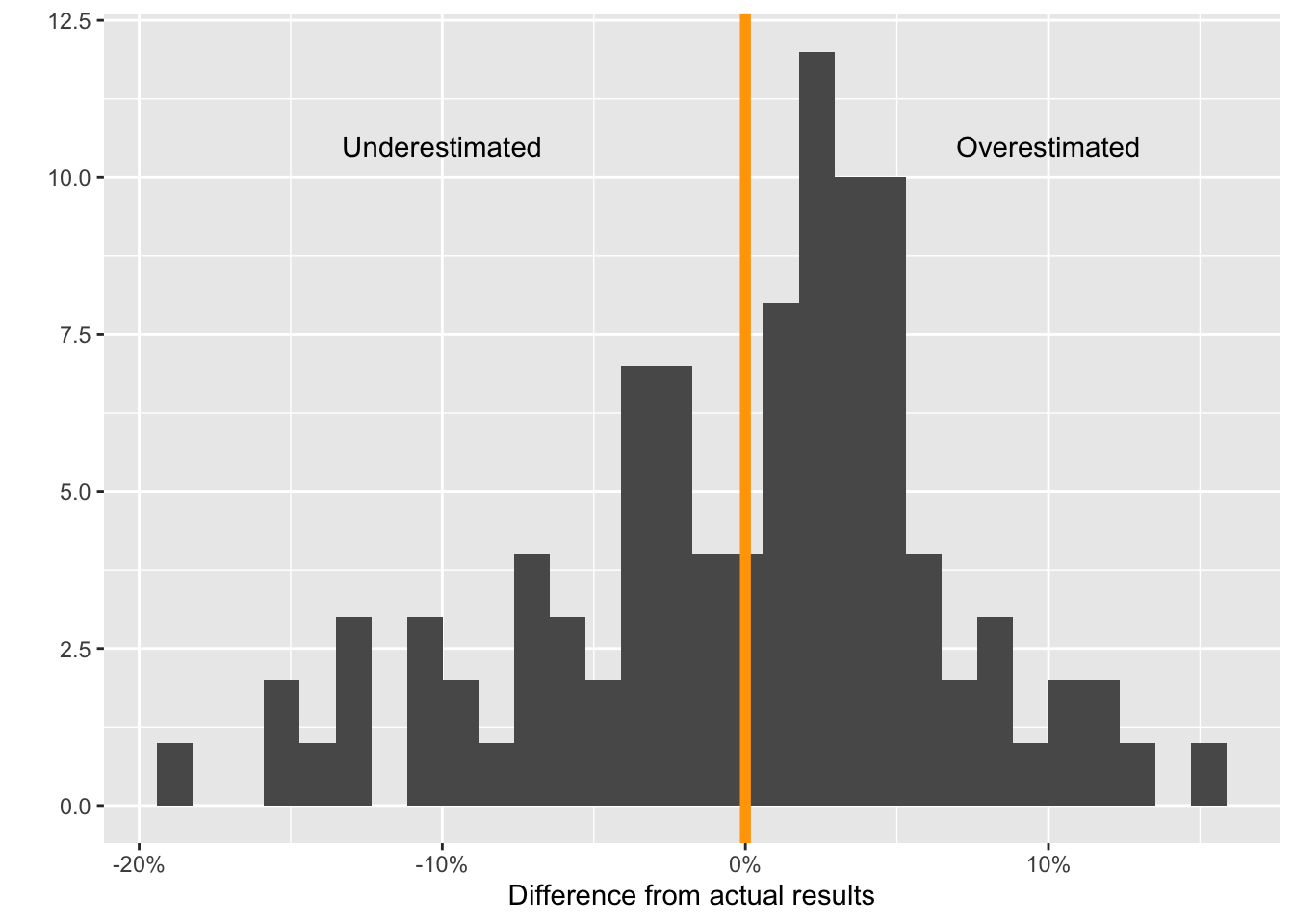 Distribution of the difference between the predicted and actual proportion of votes for all parties
The mean absolute value of differences from the actual results is 5.3%. In addition, the median value of the differences is 1.28%, which means that we slightly overestimated support for parties. However, as the histogram shows, there is significant variation in this difference across districts. Our highest overestimation was 15.6% and lowest underestimation was -18.5%.
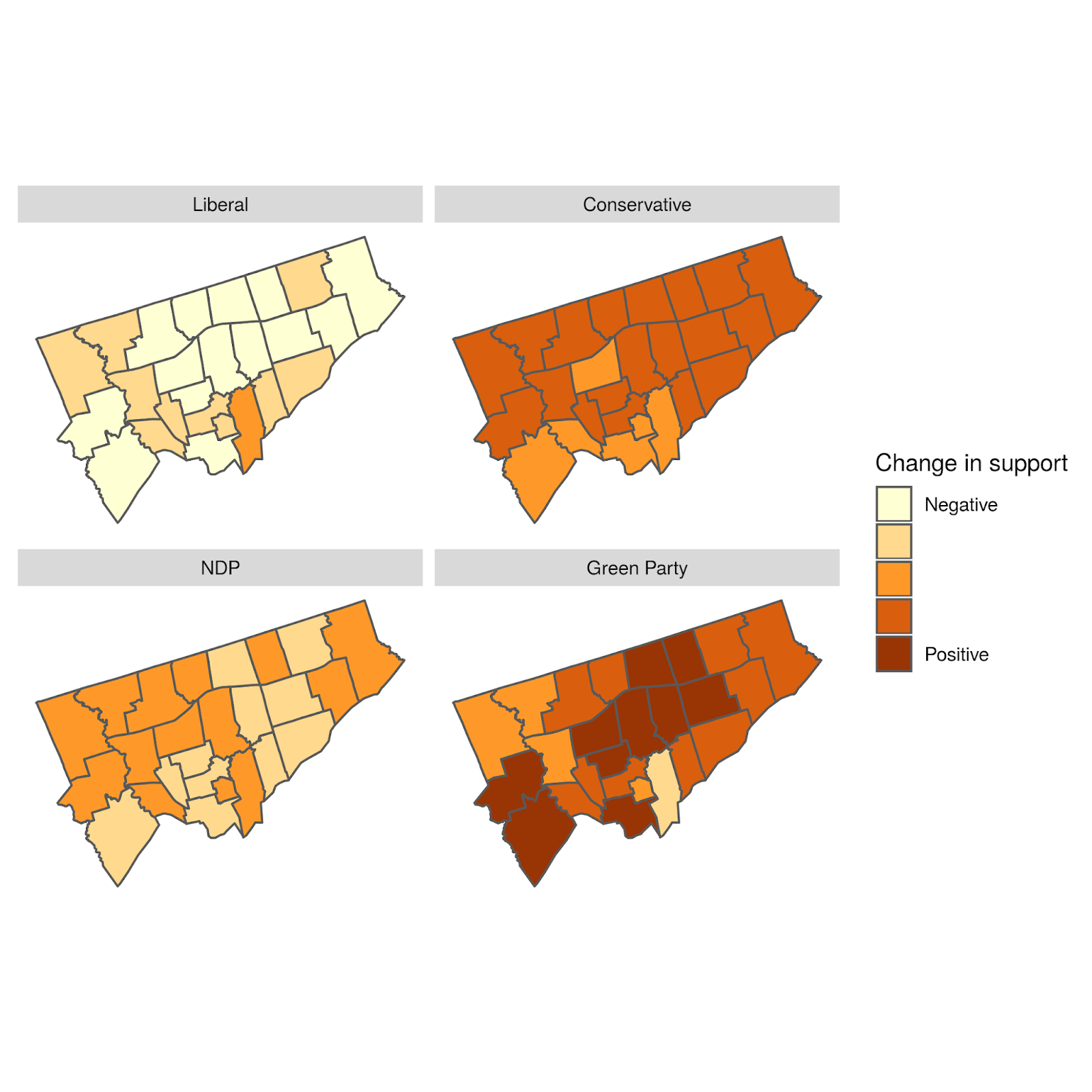
To better understand this variation, we can look at a plot of the geographical distribution of the differences. In this figure, we show each party separately to illuminate the geographical structure of the differences.
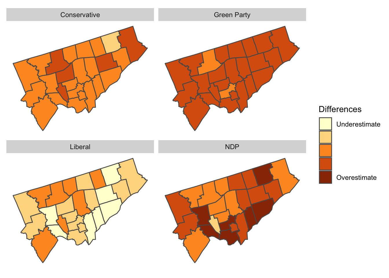 Geographical distribution of the difference between the predicted and actual proportion of votes by Electoral District and party
The overall distribution of differences doesn’t have a clear geographical bias. In some sense, this is good, as it shows our agent-based model isn’t systematically biased to any particular Electoral District.
However, our model does appear to generally overestimate NDP support while underestimating Liberal support. These slight biases are important indicators for us in recalibrating the model.
Overall, we’re very happy with an error distribution of around 5%. As described earlier, our primary objective is to explain political campaigns. Having accurate predictions is useful to this objective, but isn’t the primary concern. Rather, we’re much more interested in using the model that we’ve built for exploring different scenarios and helping to design political campaigns.
Monday, October 21, 2019
As outlined in our last two posts, our algorithm has “learned” how to simulate the behavioural traits of over 2 million voters in Toronto. This allows us to turn their behavioural “dials” and see what happens.
To demonstrate, we’ll simulate three scenarios:
- The “likeability” of the Liberal Party falls by 10% from the baseline (i.e., continues to fall);
- The Conservative Party announces a policy stance regarding climate change much more aligned with the other parties; and
- People don’t vote strategically and no longer consider the probability of each candidate winning in their riding (i.e., they are free to vote for whomever they align with and like the most, somewhat as if proportional representation were a part of our voting system).
Let’s examine each scenario separately:
1 – If Liberal “likeability” fell
In this scenario, the “likeability” scores for the Liberals in each riding falls by 10% (the amount varies by riding). This could come from a new scandal (or increased salience and impact of previous ones).
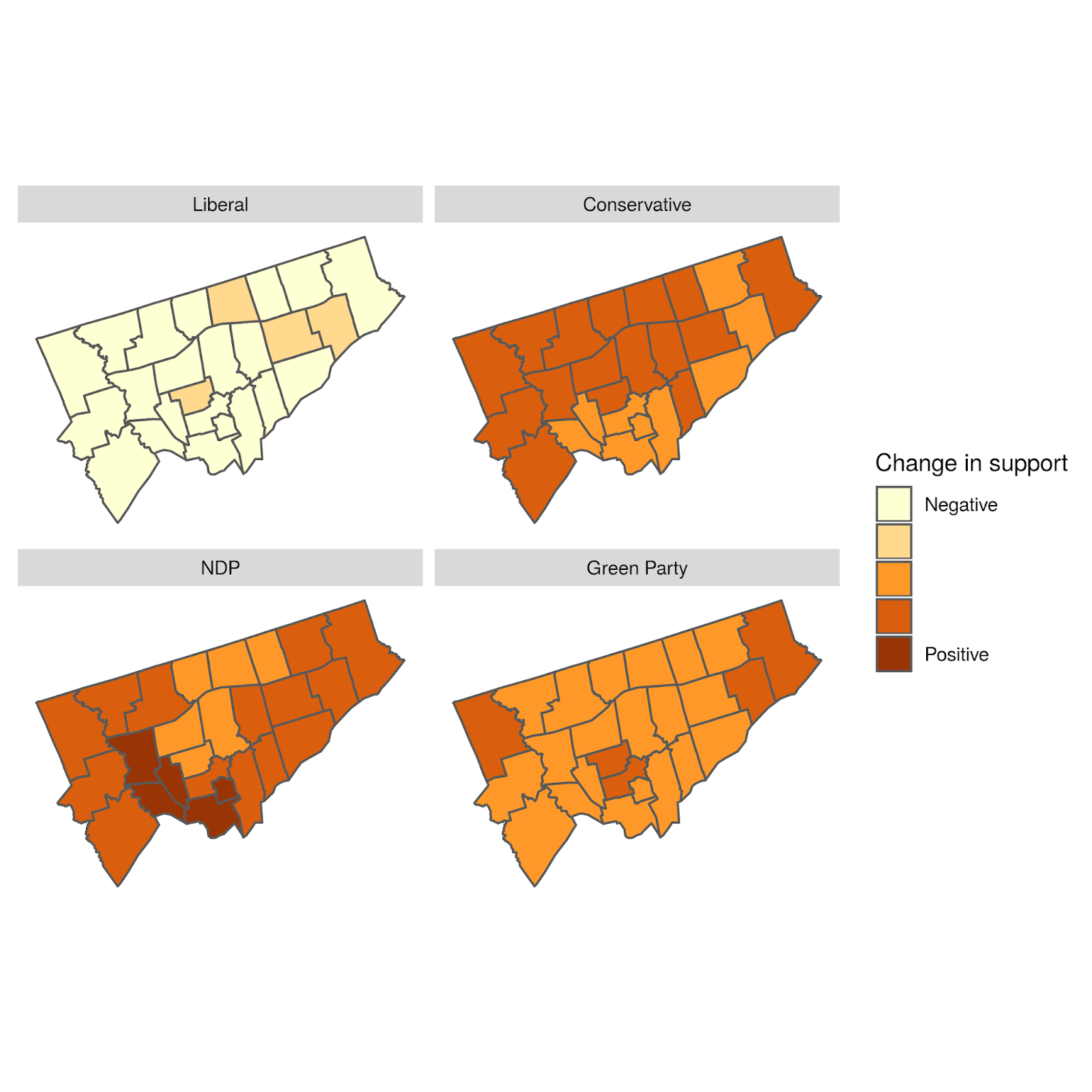
What we see in this scenario is a nearly seven point drop in Liberal support across Toronto, about half of which would be picked up by the NDP. This would be particularly felt in certain ridings that are already less aligned on policy where changes in “likeability” have a greater impact. The Libs would only safely hold 13/25 seats, instead of 23/25.
From a seat perspective, the NDP would pick up another seat (for a total of three) in at least 80% of our simulations – namely York South-Weston. (It would also put four – Beaches-East York, Davenport, Spadina-Fort York, and University-Rosedale – into serious play.) Similarly, the Conservatives would pick up two seats in at least 80% of our simulations – namely Eglinton-Lawrence and York Centre (and put Don Valley North, Etobicoke Centre, and Willowdale into serious play).
This is a great example of how changing non-linear systems can produce results that are not linear (meaning they cannot be easily predicted by polls or regressions).
2 – If Conservatives undifferentiated themselves on climate change
In this scenario, the Conservatives announce a change to their policy position on a major issue, specifically climate change. The salience of this change would be immediate (this can also be changed, but for simplicity we won’t do so here). It may seem counterintuitive, but it appears that the Conservatives, by giving up a differentiating factor, would actually lose voters. Specifically, in this scenario, no seats change hands, but the Conservatives actually give up about three points to the Greens.
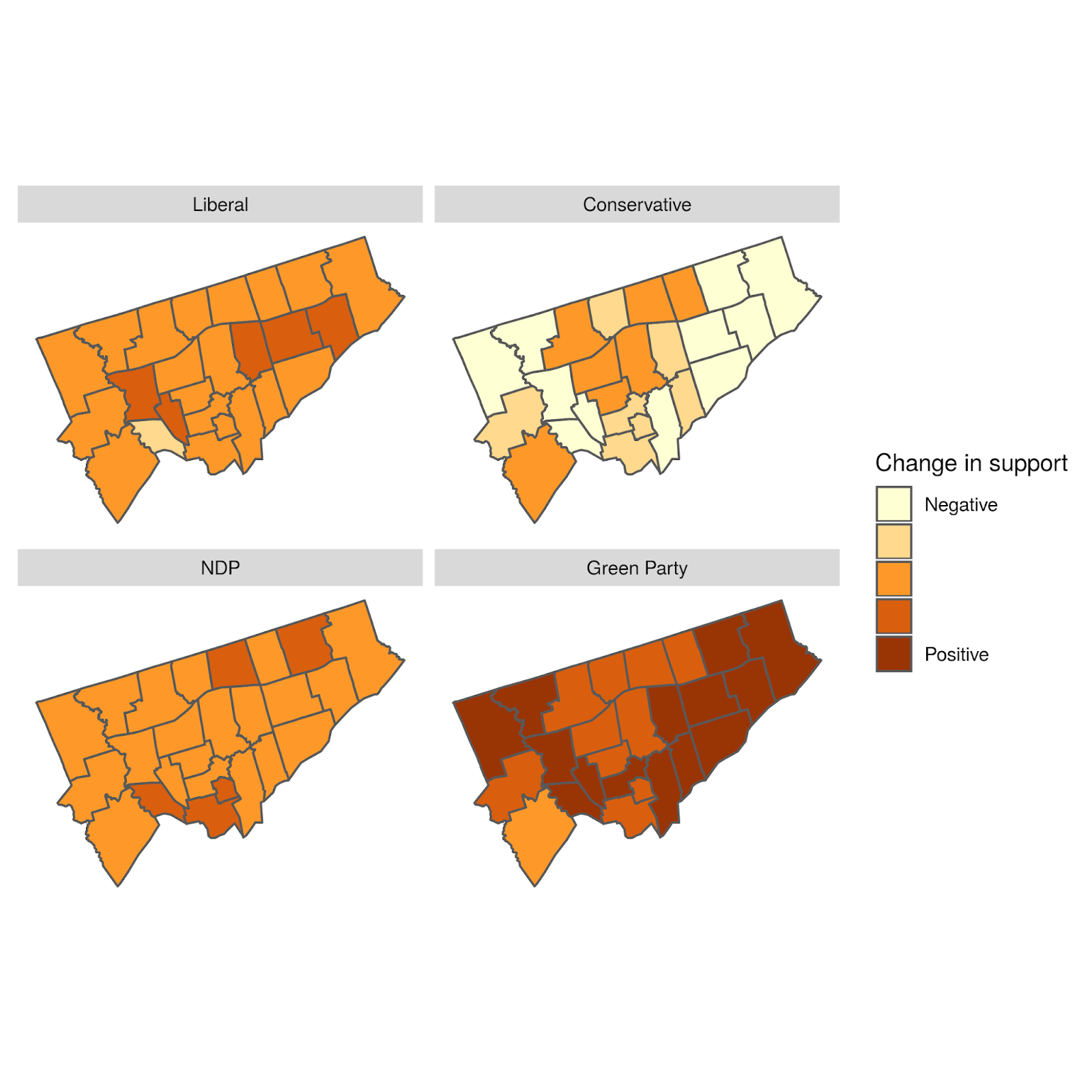
To work this through, imagine a voter who may like another party more, but chooses to vote Conservative specifically because their positions on climate change align. But if the party moved to align its climate change policy with other parties, that voter may decide that there is no longer a compelling enough reason to vote Conservative. If there are more of these voters than voters the party would pick up by changing this one policy (e.g., because there are enough other policies that still dissuade voters from shifting to the Conservatives), then the Conservatives become worse off.
The intuition may be for the defecting Conservative voters discussed above to go Liberal instead (and some do), but in fact, once policies look more alike, “likeability” can take over, and the Greens do better there than the Liberals.
This is a great example of how the emergent properties of a changing system cannot be seen by other types of models.
Proportional Representations
Recent analysis done by P.J. Fournier (of 338Canada) for Macleans Magazine used 338Canada’s existing poll aggregations to estimate how many seats each party would win across Canada if (at least one form of) proportional representation was in place for the current federal election. It is an interesting thought experiment and allows for a discussion of the value of changing our electoral practice.
As supportive as we are of such analysis, this is an area of analysis perfectly set up for agent-based modeling. That’s because Fournier’s analysis assumes no change in voting behavior (as far as we can tell), whereas ABM can relax that assumption and see how the algorithm evolves.
To do so, we have our voters ignore the winning probabilities of each candidate and simply pick who they would want to (including their “likeability”).
Perhaps surprisingly, the simulations show that the Liberals would lose significant support in Toronto (and likely elsewhere). They would drop to third place, behind the Conservatives (first place) and the Greens (second place).
Toronto would transform into four-party city: depending on the form of proportional representation chosen, the city would have 9-12 Conservative seats, 4-7 Green seats, 2-5 Liberal seats, and 2-3 NDP seats.This suggests that most Liberal voters in Toronto are supportive only to avoid their third or fourth choice from winning. This ties in with the finding that Liberals are not well “liked” (i.e., outside of their policies), and might also suggest why the Liberals back-tracked on electoral reform – though such conjecture is outside our analytical scope. Nonetheless, it does support the idea that the Greens are not taken seriously because voters sense that the Greens are not taken seriously by other voters.
More demonstrations are possible
Overall, these three scenarios showcase how agent-based modeling can be used to see the emergent outcomes of various electoral landscapes. Many more simulations could be run, and we welcome ideas for things that would be interesting to the #cdnpoli community.
Sunday, October 20, 2019
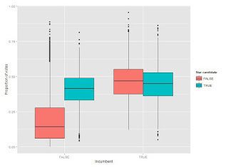
In our last post, our analysis assumed that voters had a very good sense of the winning probabilities for each candidate in their ridings. This was probably an unfair assumption to make - voters have a sense of which two parties might be fighting for the seat, but unlikely that they know the z-scores based on good sample size polls.
So, we’ve loosened that statistical knowledge a fair amount, whereby voters only have some sense of who is really in the running in their ridings. While that doesn’t change the importance of “likeability” (still averaging around 50% of each vote), it does change which parties’ votes are driven by “likeability” more than their policies.
Now, it is in fact the Liberals who fall to last in “likeability” - and by a fairly large margin - coming last or second last in every riding. This suggests that a lot of people are willing to hold their nose and vote for the Libs.
On average, the other three parties have roughly equal “likeability”, but this is more concentrated for some parties than for others. For example, the Greens appear to be either very well “liked” or not “liked” at all. They are the most “liked” in 13/25 ridings and least “liked” in 9/25 ridings - and have some fairly extreme values for “likeability”. This would suggest that some Green supporters are driven entirely by policy while others are driven by something else.
The NDP and Conservatives are more consistent, but the NDP are most “liked” in 10/25 ridings whereas the Conservatives are most “liked” in the remaining 2/25 ridings.
As mentioned in the last post, we’ll be posting some scenarios soon.
Thursday, October 17, 2019
Modeling to explain, not forecast
The goal of PsephoAnalytics is to model voting behaviour in order to accurately explain political campaigns. That is, we are not looking to forecast ongoing campaigns – there are plenty of good poll aggregators online that provide such estimation. But if we can quantitatively explain why an ongoing campaign is producing the polls that it is, then we have something unique.
That is why agent-based modeling is so useful to us. Our model – as a proof of concept – can replicate the behaviour of millions of individual voters in Toronto in a parameterized way. Once we match their voting patterns to those suggested by the polls (specifically those from CalculatedPolitics, which provides riding-level estimates), we can compare the various parameters that make up our agents behaviour and say something about them.
We can also, therefore, turn those various behavioural dials and see what happens. For example, what if a party changed its positions on a major policy issue, or if a party leader became more likeable? That allows us to estimate the outcomes of such hypothetical changes without having to invest in conducting a poll.
Investigating the 2019 Federal Election
As in previous elections, we only consider Toronto voters, and specifically (this time) how they are behaving with respect to the 2019 federal election. We have matched the likely voting outcomes of over 2 million individual voters with riding-level estimates of support for four parties: Liberals, Conservatives, NDP, and Greens. This also means that we can estimate the response of voters to individual candidates, not just the parties themselves.
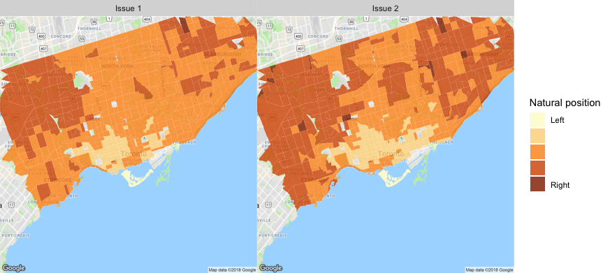
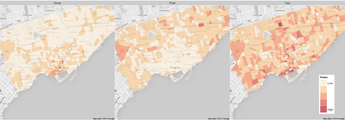
First, let’s start with the basics – here are the likely voter outcomes by ridings for each party, as estimated by CalculatedPolitics on October 16.
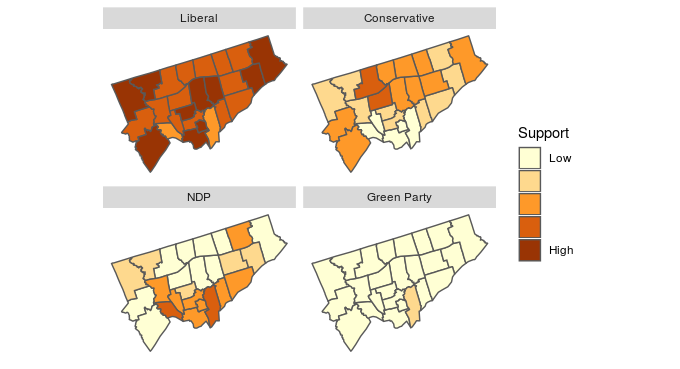
As these maps show, the Liberals are expected to win 23 of Toronto’s 25 ridings. The two exceptions are Parkdale-High Park and Toronto-Danforth, which are leaning NDP. Four ridings, namely Eglinton-Lawrence, Etobicoke Centre, Willowdale, and York Centre, see the Liberals slightly edging out the Conservatives. Another four ridings, namely Beaches-East York, Davenport, University-Rosedale, and York South-Weston, see the Liberals slightly edging out the NDP. The Greens do no better than 15% (Toronto Danforth), average about 9% across the city, and are highly correlated with support for the NDP.
What is driving these results? First, a reminder about some of the parameters we employ in our model. All “agents” (e.g., voters, candidates) take policy positions. For voters, these are estimated using numerous historical elections to derive “natural” positions. For candidates, we assign values based on campaign commitments (e.g., from CBC’s coverage, though we could also simply use a VoteCompass). Some voters can also care about policy more than others, meaning they care less about non-policy factors (we use the term “likeability” to capture all these non-policy factors). As such, candidates also have a “likeability” score. Voters also have an “engagement” score that indicates how likely they are to pay attention to the campaign and, more importantly, vote at all. Finally, voters can see polls and determine how likely it is that certain parties will win in their riding. Each voter then determine, for each party a) how closely is their platform aligned with the voter’s issue preferences; b) how much do they “like” the candidate (for non-policy reasons); and c) how likely is it the candidate can win in their riding. That information is used by the voter to score each candidate, and then vote for the candidate with the highest score, if the voter chooses to vote at all. (There are other parameters used, but these few provide much of the differentiation we see.)
Based on this, there are a couple of key take-aways from the 2019 federal election:
- “Likeability” is important, with about 50% of each vote, on average, being determined by how much the voter likes the party. The importance of “likeability” ranges from voter to voter (extremes of 11% and 89%), but half of voters use “likeability” to determine somewhere between 42% and 58% of their vote.
- Given that, some candidates are simply not likeable enough to overcome a) their party platforms; or b) their perceived unlikelihood of victory (over which they have almost no control). For example, the NDP have the highest average “likeability” scores, and rank first in 18 out of 25 ridings. By contrast, the Greens has the lowest average. This means that policy issues (e.g., climate change) are disproportionately driving Green Party support, whereas something else (e.g., Jagmeet Singh’s popularity) is driving NDP support.
In our next post, we’ll look at some scenarios where we change some of these parameters (or perhaps more drastic things).
Monday, November 26, 2018
Our predictions for the 2018 mayoral race in Toronto were generated by our new agent-based model that used demographic characteristics and results of previous elections.
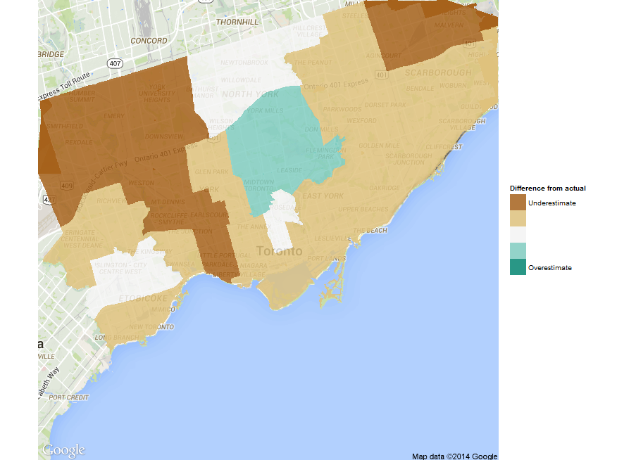
Now that the final results are available, we can see how our predictions performed at the census tract level.
For this analysis, we restrict the comparison to just Tory and Keesmaat, as they were the only two major candidates and the only two for which we estimated vote share. Given this, we start by just plotting the difference between the actual votes and the predicted votes for Keesmaat. The distribution for Tory is simply the mirror image, since their combined share of votes always equals 100%.
 Distribution of the difference between the predicted and actual proportion of votes for Keesmaat
The mean difference from the actual results for Keesmaat is -6%, which means that, on average, we slightly overestimated support for Keesmaat. However, as the histogram shows, there is significant variation in this difference across census tracts with the differences slightly skewed towards overestimating Keesmaat’s support.
To better understand this variation, we can look at a plot of the geographical distribution of the differences. In this figure, we show both Keesmaat and Tory. Although the plots are just inverted versions of each other (since the proportion of votes always sums to 100%), seeing them side by side helps illuminate the geographical structure of the differences.
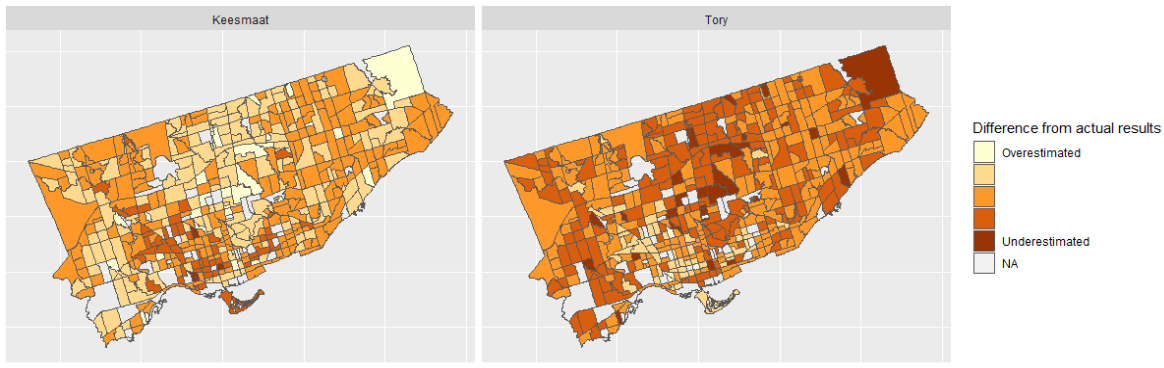 The distribution of the difference between the predicted and actual proportion of votes by census tract
The overall distribution of differences doesn’t have a clear geographical bias. In some sense, this is good, as it shows our agent-based model isn’t systematically biased to any particular census tract. Rather, refinements to the model will improve accuracy across all census tracts.
We’ll write details about our new agent-based approach soon. In the meantime, these results show that the approach has promise, given that it used only a few demographic characteristics and no polls. Now we’re particularly motivated to gather up much more data to enrich our agents’ behaviour and make better predictions.
Sunday, October 21, 2018
It’s been a while since we last posted – largely for personal reasons, but also because we wanted to take some time to completely retool our approach to modeling elections.
In the past, we’ve tried a number of statistical approaches. Because every election is quite different to its predecessors, this proved unsatisfactory – there are simply too many things that change which can’t be effectively measured in a top-down view. Top-down approaches ultimately treat people as averages. But candidates and voters do not behave like averages; they have different desires and expectations.
We know there are diverse behaviours that need to be modeled at the person-level. We also recognize that an election is a system of diverse agents, whose behaviours affect each other. For example, a candidate can gain or lose support by doing nothing, depending only on what other candidates do. Similarly, a candidate or voter will behave differently simply based on which candidates are in the race, even without changing any beliefs. In the academic world, the aggregated results of such behaviours are called “emergent properties”, and the ability to predict such outcomes is extremely difficult if looking at the system from the top down.
So we needed to move to a bottom-up approach that would allow us to model agents heterogeneously, and that led us to what is known as agent-based modeling.
Agent-based modeling and elections
Agent-based models employ individual heterogeneous “agents” that are interconnected and follow behavioural rules defined by the modeler. Due to their non-linear approach, agent-based models have been used extensively in military games, biology, transportation planning, operational research, ecology, and, more recently, in economics (where huge investments are being made).
While we’ll write more on this in the coming weeks, we define voters’ and candidates’ behaviour using parameters, and “train” them (i.e., setting those parameters) based on how they behaved in previous elections. For our first proof of concept model, we have candidate and voter agents with two-variable issues sets (call the issues “economic” and “social”) – each with a positional score of 0 to 100. Voters have political engagement scores (used to determine whether they cast a ballot), demographic characteristics based on census data, likability scores assigned to each candidate (which include anything that isn’t based on issues, from name recognition to racial or sexual bias), and a weight for how important likability is to that voter. Voters also track, via polls, the likelihood that a candidate can win. This is important for their “utility function” – that is, the calculation that defines which candidate a voter will choose, if they cast a ballot at all. For example, a candidate that a voter may really like, but who has no chance of winning, may not get the voter’s ultimate vote. Instead, the voter may vote strategically.
On the other hand, candidates simply seek votes. Each candidate looks at the polls and asks 1) am I a viable candidate?; and 2) how do I change my positions to attract more voters? (For now, we don’t provide them a way to change their likability.) Candidates that have a chance of winning move a random angle from their current position, based on how “flexible” they are on their positions. If that move works (i.e., moves them up in the polls), they move randomly in the same general direction. If the move hurt their standings in the polls, they turn around and go randomly in the opposite general direction. At some point, the election is held – that is, the ultimate poll – and we see who wins.
This approach allows us to run elections with different candidates, change a candidate’s likability, introduce shocks (e.g., candidates changing positions on an issue) and, eventually, see how different voting systems might impact who gets elected (foreshadowing future work.)
We’re not the first to apply agent-based modeling in psephology by any stretch (there are many in the academic world using it to explain observed behaviours), but we haven’t found any attempting to do so to predict actual elections.
Applying this to the Toronto 2018 Mayoral Race
First, Toronto voters have, over the last few elections, voted somewhat more right-wing than might have been predicted. Looking at the average positions across the city for the 2003, 2006, 2010, and 2014 elections looks like the following:
This doesn’t mean that Toronto voters are themselves more right-wing than might be expected, just that they voted this way. This is in fact the first interesting outcome of our new approach. We find that about 30% of Toronto voters have been based on candidate likability, and that for the more right-wing candidates, likability has been a major reason for choosing them. For example, in 2010, Rob Ford’s likability score was significantly higher that his major competitors (George Smitherman and Joe Pantalone). This isn’t to say that everyone liked Rob Ford – but those that did vote for him cared more about something other than issues, at least relative to those who voted for his opponents.
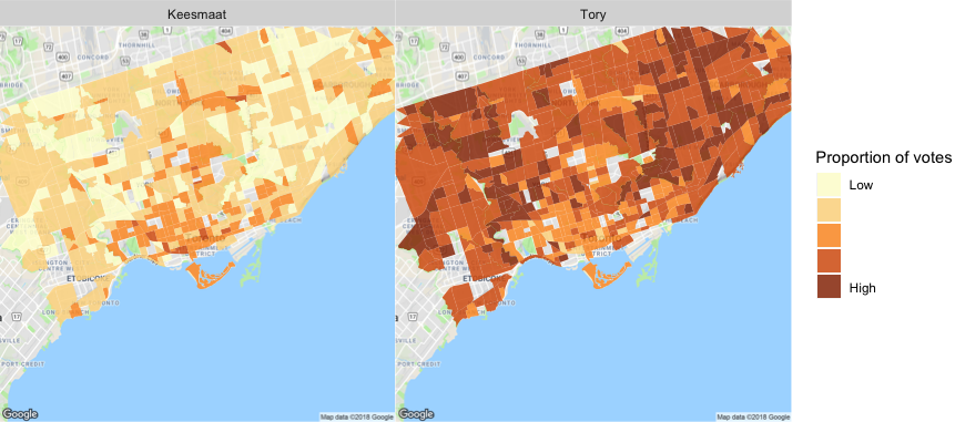
For 2018, likability is less a differentiating factor, with both major candidates (John Tory and Jennifer Keesmaat scoring about the same on this factor). Nor are the issues – Ms. Keesmaat’s positions don’t seem to be hurting her standing in the polls as she’s staked out a strong position left of centre on both issues. What appears to be the bigger factor this time around is the early probabilities assigned by voters to Ms. Keesmaat’s chance of victory, a point that seems to have been a part of the actual Tory campaign’s strategy. Having not been seen as a major threat to John Tory by much of the city, that narrative become self-reinforcing. Further, John Tory’s positions are relatively more centrist in 2018 than they were in 2014, when he had a markedly viable right-wing opponent in Doug Ford. (To prove the point of this approach’s value, we could simply introduce a right-wing candidate and see what happens…)
Thus, our predictions don’t appear to be wildly different from current polls (with Tory winning nearly 2-to-1), and map as follows:
There will be much more to say on this, and much more we can do going forward, but for a proof of concept, we think this approach has enormous promise.
Tuesday, October 20, 2015
The day after an historic landslide electoral victory for the Liberal Party of Canada, we’ve compared our predictions (and those of other organizations who provide riding-level predictions) to the actual results in Toronto.
Before getting to the details, we thought it important to highlight that while the methodologies of the other organizations differ, they are all based on tracking sentiments as the campaign unfolds. So, most columns in the table below will differ slightly from the one in our previous post as such sentiments change day to day.
This is fundamentally different from our modelling approach, which utilizes voter and candidate characteristics, and therefore could be applied to predict the results of any campaign before it even begins. (The primary assumption here is that individual voters behave in a consistent way but vote differently from election to election as they are presented with different inputs to their decision-making calculus.) We hope the value of this is obvious.
Now, on to the results! The final predictions of all organizations and the actual results were as follows:
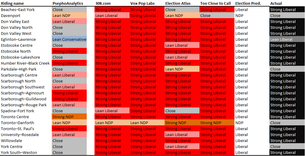
To start with, our predictions included many more close races than the others: while we predicted average margins of victory of about 10 points, the others were predicting averages well above that (ranging from around 25 to 30 points). The actual results fell in between at around 20 points.
Looking at specific races, we did better than the others at predicting close races in York Centre and Parkdale-High Park, where the majority predicted strong Liberal wins. Further, while everyone was wrong in Toronto-Danforth (which went Liberal by only around 1,000 votes), we predicted the smallest margin of victory for the NDP. On top of that, we were as good as the others in six ridings, meaning that we were at least as good as poll tracking in 9 out of 25 ridings (and would have been 79 days ago, before the campaign started, despite the polls changing up until the day before the election).
But that means we did worse in the others ridings, particularly Toronto Centre (where our model was way off), and a handful of races that the model said would be close but ended up being strong Liberal wins. While we need to undertake much more detailed analysis (once Elections Canada releases such details), the “surprise” in many of these cases was the extent to which voters, who might normally vote NDP, chose to vote Liberal this time around (likely a coalescence of “anti-Harper” sentiment).
Overall, we are pleased with how the model stood up, and know that we have more work to do to improve our accuracy. This will include more data and more variables that influence voters’ decisions. Thankfully, we now have a few years before the next election…
Friday, October 16, 2015
Well, it is now only days until the 42nd Canadian election, and we have come a long way since this long campaign started. Based on our analyses to date of voter and candidate characteristics, we can now provide riding-level predictions. As we keep saying, we have avoided the use of polls, so these present more of an experiment than anything else. Nonetheless, we’ve put them beside the predictions of five other organizations (as of the afternoon of 15 October 2015), specifically:
(We’ll note that the last doesn’t provide the likelihood of a win, so isn’t colour-coded below, but does provide additional information for our purposes here.)
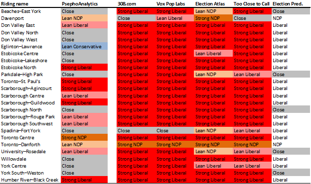
You’ll see that we’re predicting more close races than all the others combined, and more “leaning” races. In fact, the average margin of victory from 308, Vox Pop, and Too Close to Call are 23%/26%/23% respectively, which sounds high. Nonetheless, the two truly notable differences we’re predicting are in Eglinton-Lawrence, where the consensus is that finance minister Joe Oliver will lose badly (we predict he might win) and Toronto Centre, where Bill Munro is predicted to easily beat Linda McQuaig (we predict the opposite).
Anyway, we’re excited to see how these predictions look come Monday, and we’ll come back after the election with an analysis of our performance.
Now, get out and vote!
Thursday, October 15, 2015
We’ve started looking into what might be a natural cycle between governing parties, which may account for some of our differences to the polls that we’ve seen. The terminology often heard is “time for a change” – and this sentiment, while very difficult to include in voter characteristics, is possible to model as a high level risk to governing parties.
To start, we reran our predictions with an incumbent-year interaction, to see if the incumbency bonus changed over time. Turns out it does – incumbency effect declines over time. But it is difficult to determine, from only a few years of data, whether we’re simply seeing a reversion to the mean. So we need more data – and likely at a higher level.
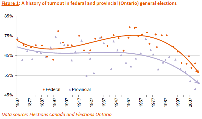
Let’s start with the proportion of votes received by each of today’s three major parties (or their predecessors – whose names we’ll simply substitute with modern party names), with trend lines, in every federal election since Confederation:
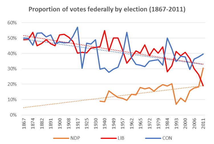
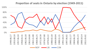
This chart shows that the Liberal & Conservative trend lines are essentially the same, and that the two parties effectively cycle as the governing party over this line.
Prior to a noticeable 3rd party (i.e., the NDP starting in the 1962 election and its predecessor Co-operative Commonwealth Federation starting in the 1935 election) the Liberals and Conservatives effectively flipped back and forth in terms of governing (6 times over 68 years), averaging around 48% of the vote each. Since then, the flip has continued (10 more times over the following 80 years), and the median proportion of votes for Liberals, Conservatives, and NDP has been 41%/35%/16% respectively.
Further, since 1962, the Liberals have been very slowly losing support (about 0.25 points per election), while the other two parties have been very slowly gaining it (about 0.05 points per election), though there has been considerable variation across each election, making this slightly harder to use in predictions. (We’ll look into including this in our risk modeling).
Next, we looked at some stats about governing:
- In the 148.4 years since Sir John A. Macdonald was first sworn in, there have been 27 PM-ships (though only 22 PMs), for an average length of 5.5 years (though 4.3 years for Conservatives and 6.9 years for Liberals).
- Parties often string a couple PMs together - so the PM-ship has only switched parties 16 times with an average length of 8.7 years (or 7.2 Cons vs. 10.4 Libs).
- Only two PMs have won four consecutive elections (Macdonald and Laurier), with four more having won three (Mackensie King, Diefenbaker, Trudeau, and Crétien) prior to Harper.
All of these stats would suggest that Harper is due for a loss: he has been the sole PM for his party for 9.7 years, which is over twice his party’s average length for a PM-ship. He’s also second all-time behind Macdonald in a consecutive Conservative PM role (having past Mulroney and Borden last year). From a risk-model perspective, Harper is likely about to become hit hard by the “time for a change” narrative.
But how much will this actually affect Conservative results? And how much will their opponents benefit? These are critical questions to our predictions.
In any election where the governing party lost (averaging once every 9 years; though 7 years for Conservatives, and 11 years for Liberals), that party saw a median drop of 6.1 points from the preceding election (average of 8.1 points). Since 1962 (first election with the NDP), that loss has been 5.5 points. But do any of those votes go to the NDP? Turns out, not really: those 5.5 points appear to (at least on average) switch back to the new governing party.
Given the risk to the current governing party, we would forecast a 5.5%-6.1% shift from the Conservatives to the Liberals, on top of all our other estimates (which would not overlap with any of this analysis), assuming that Toronto would feel the same about change as the rest of the country has historically.
That would mean our comparisons to recent Toronto-specific polls would look like this:
Remember – our analysis has avoided the use of polls, so these results (assuming the polls are right) are quite impressive.
Next up (and last before the election on Monday) will be our riding-level predictions.
Tuesday, October 13, 2015
Political psychologists have long held that over-simplified “rational” models of voters do not help accurately predict their actual behavior. What most behavioural researchers have found is the decision-making (e.g., voting) often boils down to emotional, unconscious factors. So, in attempting to build up our voting agents, we will need to at least:
- include multiple issue perspectives, not just a simple evaluation of “left-right”;
- include data for non-policy factors that could determine voting; and
- not prescribe values to our agents beyond what we can empirically derive.
Given that we are unable to peek into voters’ minds (and remember: we are trying to avoid using polls[1]), we need data for (or proxies for) factors that might influence someone’s vote. So, we gathered (or created) and joined detailed data for the 2006, 2008, and 2011 Canadian federal elections (as well as the 2015 election, which will be used for predictions).
In a new paper, we discuss what influence multiple factors, such as “leader likeability”, incumbency, “star” status, demographics and policy platforms, may have on voting outcomes, and use these results to predict the upcoming federal election in Toronto ridings.
At a high-level, we find that:
- Almost all variables are statistically significant.
- Being either a star candidate or an incumbent can boost a candidates share of the vote by 21%, but being both an incumbent and a star candidate does not give a candidate an incremental increase. The two effects are equivalent to belonging to a party (21%).
- Leader likeability is associated with a 0.3% change in the proportion of votes received by a candidate. So, a leader that essentially polls the same as their party yields their Toronto-based candidates about 14 points.
- The relationships between age, gender, family income, and the proportion of votes vary widely across the parties (as expected). For example, family income tends to increase support for Conservatives (0.005/$10,000) while decreasing for the other two major parties by roughly the same magnitude.
- Policy matters, but only slightly, and only economic and environmental issues overall.
With our empirical results, we can turn to predicting the 2015 federal election in Toronto ridings.
It turns out that our Toronto-wide results are fairly in line with recent Toronto-specific polling results (weighted by age and sample size) – though we’ll see how right we all are come election day – which means that there may some inherent truth in the coefficients we have found.
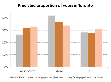
Given that we haven’t used polls or included localized details or party platforms, these results are surprisingly good. The seeming shift from Liberal to Conservative is something that we’ll need to look into further. It is likely highlighting an issue with our data: namely, that we only have three years of detailed federal elections data, and these elections have seen some of the best showings for the Conservatives (and their predecessors) in Ontario since the end of the second world war (the exceptions being in the late 1950s with Diefenbaker, 1979 with Joe Clark, and 1984 with Brian Mulroney), with some of the worst for the Liberals over the same time frame. That is, we are not picking up a (cyclical) reversion to the mean in our variables, but might investigate the cycle itself.
Nonetheless, given we set out to understand (both theoretically and empirically) how to predict an election while significantly limiting the use of polls, and it appears that we are at least on the right track.
[1] This is true for a number of reasons: first, we want to be able to simulate elections, and therefore would not always have access to polls; second, we are trying to do something fundamentally different by observing behaviour instead of asking people questions, which often leads to lying (e.g., social desirability biases: see the “Bradley effect”); third, while polls in aggregate are generally good at predicting outcomes, individual polls are highly volatile.
Friday, September 25, 2015
Given that we are unable to peek into voters’ minds (remember: we are trying to avoid using polls as much as possible), we need data (or proxies) for factors that might influence someone’s vote. We gathered (or created) and joined data for the 2006, 2008, and 2011 Canadian federal elections (as well as the 2015 election, which will be used for predictions) for Toronto ridings.
We’ll be explaining all this in more detail next week, but for now, here are some basics:
- We’ve assigned leader “likeability” scores to the major party leaders in each election, using polls that ask questions about leadership characteristics and formulaically compare them to party-level polls around the same time. This provides a value for (or at least a proxy of) how much influence the party leader was having on their party’s showing in the polls, and should account for much of the party variation that we see from year to year. (We also use party identifiers, to identify a “base”.)
- For all 366 candidates across the three elections, we identify two things: are they an incumbent, and are they a “star” candidate, by which we mean would they be generally known outside of their riding? This yields 64 candidate-year incumbents (i.e., an individual could be an incumbent in all three elections) and 29 candidate-year stars.
Regressing these data against the proportion of votes received across ridings yields some interesting results. First: party, leader likeability, star candidate, and incumbency are all statistically significant (as is the interaction of star candidate and incumbency). This isn’t a surprise, given the literature around what it is that drives voters’ decisions. (Note that we haven’t yet included demographics or party platforms.)
Breaking down the results: Being a star candidate or an incumbent (but not both) adds about 20 points right off the top, so name recognition obviously matters a lot. Likeability matter too; a leader that essentially polls the same as their party yields candidates about 14 points. (As an example of what this means, Stephane Dion lost the average Liberal candidate in Toronto about 9 points relative to Paul Martin. Alternatively, in 2011, Jack Layton added about 16 points more to NDP candidates in Toronto than Michael Ignatieff did for equivalent Liberal candidates.) Finally, party base matters too: for example, being an average Liberal candidate in Toronto adds about 17 points over the equivalent NDP candidate. (We expect some of this will be explained with demographics and party platforms.)
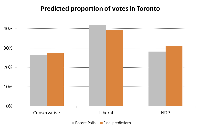
To be clear, these are average results, so we can’t yet use them effectively for predicting individual riding-level races (that will come later). But, if we apply them to all 2015 races in Toronto and aggregate across the city, we would predict voting proportions very similar to the results of a recent poll by Mainstreet (if undecided voters split proportionally):
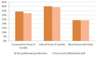
Given that we haven’t used polls or included localized details or party platforms, these results are amazing, and give us a lot of confidence that we’re making fantastic progress in understanding voter behaviour (at least in Toronto).
Friday, September 18, 2015
Analyzing the upcoming federal election requires collecting and integrating new data. This is often the most challenging part of any analysis and we’ve committed significant efforts to obtaining good data for federal elections in Toronto’s electoral districts.
Clearly, the first place to start was with Elections Canada and the results of previous general elections. These are available for download as collections of Excel files, which aren’t the most convenient format. So, our toVotes package has been updated to include results from the 2006, 2008, and 2011 federal elections for electoral districts in Toronto. The toFederalVotes data frame provides the candidate’s name, party, whether they were an incumbent, and the number of votes they received by electoral district and poll number. Across the three elections, this amounts to 82,314 observations.
Connecting these voting data with other characteristics requires knowing where each electoral district and poll are in Toronto. So, we created spatial joins among datasets to integrate them (e.g., combining demographics from census data with the vote results). Shapefiles for each of the three federal elections are available for download, but the location identifiers aren’t a clean match between the Excel and shapefiles. Thanks to some help from Elections Canada, we were able to translate the location identifiers and join the voting data to the election shapefiles. This gives us close to 4,000 poll locations across 23 electoral districts in each year. We then used the census shapefiles to aggregate these voting data into 579 census tracts. These tracts are relatively stable and give us a common geographical classification for all of our data.
This work is currently in the experimental fed-geo branch of the toVotes package and will be pulled into the main branch soon. Now, with votes aggregated into census tracts, we can use the census data for Toronto in our toCensus package to explore how demographics affect voting outcomes.
Getting the data to this point was more work than we expected, but well worth the effort. We’re excited to see what we can learn from these data and look forward to sharing the results with you.
Thursday, September 17, 2015
A number of people have been asking whether we are going to analyze the upcoming federal election on October 19, like we did for the Toronto mayoral race last year. The truth is, we never stopped working after the mayoral race, but are back with a vengeance for the next five weeks.
We have gathered tonnes of new data and refined our methodology. We have also established a new domain name: psephoanalytics.ca. You can still subscribe to email updates here, or follow us on twitter @psephoanalytics. Finally, if you’d like to chat directly, please email us psephoanalytics@gmail.com.
Nonetheless, stay tuned for lots of updates over the coming weeks, culminating in some predictions for Toronto ridings prior to October 19.
Friday, April 24, 2015
The first (and long) step in moving towards agent-based modeling is the creation of the agents themselves. While fictional, they must represent reality – meaning they need to behave like actual people. The main issue in voter modeling, however, is that since voting is private we do not know how individuals behave, only collections of voters – and we do not want them all to behave the exact same way. That is why one of the key elements of our work is the ability to create meaningful differences among our agents – particularly when it comes to the likes of issue positions and political engagement.
The obvious difficulty is how to do that. In our model, many of our agents’ characteristics are limited to values between 0 and 1 (e.g., political positions, weights on given issues). Many standard distributions, such as the normal, would be cut off at these extremes, creating unrealistic “spikes” of extreme behaviour. We also cannot use uniform distributions, as the likelihood of individuals in a group looking somewhat the same (i.e., more around an average) seems much more reasonable than them looking uniformly different.
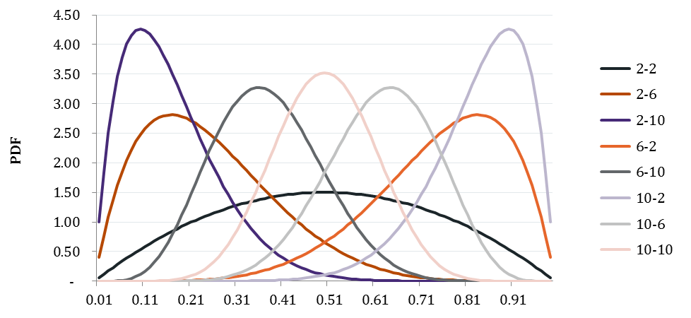
Which brings us to the β distribution. In a new paper, we discuss applying this family of distributions to voter characteristics. While there is great diversity in the potential shapes of these distributions - granting us the flexibility we need - in (likely) very extreme cases, the shape will not “look like” what we would expect. Therefore, one of our goals will be to somewhat constrain our selection of fixed values for α and β, based on as much empirical data as possible, to ensure we get this balance right.
A selection α-β combinations that generate “useful” distributions:
Wednesday, March 18, 2015
As the next Federal General Election gets closer, we’re turning our analytical attention to how the election might play out in Toronto. The first step, of course, is to gather data on prior elections. So, we’ve updated our toVotes data package to include the results of the 2008 and 2011 federal elections for electoral districts in Toronto.
This dataset includes the votes received by each candidate in each district and poll in Toronto. We also include the party affiliation of the candidate and whether they are an incumbent. These data are currently stored in a separate dataset from the mayoral results, since the geography of the electoral districts and wards aren’t directly comparable. We’ll work on integrating these datasets more closely and adding in further election results over the coming weeks.
Hopefully the general availability of cleaned and integrated datasets, such as this one, will help generate more analytically-based discussions of the upcoming election.
Tuesday, January 27, 2015
Turnout is often seen as (at least an easy) metric of the health of a democracy – as voting is a primary activity in civic engagement. However, turnout rates continue to decline across many jurisdictions[i]. This is certainly true in Canada and Ontario.
From the PsephoAnalytics perspective – namely, accurately predicting the results of elections (particularly when using an agent-based model (ABM) approach) – requires understanding what it is that drives the decision to vote at all, instead of simply staying home.
If this can be done, we would not only improve our estimates in an empirical (or at least heuristic) way, but might also be able to make normative statements about elections. That is, we hope to be able to suggest ways in which turnout could be improved, and whether (or how much) that mattered.
In a new paper we start to investigate the history of turnout in Canada and Ontario, and review what the literature says about the factors associated with turnout, in an effort to help “teach” our agents when and why they “want” to vote. More work will certainly be required here, but this provides a very good start.
[i] See the OECD social indicators or International IDEA voter turnout statistics
Friday, January 23, 2015
We value constructive feedback and continuous improvement, so we’ve taken a careful look at how our predictions held up for the recent mayoral election in Toronto.
The full analysis is here. The summary is that our estimates weren’t too bad on average: the distribution of errors is centered on zero (i.e., not biased) with a small standard error. But, on-average estimates are not sufficient for the types of prediction we would like to make. At a ward-level, we find that we generally overestimated support for Tory, especially in areas where Ford received significant votes.
We understood that our simple agent-based approach wouldn’t be enough. Now we’re particularly motivated to gather up much more data to enrich our agents’ behaviour and make better predictions.
Sunday, November 2, 2014
The results are in, and our predictions performed reasonably well on average (we averaged 4% off per candidate). Ward by ward predictions were a little more mixed, though, with some wards being bang on (looking at Tory’s results), and some being way off – such as northern Scarborough and Etobicoke. (For what it’s worth, the polls were a ways off in this regard too.) This mostly comes down to our agents not being different enough from one another. We knew building the agents would be the hardest part, and we now have proof!
Regardless, we still think that the agent-based modeling approach is the most appropriate for this kind of work – but we obviously need a lot more data to teach our agents what they believe. So, we’re going to spend the next few months incorporating other datasets (e.g., historical federal and provincial elections, as well as councillor-level data from the 2014 Toronto election). The other piece that we need to focus on is turnout. We knew our turnout predictions were likely the minimum for this election, but aren’t yet able to model a more predictive metric, so we’ll be conducting a study into that as well.
Finally, we’ll provide detailed analysis of our predictions once all the detailed official results become available.
Saturday, October 25, 2014
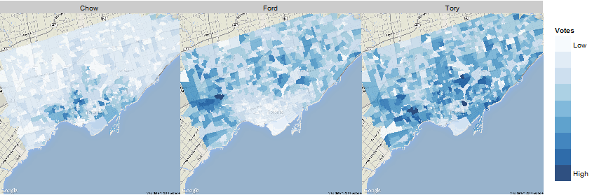
Our final predictions have John Tory winning the 2014 mayoral election in Toronto with a plurality 46% of the votes, followed by Doug Ford (29%) and Olivia Chow (25%). We also predict turnout of at least 49% across the city, but there are differences in turnout among each candidate’s supporters (with Tory’s supporters being the most likely to vote by a significant margin - which is why our results are more in his favour than recent polls). We predict support for each candidate will come from different pockets of the city, as can be seen on the map below.
These predictions were generated by simulating the election ten times, each time sampling one million of our representative voters (whom we created) for their voting preferences and whether they intend to vote.
Each representative voter has demographic characteristics (e.g., age, sex, income) in accordance with local census data, and lives in a specific ‘neighbourhood’ (i.e., census tract). These attributes helped us assign them political beliefs – and therefore preferences for candidates – as well as political engagement scores that come from various studies of historical turnout (from the likes of Elections Canada). The latter allows us to estimate the likelihood of each specific agent actually casting a ballot.
We’ll shortly also release a ward-by-ward summary of our predictions.
In the end, we hope this proof-of-concept proves to be a more refined (and therefore useful in the long-term) than polling data. As the model becomes more sophisticated, we’ll be able to do scenario testing and study other aspects of campaigns.
Saturday, October 25, 2014
As promised, here is a ward-by-ward breakdown of our final predictions for the 2014 mayoral election in Toronto. We have Tory garnering the most votes in 33 wards for sure, plus likely another 5 in close races. Six wards are “too close to call”, with three barely leaning to Tory (38, 39, and 40) and three barely leaning to Ford (8, 35, and 43). We’re not predicting Chow will win in any ward, but will come second in fourteen.
Ward	Tory	Ford	Chow	Turnout
1	41%	36%	23%	48%
2	44%	34%	22%	50%
3	49%	31%	20%	51%
4	50%	31%	19%	51%
5	49%	32%	19%	50%
6	46%	33%	21%	50%
7	43%	36%	21%	49%
8	39%	39%	22%	47%
9	42%	37%	21%	50%
10	45%	35%	20%	50%
11	40%	36%	24%	49%
12	40%	36%	23%	49%
13	55%	13%	32%	49%
14	48%	17%	35%	47%
15	43%	36%	21%	50%
16	57%	29%	14%	50%
17	43%	33%	24%	49%
18	47%	16%	37%	47%
19	48%	15%	36%	45%
20	49%	16%	36%	44%
21	56%	12%	32%	49%
22	57%	12%	31%	48%
23	45%	34%	21%	48%
24	48%	33%	20%	50%
25	55%	30%	14%	50%
26	42%	23%	35%	49%
27	52%	14%	34%	46%
28	48%	17%	35%	47%
29	46%	21%	33%	50%
30	52%	14%	34%	48%
31	42%	23%	35%	49%
32	57%	12%	31%	49%
33	45%	35%	20%	49%
34	46%	34%	21%	50%
35	38%	41%	21%	49%
36	44%	37%	19%	50%
37	41%	38%	21%	50%
38	40%	39%	21%	49%
39	40%	39%	21%	50%
40	41%	39%	20%	50%
41	41%	38%	21%	50%
42	41%	38%	21%	48%
43	40%	40%	21%	50%
44	49%	35%	16%	50%
Friday, October 10, 2014
The first (and long) step in moving towards agent-based modeling is the creation of the agents themselves. While fictional, they must be representative of reality – meaning they need to behave like actual people might.
In developing a proof of concept of our simulation platform (which we’ll lay out in some detail soon), we’ve created 10,000 agents, drawn randomly from the 542 census tracts (CTs) that make up Toronto per the 2011 Census, proportional to the actual population by age and sex. (CTs are roughly “neighbourhoods”.) So, for example, if 0.001% of the population of Toronto are male, aged 43, living in a CT on the Danforth, then roughly 0.001% of our agents will have those same characteristics. Once the basic agents are selected, we assign (for now) the median household income from the CT to the agent.
But what do these agents believe, politically? For that we take (again, for now) a weighted compilation of relatively recent polls (10 in total, having polled close to 15,000 people, since Doug Ford entered the race), averaged by age/sex /income group/region combinations (420 in total). These give us average support for each of the three major candidates (plus “other”) by agent type, which we then randomly sample (by proportion of support) and assign a Left-Right score (0-100) as we did in our other modeling.
This is somewhat akin to polling, except we’re (randomly) assigning these agents what they believe rather than asking, such that it aggregates back to what the polls are saying, on average.
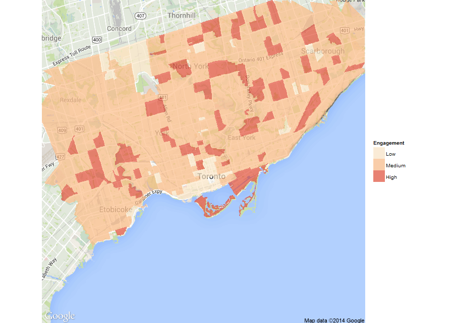
Next, we take the results of an Elections Canada study on turnout by age/sex that allows us to similarly assign “engagement” scores to the agents. That is, we assign (for now) the average turnout by age/sex group accordingly to each agent. This gives us a sense of likely turnout by CT (see map below).
There is much more to go here, but this forms the basis of our “voter” agents. Next, we’ll turn to “candidate” agents, and then on to “media” agents.
Happy thanksgiving!
Tuesday, September 30, 2014
Our most recent analysis shows Tory still in the lead with 44% of the votes, followed by Doug Ford at 33% and Olivia Chow at 23%.
Our analytical approach allows us to take a closer, geographical look. Based on this, we see general support for Tory across the city, while Ford and Chow have more distinct areas of support.
This still based on our original macro-level analysis, but gives a good sense of where our agents support would be (on average) at a local level.
Friday, September 26, 2014
Given the caveats we outlined re: macro-level voting modeling, we’re moving on to a totally different approach. Using something called agent-based modeling (ABM), we’re hoping to move to a point where we can both predict elections, but also use the system to conduct studies on the effectiveness of various election models.
ABM can be defined simply as an individual-centric approach to model design, and has become widespread in multiple fields, from biology to economics. In such models, researchers define agents (e.g., voters, candidates, and media) each with various properties, and an environment in which such agents can behave and interact.
Examining systems through ABM seeks to answer four questions:
- Empirical: What are the (causal) explanations for how systems evolve?
- Heuristic: What are outcomes of (even simple) shocks to the system?
- Method: How can we advance our understanding of the system?
- Normative: How can systems be designed better?
We’ll start to provide updates on our progress on the development on our system in the coming weeks.
Friday, September 19, 2014
Based on updated poll numbers (per Threehundredeight.com as of September 16) - where John Tory has a commanding lead - we’re predicting that the wards to watch in the upcoming Toronto mayoral election are clustered in two areas, surprisingly, traditional strongholds for Doug Ford and Olivia Chow.
The first set are Etobicoke North & Centre (wards 1-4), traditional Ford territory. The second are in the south-west portion of downtown, traditional NDP territory, specifically Parkdale-High Park, Davenport, Trinity-Spadina (x2), and Toronto Danforth (respectively wards 14, 18-20, and 30).
As the election gets closer, we’ll provide more detailed predictions.
Tuesday, September 16, 2014
As with any analytical project, we invested significant time in obtaining and integrating data for our neighbourhood-level modeling. The Toronto Open Data portal provides detailed election results for the 2003, 2006, and 2010 elections, which is a great resource. But, they are saved as Excel files with a separate worksheet for each ward. This is not an ideal format for working with R.
We’ve taken the Excel files for the mayoral-race results and converted them into a data package for R called toVotes. This package includes the votes received by ward and area for each mayoral candidate in each of the last three elections.
If you’re interested in analyzing Toronto’s elections, we hope you find this package useful. We’re also happy to take suggestions (or code contributions) on the GitHub page.
Friday, September 12, 2014
In our first paper, we describe the results of some initial modeling - at a neighbourhood level - of which candidates voters are likely to support in the 2014 Toronto mayoral race. All of our data is based upon publicly available sources.
We use a combination of proximity voter theory and statistical techniques (linear regression and principal-component analyses) to undertake two streams of analysis:
- Determining what issues have historically driven votes and what positions neighbourhoods have taken on those issues
- Determining which neighbourhood characteristics might explain why people favour certain candidates
In both cases we use candidates’ currently stated positions on issues and assign them scores from 0 (‘extreme left’) to 100 (‘extreme right’). While certainly subjective, there is at least internal consistency to such modeling.
This work demonstrates that significant insights on the upcoming mayoral election in Toronto can be obtained from an analysis of publicly available data. In particular, we find that:
- Voters will change their minds in response to issues. So, “getting out the vote” is not a sufficient strategy. Carefully chosen positions and persuasion are also important.
- Despite this, the ‘voteability’ of candidates is clearly important, which includes voter’s assessments of a candidate’s ability to lead and how well they know the candidate’s positions.
- The airport expansion and transportation have been the dominant issues across the city in the last three elections, though they may not be in 2014.
- A combination of family size, mode of commuting, and home values (at the neighbourhood level) can partially predict voting patterns.
We are now moving on to something completely different, where we use an agent-based approach to simulate entire elections. We are actively working on this now and hope to share our progress soon.
Wednesday, September 10, 2014
Political campaigns have limited resources -–both time and financial - that should be spent on attracting voters that are more likely to support their candidates. Identifying these voters can be critical to the success of a candidate.
Given the privacy of voting and the lack of useful surveys, there are few options for identifying individual voter preferences:
- Polling, which is large-scale, but does not identify individual voters
- Voter databases, which identify individual voters, but are typically very small scale
- In-depth analytical modeling, which is both large-scale and helps to ‘identify’ voters (at least at a neighbourhood level on average)
The goal of PsephoAnalytics* is to model voting behaviour in order to accurately explain campaigns (starting with the 2014 Toronto mayoral race). This means attempting to answer four key questions:
- What are the (causal) explanations for how election campaigns evolve – and how well can we predict their outcomes?
- What are effects of (even simple) shocks to election campaigns?
- How can we advance our understanding of election campaigns?
- How can elections be better designed?
Psephology (from the Greek psephos, for ‘pebble’, which the ancient Greeks used as ballots) deals with the analysis of elections.