Lined that up surprisingly well, if accidentally

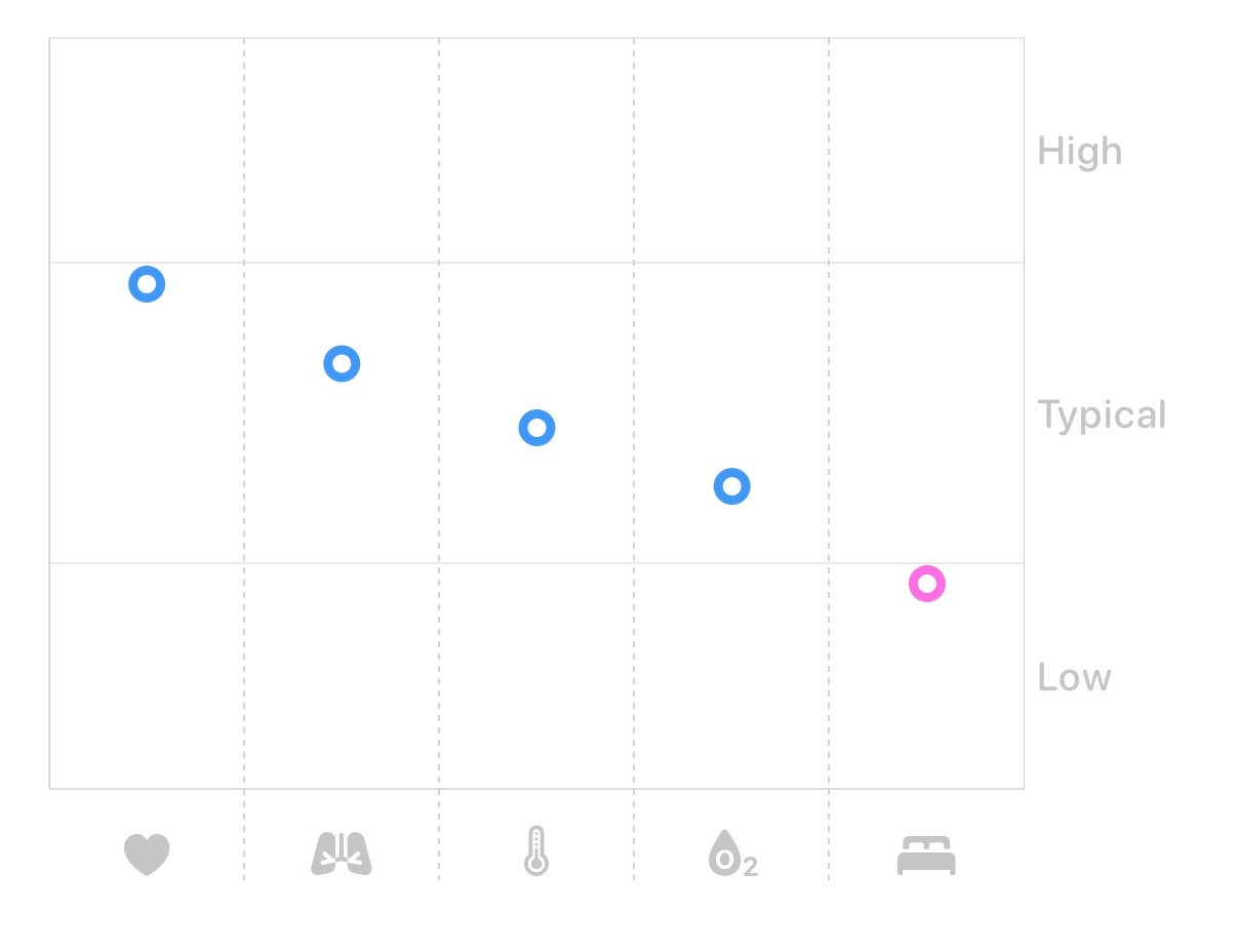
A scatter plot shows data points with blue circles representing heart, lungs, temperature, and oxygen levels from high to typical, and a pink circle representing sleep quality in the low range.

Microposts